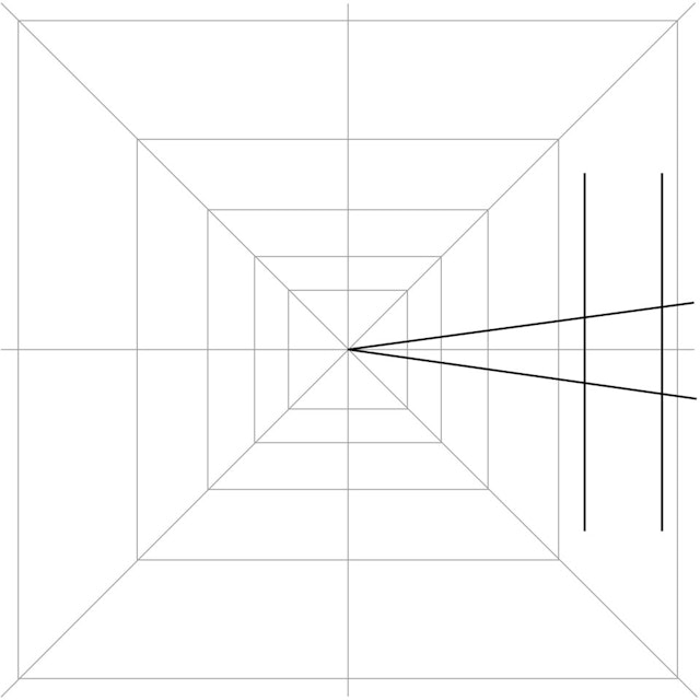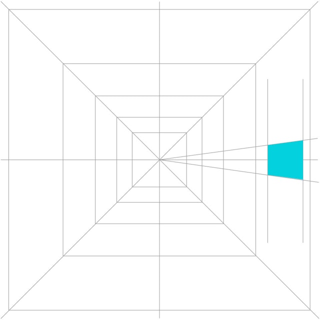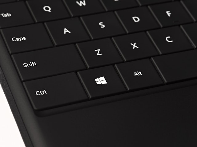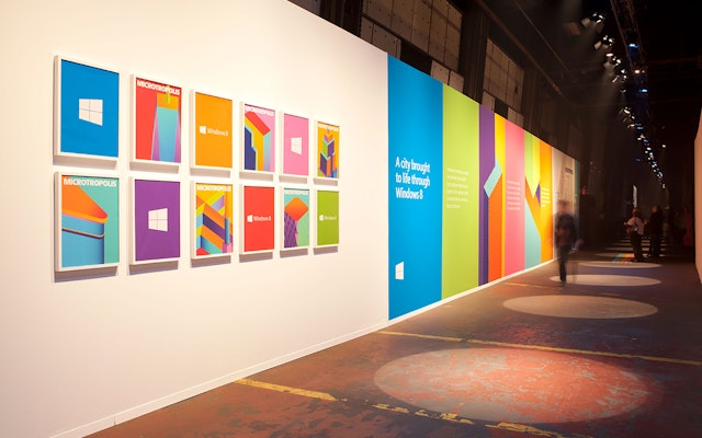


The new identity suggests dimensionality using the classic principle of perspective: lines receding into space.


Designed in coordination with the launch of Windows 8, Pentagram's new identity for the operating system takes the iconic Windows logo back to its roots—as a window. The logo re-imagines the familiar four-color symbol as a modern geometric shape that introduces a new perspective on the Microsoft brand.
Meeting with Microsoft early in the development process, Pentagram asked: “Your name is Windows. Why are you a flag?” The answer is that the brand started as a window, but over the years, as computing systems grew more powerful and graphics more complex, evolved into a flag. The designers made the assumption that the waving flag was probably a result of typical industry comments that a plain window looked too static, and that straight lines were too severe.
The new identity returns the logo to its roots. The name Windows was originally introduced as a metaphor for seeing into screens and systems and a new view on technology. The new identity reintroduces this idea with the actual visual principles of perspective. It also reflects the Metro design language developed by Microsoft for its products, graphics and user interfaces.
In a post on his blog, Sam Moreau, Microsoft’s Principal Director of User Experience for Windows, says: “’Windows’ really is a beautiful metaphor for computing and with the new logo we wanted to celebrate the idea of a window, in perspective.”
The designers created a complete system based on the idea of perspective. They completed motion studies to demonstrate the transformation of the flag shape into a window shape, to show that they weren’t that far apart and would be an easy and elegant transition for the brand.
In its research, the team considered the Windows brand history. The original Windows logo looked like a window. As computing became more powerful, the logos for Windows began to get more complex, to show off the capabilities of Microsoft systems. The logo for Windows 1.0 resembled panes of glass. By Windows 3.1, this had been replaced with a waving effect for a sense of motion and the four colors that became a signature of the Windows brand.
For Microsoft, the logo became a natural place to demonstrate the graphic capabilities of each new version of Windows. The Windows logo underwent another transformation for Windows XP, when the “flag” began looking more material and gained a 3D effect with a gradient. For Windows Vista, the flag evolved into a kind of dimensional button or “pearl,” as it became known in Microsoft’s branding language.
The new logo reflects the sleek, modern “Metro” design language first introduced by Microsoft in its Windows 7 phones. Metro is based on the design principles of the Swiss International Style, with clean lines, shapes and typography and bold, flat colors. One guideline of Metro is that the graphic or interface must appear “authentically digital” – that is, it should not appear to be material or three-dimensional using gradients or effects. The new identity suggests dimensionality using the classic principle of perspective: lines receding into space.
The perspective drawing is based on classical perspective drawing, not computerized perspective. The cross bar stays the same size no matter the height of the logo, which means it has to be redrawn for each time it increases in size, like classic typography.
The perspective analogy is apt because the whole point of Microsoft products is that they are tools for someone to achieve their goals from their own perspective. The window here is a neutral tool for a user to achieve whatever they can, based on their own initiative. The logo design is deliberately neutral so that it can function effectively in a myriad of uses, especially motion. The old logo was flat and drawn in motion; the new logo is a neutral container that can convey actual motion, becoming a more active and effective brand.
Office
- New York
