The wordmark uses a font based on the signs from protest marches in the 1960s, specifically the iconic ‘I AM A MAN’ poster.

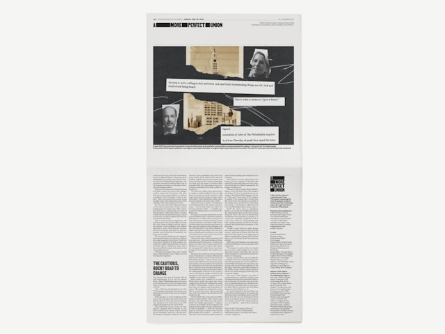
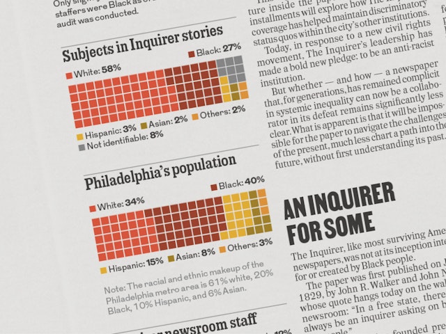
The first chapter looks at The Inquirer’s own role in perpetuating racial inequality inside and outside of the newsroom.

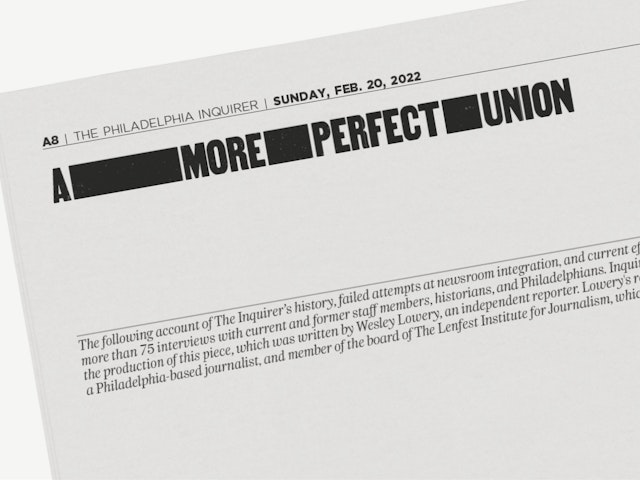

The Philadelphia Inquirer has launched “A More Perfect Union,” a yearlong special project examining the roots of systemic racism in America through institutions founded in Philadelphia. Pentagram developed an identity and visual tool kit for the series, along with the print edition of chapter one, included as an insert with the Sunday, February 20 issue of the newspaper.
Pentagram was commissioned by Publisher and CEO Lisa H. Hughes and worked closely with contributing editor Errin Haines, Creative Director Elizabeth Samet, and Design Director Suzette Moyer and their teams. The digital application of the project has been developed in-house by interactive designer Dain Saint.
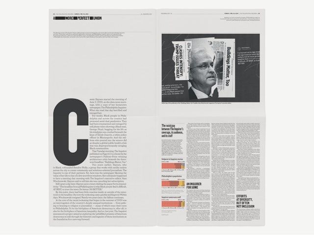
The first chapter, written by Wesley Lowery, looks at The Inquirer’s own role in perpetuating racial inequality inside and outside of the newsroom, laying out the challenges and opportunity ahead.
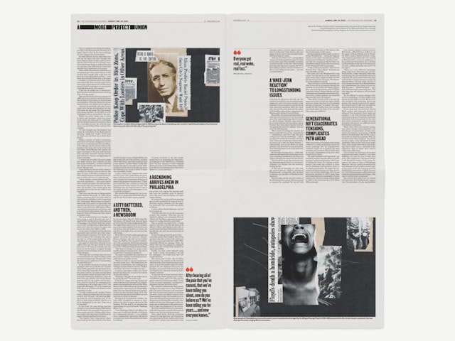
Pentagram created the wordmark with a font based on the signs used at protest marches in the 1960s, specifically the iconic “I AM A MAN” poster originally designed for the Memphis Sanitation Workers Strike in 1968. The font Martin was revived by Tré Seals as part of his collection at Vocal Type. The heavy rules evoke redactions, a device made explicit in animation applications. The illustrations were made by Mark Harris.
Client
The Philadelphia InquirerSector
- Publishing
- Arts & Culture
Discipline
- Brand Identity
- Publications
Office
- New York
Partner
Project team
- Shigeto Akiyama
- Jordan Taylor
- Avery George
Collaborators
- Mark Harris, illustrator


