
AFT worked with Pentagram to clarify their message and elevate their brand in order to reflect the organization’s expanded reach.


Inspired by the three sections of the logo, geometric shapes become a brand system of overlapping and interacting moments that represent the exchange of ideas and collaboration inherent to the organization.


The overlapping shapes allow the colors to be layered together to further emphasize the ideas of mixing perspectives.


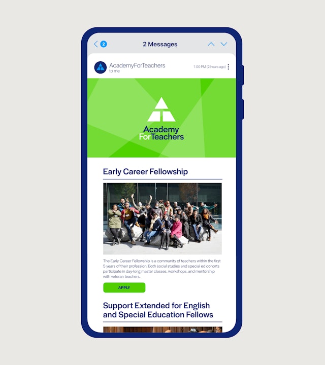
Pentagram brought the identity to life through Academy for Teachers' new website, including extensive reorganization of AFT’s immense catalog of programming and offerings.


The Academy for Teachers (AFT) is a nonprofit organization created to honor and support teachers. AFT is best known for their “Master Classes” that provide in-person seminars for NYC area teachers with famous thought-leaders, hosted in some of New York’s greatest venues. In the wake of Covid and the massive shift to remote learning, AFT significantly diversified their program offerings to reach teachers where they are, during a time teachers are more important—and less supported—than ever before.
AFT worked with Pentagram to clarify their message and elevate their brand in order to reflect the organization’s expanded reach. Pentagram developed a brand ethos, “Elevate & Radiate,” to represent both respect for the profession of teaching and a celebration of the community; a two-pronged approach that encouraged AFT to focus on teachers, with the understanding that teachers impact the world.
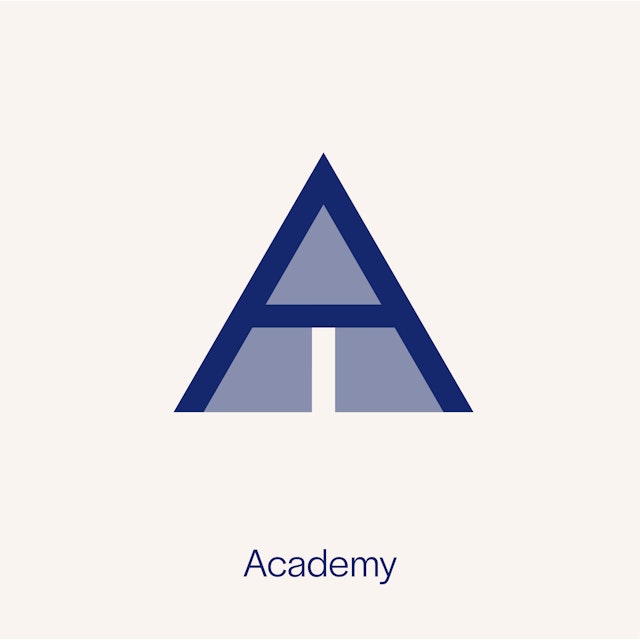
The new strategy led to a bold, fresh visual identity system that harnesses the energy and passion of the organization. The deceivingly simple logomark represents not only a hidden A and T for the organization’s initials, but also AFT’s unique programming, which unifies teachers from three diverse worlds—public, private and charter schools (something rarely seen in professional development).
Inspired by the three sections of the logo, geometric shapes become a brand system of overlapping and interacting moments that represent the exchange of ideas and collaboration inherent to the organization. Referring back to the brand's core principles, these shapes symbolize the “radiation” of shared experiences between teachers, their students and beyond.
The AFT brand color palette is bright and energetic, anchored by a traditional “academic” navy and white. A mix of six vivid hues round out the palette and infuse the brand with spirit and optimism. The overlapping shapes allow the colors to be layered together to further emphasize the ideas of mixing perspectives.
The primary typeface for the new brand identity is Halyard Display by Darden Studio, a clear and didactic grotesque sans serif that serves as a friendly workhorse for the brand’s wide range of programming and audiences. The slight quirks found in some letters (notably the Q, R and lowercase g) add a touch of humanity and speak to the diverse connections AFT works to make across various communities.
Pentagram brought the identity to life through Academy for Teachers' new website, including extensive reorganization of AFT’s immense catalog of programming and offerings. The angled shapes become windows to create a dynamic web experience, one that feels completely ownable to the Academy. Small animations and fun details (overlapping colored shapes that pop in from the edge, bullets in the signature triangle shape) truly represent an organization of pride and community. Pentagram also created a full stationery suite, social media system and a variety of merchandise (including softball designs for the organization’s teacher-led team) to take the Academy for Teachers into their next chapter.
Office
- New York
Partner
Project team
- Timothy Cohan
- Katherine Killeffer
- Meredith Zerby
- Anastasia Kharchenko
- Beatriz Congar
- Dianne Kim
