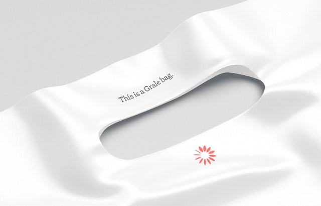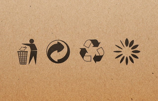
The Grale symbol is a flower-like circle of radiating shapes that illustrate the decomposition of a leaf.


The icon is designed to both stand on its own and work alongside other existing international recycling and upcycling symbols on packaging.


The identity sidesteps an overly scientific look to position Grale as a friendly and useful innovation for manufacturers and consumers.


Plastic has driven remarkable technological progress while leaving behind a legacy of pollution and health risks, including microplastics that are now ubiquitous in the environment. Grale has created an award-winning breakthrough technology that replaces plastics with eco-friendly, plant-based alternatives. Founded in 2018 by the visionary brothers Allen and Max Mohammadi and based in Stockholm, Sweden, the company has expanded its mission beyond single-use plastics to address broader sustainability challenges.
Pentagram has developed a new brand identity and visual language for Grale that conveys its commitment to a circular and sustainable future. The framework encompasses brand positioning and messaging, including a new name for the company, which was formerly known as PlasticFri.
Grale aspires to be the “holy grail” of sustainability by creating scalable, affordable and widely available solutions for a healthier world. The company currently offers both film-based and fiber-based products, like straws, coffee cups and single-use plastic bags. The material looks and works like standard petroleum-based plastics, but is 100-percent biodegradable, compostable, non-toxic and free from conventional plastics.
The identity sidesteps an overly scientific look to position Grale as a friendly and useful innovation for manufacturers and consumers. Simultaneously, the identity behaves as a contemporary brand, with the goal of appealing to a young, trend-conscious audience.
The Grale symbol is a flower-like circle of radiating shapes that illustrate the decomposition of a leaf. This idea is reflected in a supporting graphic motif that “dissolves” the leaves into particles through the use of gradations.
The icon is designed to both stand on its own and work alongside other existing international recycling and upcycling symbols on packaging and other applications. The logo also functions as a kind of asterisk, appended to taglines and information on sustainability to identify them as part of Grale.
The typical color and motifs of the green movement were intentionally avoided to set Grale apart from a saturated category, much of which is now recognized to be “greenwashing.” Instead, the primary brand color is a warm coral, supported by a palette of pinks, yellows and reds. The leaves of the logo are also incorporated into a series of custom icons for the brand.
The wordmark features a distinct “g” and other customized letterforms that give the logotype its own recognizable look that allows it to be used without the icon. The primary brand typeface is the approachable serif Grenette (by Colophon).
Along with the visuals, the verbal messaging is energetic and positive, helping to create an optimistic and hopeful spirit around a significant challenge––striving for a cleaner world with less pollution, and less plastic.
Office
- New York
Partner
Project team
- Shigeto Akiyama
- Antonio Nogueira
- Gracia Lee
- Brett Hilton
- Sewon Bae
Collaborators
- Robin Haueter, strategist
- Ginger Strand, strategist
