

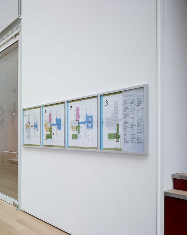
The designers also developed a complete program of wayfinding, directories and donor signage for the entire museum, as well as several donor walls in the Griffin Court, the soaring central space of the Modern Wing.






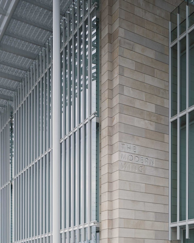
The Art Institute of Chicago opened its Modern Wing in 2009, a stunning 264,000 square foot expansion designed by the Pritzker Prize-winning architect Renzo Piano. The wing is devoted to the museum's modern and contemporary art, photography and design collections. The Art Institute has long been one of the world's great encyclopedic museums, and the addition of the wing officially makes it the second-largest art museum in the U.S. As part of the expansion Pentagram was commissioned to create a new identity for the museum as well as a comprehensive program of interior and exterior environmental graphics.
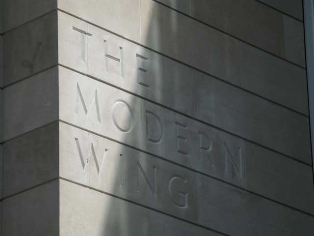
The Art Institute is well known for its holdings in Impressionist and Post Impressionist art, but it also has a strong commitment to design and possesses one of the best design and architecture collections in the country. The designers were impressed with how closely museum director James Cuno was involved in the development of the identity. In a 2008 profile in The New York Times, Cuno said: “We realized this is a moment of renewal for the museum, and we wanted to communicate that graphically.” The new identity was inspired by the inscription of the name on the famous Michigan Avenue façade of its 1893 Beaux Arts building. Following the practice of classical and neo-classical inscriptions, the lettering on the façade uses the Roman “V” in place of the “U” in the word “Institute.” The new mark strikes a point of balance between the modernity of the Piano-designed wing and the classicism of the Michigan Avenue building. When seen in relation to the historic façade, the mark has the gravitas of an engraved cornerstone, but when seen in relation to the Modern Wing, it echoes the precision and lightness of Piano's structure.
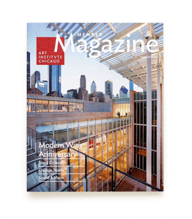
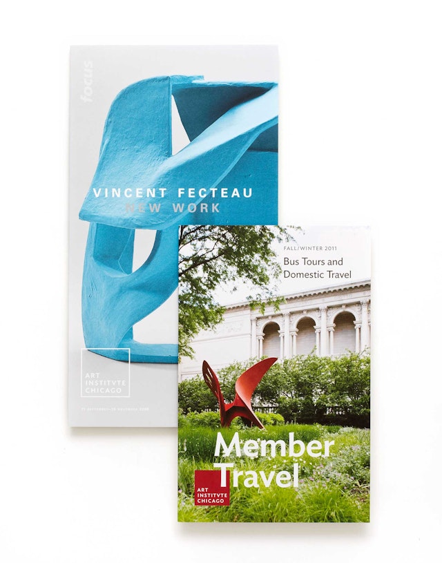
After photographing and analyzing the façade lettering, the team discovered an interesting counterpart in the form of a display font called Topaz, designed by Hoefler & Frere-Jones. The design uses the Topaz “V” in place of the “U.” In the Times piece, Cuno describes the font as having a “contemporary edge but at the same time recalls Wiener Werkstätte or Secessionist architecture.” When the designers approached Hoefler about developing Topaz from a capitals-only display font into a full-spectrum typeface, he learned that Topaz originated from a typeface in development that Hoefler had been wanting to finish. The completed font is now know as Ideal Sans. The typographic signature is set in Ideal Sans within a deep red square that complements the forms of Piano's new building. The square can be used subordinate to other messaging, as in the members' magazine.
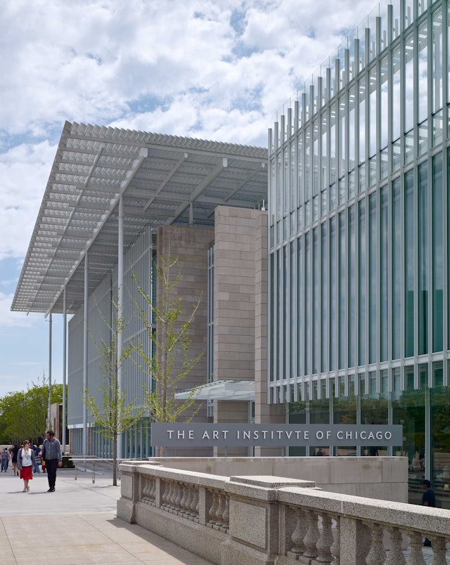
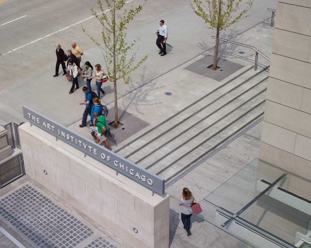
The signage has been fully integrated with the architecture of Piano’s addition, using aluminum, limestone and glass to provide an interplay between solid and engraved elements, as well as linear and transparent elements. The designers also developed a complete program of wayfinding, directories and donor signage for the entire museum, as well as several donor walls in the Griffin Court, the soaring central space of the Modern Wing.
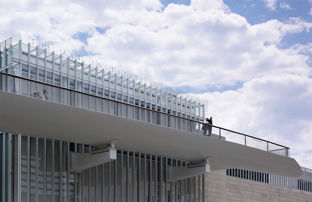
A large-scale installation on the wing's exterior was developed when the team discovered that the words “Art Institute of Chicago” fit exactly within the mullions of what Piano refers as the "light box" at the top of the wing. These three-dimensional letterforms are applied to the front and the back of the glass, and in certain lighting conditions appear to float in air. This highly visible installation runs along the Nichols Bridgeway, a walkway that connects the sculpture garden on the roof of the wing to Millennium Park, adjacent to the museum.
Client
The Art Institute of ChicagoSector
- Arts & Culture
Discipline
- Brand Identity
- Signage & Environmental Graphics
Office
- New York
