Banco Itaú is celebrating its 100th anniversary in 2024, and commissioned Pentagram to collaborate on a new identity that draws on this extraordinary heritage and helps position the bank for the future.

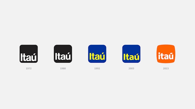


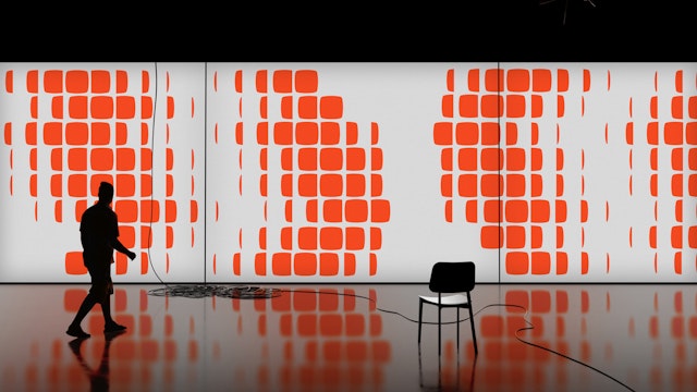
To create a new proprietary shape, Pentagram and Itaú’s in-house design team pushed beyond the square, increasing the radius of the corner curves and rounding out the sides to make the form more organic and dynamic.





Banco Itaú is the biggest bank in Brazil and one of the largest financial institutions in Latin America. The company is celebrating its 100th anniversary in 2024, and commissioned Pentagram to collaborate on a new identity that draws on this extraordinary heritage and helps position the bank for the future.
Itaú means black stone in Tupi-Guarani, the indigenous Brazilian language. Since the 1970s, the Itaú logo has been a square with rounded-off corners––a distinctive, recognizable shape that became closely associated with the bank. Of course, that shape is now ubiquitous as the container for app icons on every phone on the planet.
To create a new proprietary shape, Pentagram and Itaú’s in-house design team pushed beyond the square, increasing the radius of the corner curves and rounding out the sides to make the form more organic and dynamic.
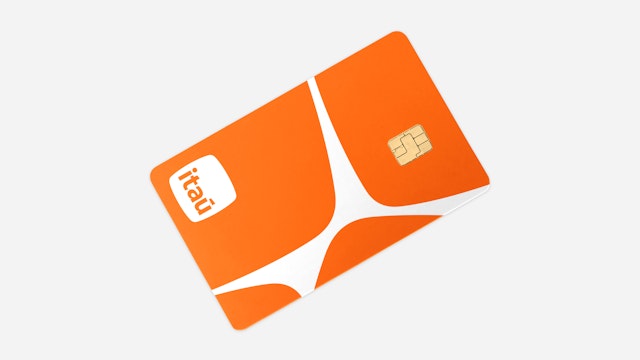
Inspired by river stones that have been smoothed and polished by time, Itaú calls its new shape the pedra (stone in Portuguese and Spanish), evoking a sense of longevity and endurance as it approaches its centenary. A stone also has a feeling of being tactile and personal, in line with Itaú’s approach to banking.
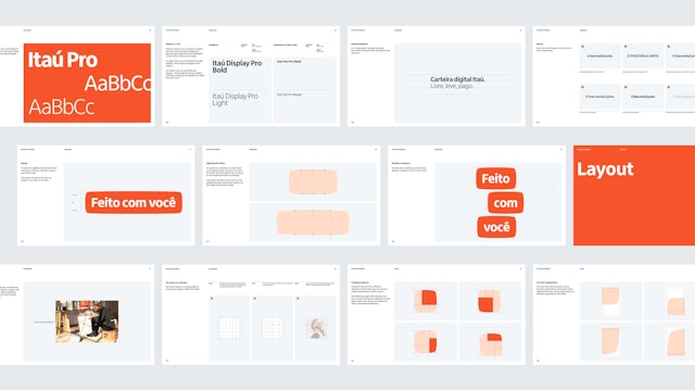
Starting with the humanist sans serif created by Dalton Maag, with the help of Fabio Haag Type and Commercial Type, Pentagram adjusted the letters in the logo for a fuller geometry. The new logotype uses an approachable lowercase i, with a round tittle, and balances the acute accent over the u.
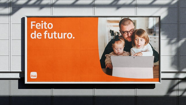
The previous logo was blue and yellow, set off by a warm, radiant orange that was prominently used throughout Itaú’s branding. The redesign makes this orange the primary brand color, and introduces a broader secondary palette that includes Brazilian colors like yellow, blue, green and pink.
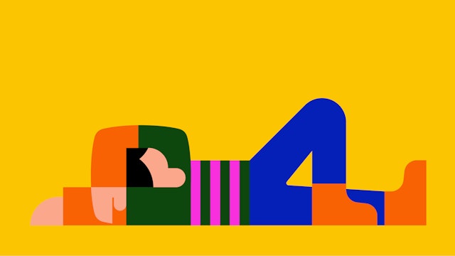
The pedra serves as the foundation for a full graphic language, used as a container for images or type, as an element within patterns and motifs, or playfully integrated––and sometimes hidden––in colorful illustrations.