

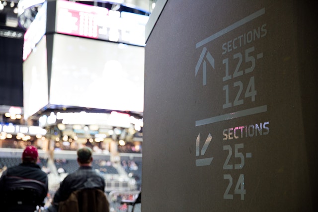


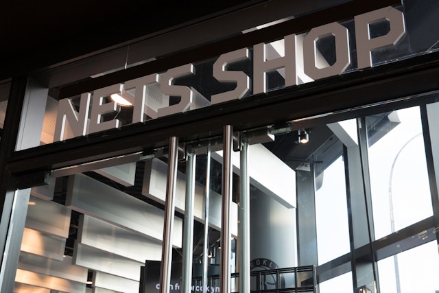
To establish a unique sense of place, the design team wanted to commission a custom font that would set off the architecture, represent the Brooklyn “DIY” sensibility and dynamic history of the site as a railyard, and work well in an athletic context.
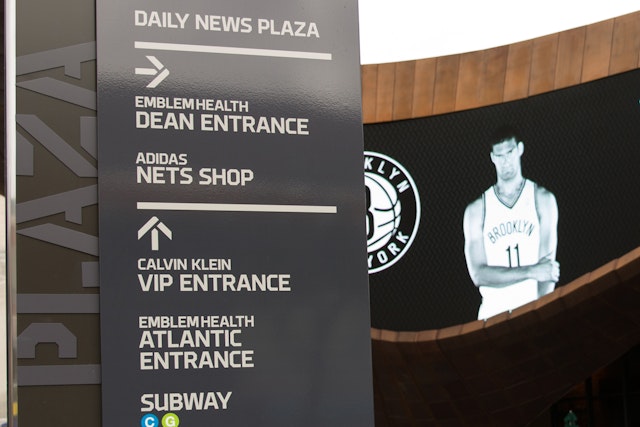


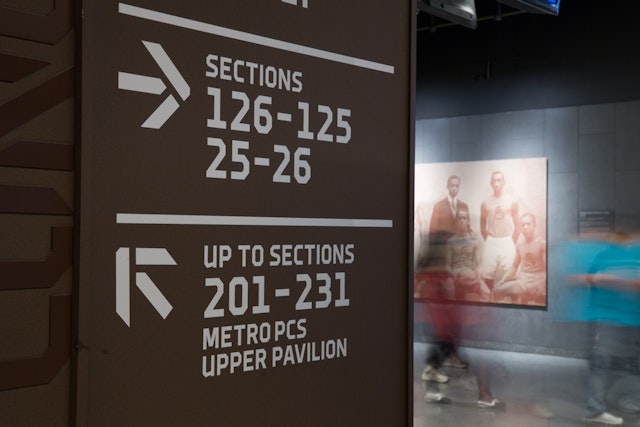

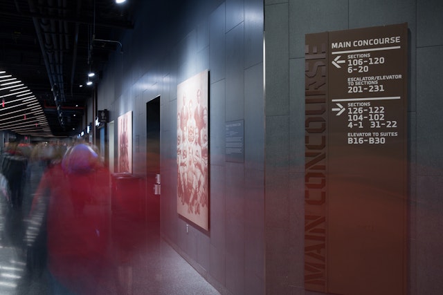
The strong typography of the signs is matched by a robust material that resembles the weathered steel of the building exterior.



In 2013, the Brooklyn Nets returned to the Barclays Center for their first home games of the 2013-2014 season. In the short year since the 18,000-seat arena opened, it has become the top-selling venue in the US (and number two in the world) and a symbol of the resurgent borough. In addition to being the home of the Nets, Barclays is also home to the NHL New York Islanders, and has hosted concerts by artists like the Rolling Stones, Jay-Z, and Paul McCartney and events like 2013 MTV Video Music Awards. The arena has been honored with the Building Brooklyn Award for Economic Development from the Brooklyn Chamber of Commerce, named Architizer's Building of the Year and given the AIA New York State Award of Merit.
The distinctive design of the Barclays Center has played a major role in its appeal. The iconic architecture of the building, designed by SHoP Architects and Ellerbe Becket (now part of AECOM), has become an instant landmark at the crossroads of Atlantic and Flatbush Avenues. Pentagram has designed a program of signage, wayfinding and environmental graphics for the arena that reflect its one-of-a-kind character. Working closely with the architects and the arena developer, Forest City Ratner Companies, the designers have created graphics that are seamlessly integrated with the interior architecture and convey a tough, friendly spirit, a lot like Brooklyn itself.
Pentagram worked on the development of the Barclays signage from the project’s earliest days in 2006. The system was devised in deep collaboration with the architects to create signage that would both complement the building’s unusual weathered steel framework and provide cohesive, easy-to-use navigation for the 675,000 sq ft space. The finished program of interior and exterior signage and wayfinding includes over 2,300 signs, from landmark signage at Daily News Plaza outside the main entrance to back-of-house signs for the building’s extensive infrastructure. The comprehensive system not only helps attendees navigate the interior of the arena, but also directs commuters towards the various entrances of Atlantic Terminal, one of the largest transportation hubs in the city, with access to 11 subway lines and the Long Island Rail Road.
To establish a unique sense of place, the design team wanted to commission a custom font that would set off the architecture, represent the Brooklyn “DIY” sensibility and dynamic history of the site as a railyard, and work well in an athletic context. The designers worked with the Brooklyn-based type designer Chester Jenkins to develop a family of fonts for the Atlantic Yards development where the arena is located, including Brooklyn Sport, a typeface specifically for the arena. The Brooklyn fonts are now available to public.
The strong typography of the signs is matched by a robust material that resembles the weathered steel of the building exterior. For fabrication of interior signage and wall-cladding, the team introduced a newly developed, innovative powder-coated aluminum that matches the color and finish of the weathered steel bands outside. The Brooklyn Sport font works well on the material, and the aluminum wraps the core of the concourse walls and concessions, where the type reads legibly in a contrasting tone. Perhaps most importantly, unlike the weathered steel of the exterior, the aluminum will maintain its finish, ensuring that the signage remains legible. Many overhead identification and directional signs appear as three-dimensional letterforms that hang from one edge, echoing the sculptural quality of the building.
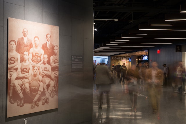
The main concourse features a series of mural-sized historic photographs of the Brooklyn teams of the Black Fives, the early-twentieth century African-American men’s and women’s basketball clubs that represented most major American cities prior to the racial integration of the National Basketball League and National Basketball Association. The images are part of the broader arts program at Barclays, which includes large-scale installations of works by local artists Mickalene Thomas, OpenEndedGroup (featuring visualizations of the choreography of Bill T. Jones), José Parlá, and more.
The designers developed full standards for retail signage and sponsor acknowledgments, including the landmark sign with the Barclays logo on the building’s exterior.
Office
- New York
