

To celebrate the brand’s 100th anniversary, Pentagram has designed playful new packaging that reimagines the iconic Blue Nun character.
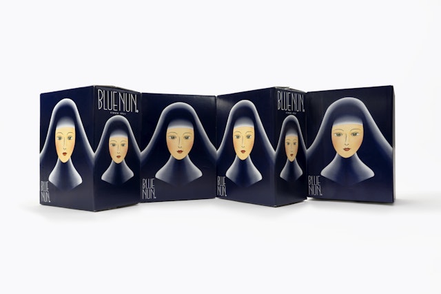


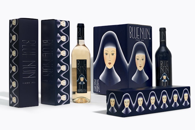

Blue Nun is a German wine brand with a rich, flamboyant history. Originally launched in 1921, the brand’s affordable prices and clever approach toward mass appeal marketing quickly made it a trendy staple among wine drinkers and partygoers. To celebrate the brand’s 100th anniversary, Pentagram has designed playful new packaging that reimagines the iconic Blue Nun character.
The original label image depicted 18th century nuns picking grapes in a vineyard, but for the anniversary, the design team wanted to capture the lively, indulgent spirit of the Roaring Twenties decade that birthed the brand, so they opted to give the nun a complete makeover. The new label features a saucy, glamorous portrait of a blushing nun inspired by the French 20th century designer and Art Deco artist Erté.
Office
- New York
Partner
Project team
- Bruno Bergallo
- Yansong Yang
- JungIn You
- Jack Roizental
- Olivia Ray
