Pentagram was asked to create a brand identity for this exciting new venture which would appeal to all the stakeholders—the cattle owners, the store owners and the end users.

The name Câm was chosen as it worked on several levels—it has a strong connection both to Nigeria and to Câm’s founder.
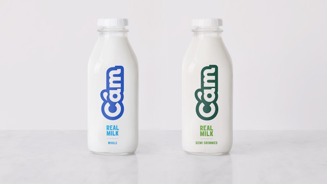
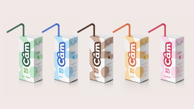
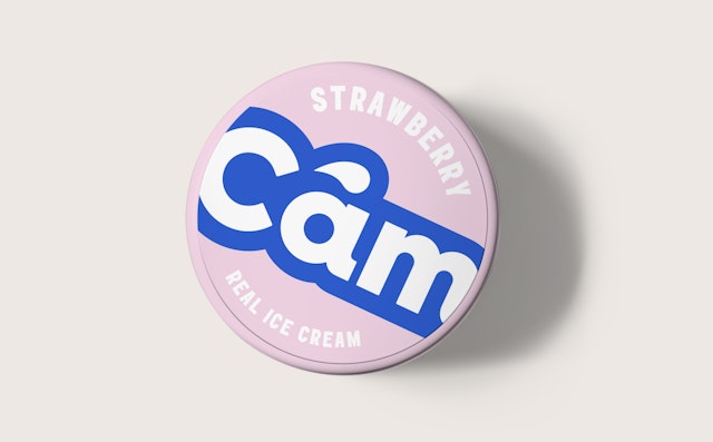
The cool colour palette of royal blue and white mixed with soft pastels gives Câm a clean, modern feel which reflects the natural product and is in contrast to the busy packaging of processed milk products.

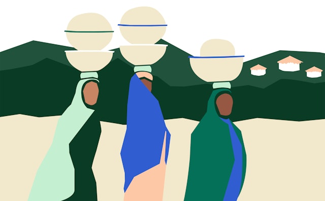

The team also created Illustrations which show the various stages of the journey that the milk goes on, these are for use on social media and as environmental graphics within the office and factory spaces.
Pentagram has designed the brand identity for Câm (pronounced ”cham”), which produces, distributes and sells fresh, pasteurised milk throughout Nigeria.
The market for milk in Nigeria has traditionally been dominated by UHT, condensed and powdered milk products, and drinking yogurt. The demand for fresh, pasteurised milk far outstrips supply, making the cost very high (around £11 per litre) and putting the product out of the reach of many people.
Small herds, isolated locations, low-quality pasture and feed (leading to low yields) and consumption by the farmers themselves all meant that it was difficult to produce and distribute sufficient fresh milk to meet this demand.
The brainchild of entrepreneur Aisha Bashir, Câm was set up based on a new business model to address these problems. It starts with bringing cattle owners and farmers together to form co-ops. This allows farmers to bring their milk to a centralised collection point, where cows are milked into containers provided by Câm. The milk is then transported to a processing plant where it is pasteurised and bottled or made into dairy products such as greek-style yoghurt or flavoured milk, before being distributed to stores or delivered directly to consumers.
Pentagram was asked to create a brand identity for this exciting new venture which would appeal to all the stakeholders—the cattle owners, the store owners and the end users. The name Câm was chosen as it worked on several levels—Câm is the word for milk in the Kanuri language.
Kanuri is also the name of the ethnic group that Aisha is from on her mother's side. Aisha's first taste of dairy was from her early years when she spent time with her grandmother from her mother's side of the family—her childhood memories are of the fresh, rich, creamy, tart yoghurt sold from the calabashes of pastoralist women who walked from neighbourhood to neighbourhood selling fermented dairy products.
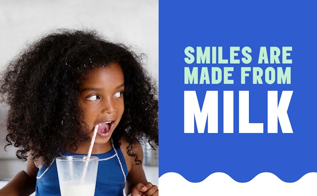
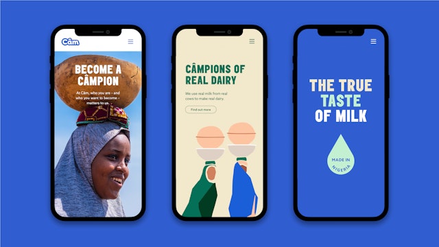
Many Nigerians suffer from a lack of calcium and nutrients, which can affect physical and mental growth, so it was important that the brand emphasised the healthy properties of real milk. Câm needed to be portrayed as ‘the true taste of milk’, rather than the processed taste that consumers had become used to.
The new logotype is friendly and welcoming, using bold typography, rounded letterforms with the circumflex over the letter ‘a’ forming a drop of milk. The cool colour palette of royal blue and white mixed with soft pastels gives Câm a clean, modern feel which reflects the natural product and is in contrast to the busy packaging of processed milk products.
The uppercase typography (using ‘Elephant' by Alias, which was originally inspired by classic wood type grotesques) perfectly articulates the various slogans such as ‘Real Milk, Freshly Pasteurised‘ and ‘The True Taste of Milk’.
The packaging is simple and sustainable, with milk distributed in glass bottles which can be used for 'refills' by customers. The team also created Illustrations which show the various stages of the journey that the milk goes on, these are for use on social media and as environmental graphics within the office and factory spaces.
Câm is a young brand which aims to make a real difference to the nutritional needs of the Nigerian people; it will provide women with sustainable incomes and transform smallholder communities into entrepreneurial hubs. Its vision is to help Nigeria reach self-sufficiency in dairy production, and its inclusive new identity now matches its admirable ambitions.
Office
- London
Partner
Project team
- Katerina Kerouli
- Alice Murray
- Marisa Piñana
- Vicky Ryan
- Nathalie Shores
- Alex Wright
- Jess Yanzio
Collaborators
- Sam West (copywriting)
