
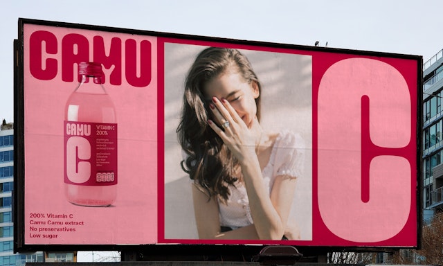
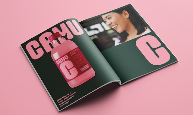
Pentagram was asked to create a brand strategy to articulate the unique personality of Camu C, and a brand identity system that could work across various print and online applications.

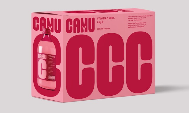

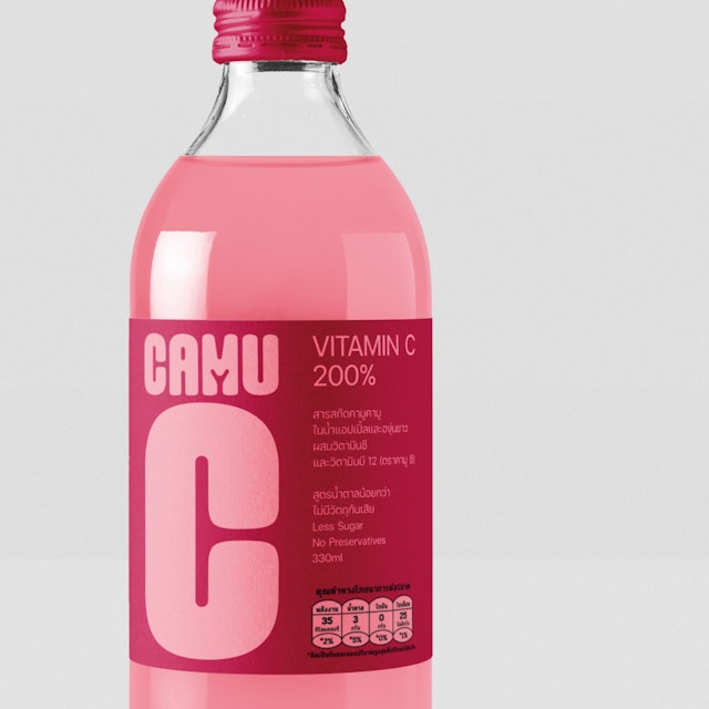
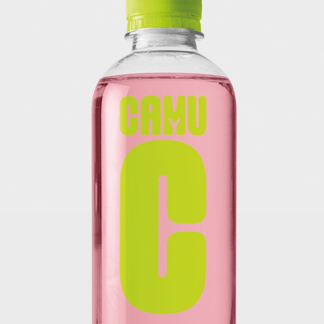

The team’s aim was to celebrate the health benefits of drinking Camu C while appealing to its young and health-conscious audience.
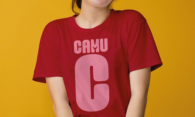

Rejecting the clichés of health and performance drinks brands, the new brand identity plays to the strengths of the drink’s healthy ingredients.
Pentagram has created the brand identity for Camu C, a new Ready to Drink consumer drinks brand from Lifestar, a subsidiary of RS Group in Thailand. RTD drinks (which include iced tea, flavoured waters and herbal and CBT drinks) provide consumers with a healthier alternative to fizzy drinks and are a fast-growing market worldwide.
Camu C takes its name from Camu Camu, an Amazonian berry fruit that resembles a cherry and has one of the highest Vitamin C levels in the plant world. Considered to be a superfood, it can be added to food and drinks as a health supplement. Also high in flavonoids, its key benefits are its antioxidant and detox properties and its potential to improve skin, and boost energy levels and the immune system.
Pentagram’s design team was asked to create a brand strategy to articulate the unique personality of Camu C and a brand identity system that could work across various print and online applications, including packaging, print and billboard adverts, as well as on the website, social media, on digital banners and in animations for online advertising.
The team’s aim was to celebrate the health benefits of drinking Camu C while appealing to its young and health-conscious audience. The confident typographic approach features a curvy Camu C logo made from a customised version of the typeface Good Girl. The tone of voice and use of typography plays with the fresh and fun feel of the brand.
Colour plays a key part in the brand identity, with a vibrant colour palette composed of pinks and greens, inspired by the Camu Camu berries and their leaves.
Camu C has launched with a low sugar 200% (Thai RDI) Vitamin C drink. Shiny pink Camu Camu berries feature on the label—these are a nod to the drink’s all-natural ingredients and a distinctive light pink letter ‘C’ on the dark pink cap makes the drink instantly recognisable on the shelf.
Pentagram has created a vibrant and spirited brand identity for Camu C, which will help it stand out in an already crowded marketplace. Rejecting the clichés of health or performance drinks brands, the new brand identity plays to the strengths of the drink’s healthy ingredients, reassuring us that Camu C is fun and enjoyable to drink, as well as being good for us.
Office
- London
Partner
Project team
- Hamlet Auyeung
- Cleber de Campos
- Ian Osborne
- Kate Blewett
Collaborators
- Marion Bisserier (typographer)
