
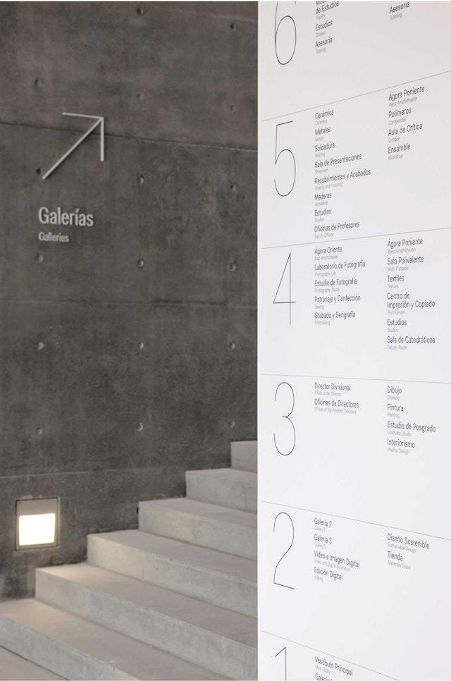


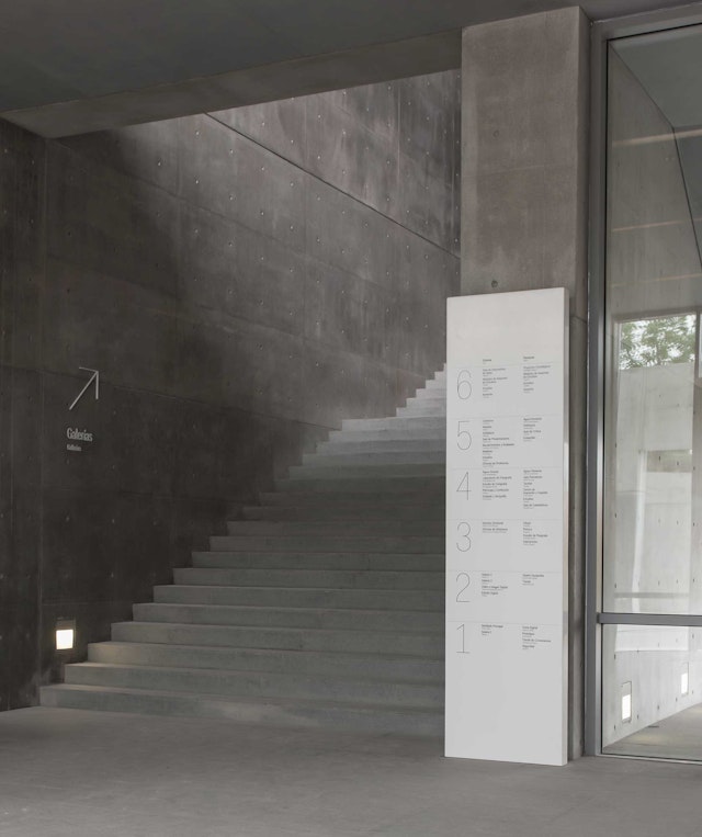
The signage for the building takes a contrarian approach: pristine white lettering, glossy white discs, and glassy prisms form a counterpoint to the rough gray concrete walls.




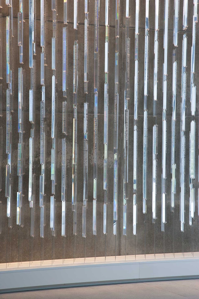
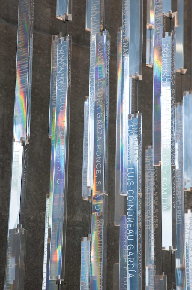
Names of donors are engraved into the surface of the rods, with three to five bars grouped on each strand.



A school of design and architecture that is itself a bold architectural statement, the Centro Roberto Garza Sada (CRGS) is a new arts center at the Universidad de Monterrey (UDEM) designed by the Pritzker Prize-winning architect Tadao Ando. Located in the mountainous landscape of northeast Mexico, the monumental concrete building rises out of its surroundings to announce the university and has quickly become an iconic landmark for the growing city of Monterrey. Pentagram has designed a comprehensive program of signage, wayfinding and environmental graphics for the center that complement the raw physicality of Ando’s building with clean, crisp shapes and sleek, smooth surfaces.
The CRGS was conceived by Ando as a “Gate of Creation” that is both a marquee building for UDEM and a metaphor for the learning process. The six-story structure acts as a gateway for the campus and provides amazing vistas of the region. Constructed of cast concrete, the monolithic, minimalist form bridges over a massive triangular void at its center. The portal is meant to symbolize the opening or beginning of the students’ educational journey, and anchors the diagonal axis of the campus. The building was recently honored at the 2013 World Architecture Festival, where it was short-listed in the Higher Education and Research category.
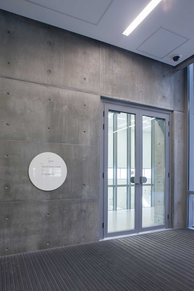
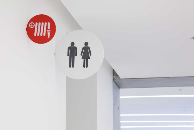
Pentagram's signage for the building takes a contrarian approach: pristine white lettering, glossy white discs, and glassy prisms form a counterpoint to the rough gray concrete walls. The sign family consists of discs in various scales, ranging from six-inch diameter to five feet. Typography is carefully composed against the empty white space of the pure geometric shapes. The typeface used throughout the environmental graphics is Fakt, a refined, highly functional sans serif font designed by Thomas Thiemich.
A variety of techniques are used to fully integrate the program with the architecture. Some signs use letters pin-mounted directly on the concrete; studio workspaces are identified with oversized numbers silkscreened directly on walls. The building’s main directory is fabricated of smooth Corian with etched and paint-filled lettering. The shiny metal circles feature an enameled finish with silkscreened graphics. Many of the signs reference the dramatic diagonal of the building with slanted lines and arrows.
The designers also developed a unique installation of donor recognition signage for CRGS. Located just off a wall of glass at the main entrance, the sculptural installation consists of over 100 three-sided bars of clear, polished Plexiglas hanging on lengths of cable. Names of donors are engraved into the surface of the rods, with three to five bars grouped on each strand. (A legend is posted nearby to find the exact location of each name.) The prism-like rods shift in the air and change with the light: during the day they catch the sun that flows through the building’s void, and at night they are illuminated. The pattern of lines elegantly echoes the striations in Ando’s concrete, while the crystalline forms set off the building’s immense mass.
Client
Centro Garza Sada (CRGS)Sector
- Education
- Arts & Culture
Discipline
- Signage & Environmental Graphics
Office
- New York
