Pentagram was invited to develop a new overarching brand strategy (including architecture, positioning and tone of voice) for the Devonshire Group, and a new brand architecture for Chatsworth, covering its charity, its distinct areas and offers, outlets and sub-brands.

The new branding represents a strategic shift that responds to audiences’ desire for Chatsworth and other Devonshire Group sites to feel more inclusive, more dynamic and more relevant, without losing any of their commitment to preserve their heritage for future generations.


The Devonshire Group brings together the charities, businesses and estates in the care of the Devonshire family, including Chatsworth in Derbyshire, the Bolton Abbey Estate in North Yorkshire and the Lismore Estate in County Waterford, Ireland.
The Group’s main enterprises span visitor, retail, food and drink and accommodation businesses, residential and commercial property and property development, and sustainable forestry and farming, employing over 1400 people in the UK and Ireland.
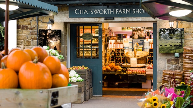
Located within the Peak District National Park, Chatsworth has been home to sixteen generations of the Devonshire family. Much more than just a house, Chatsworth is also a thriving cultural destination, a nationally important historic landscape, and a working estate. It is also a registered charity dedicated to the long-term preservation of the house, collections, garden, woodlands and park for the benefit of everyone. Chatsworth hosts well-known events such as the International Horse Trials Fair and the Chatsworth Country Fair, as well as large-scale art and design exhibitions. It has a well-developed estate and locally-made food, gift and product range available in outlets within the estate and in surrounding villages.
Chatsworth’s and the Devonshire Group’s existing brand positionings had not been updated in some time, and needed honing to reflect the family’s and stakeholders’ ambition and vision. The group was keen to develop their brand narrative, to place greater focus on their contribution to the cultural economy in the UK and globally, and the lasting benefits they seek to bring to their audiences, their communities and their environment.
To help communicate this, Pentagram was invited to develop a new overarching brand strategy (including architecture, positioning and tone of voice) for the Devonshire Group, as well as a new brand architecture for Chatsworth, covering its charity, its distinct areas and offers, outlets and sub-brands. The new branding needed to acknowledge the heritage of family and place, and be nimble enough to cover future ideas and development.
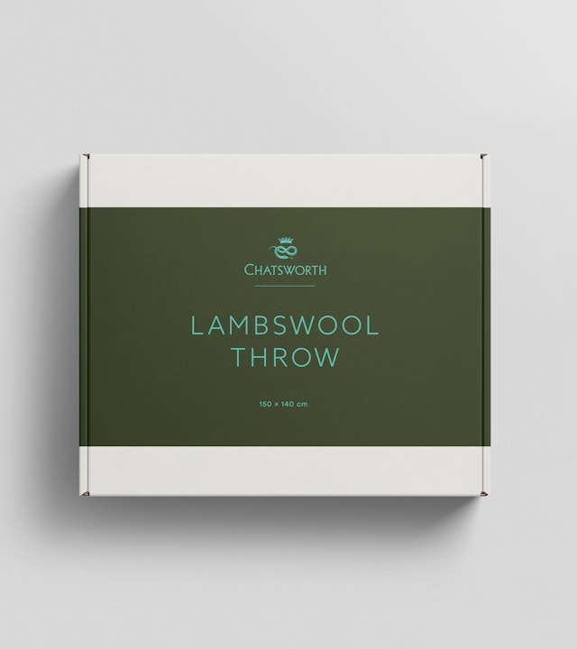
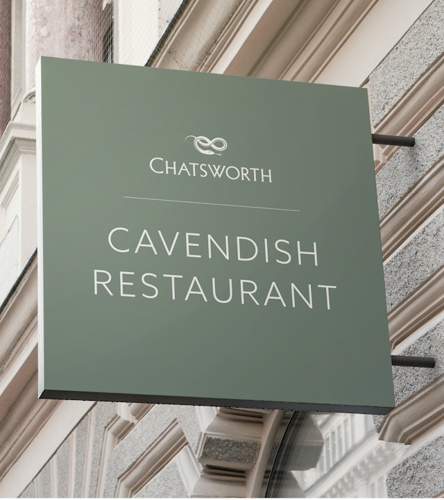
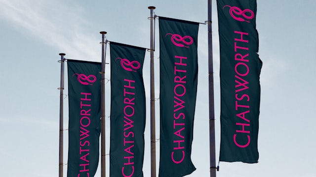
The family’s rich heraldic heritage plays a key part in the new brand, which centres around a hand-drawn serpent motif. The serpent is a family emblem found consistently across its heraldry, and stone-carved serpents are found in abundance at Chatsworth, Bolton Abbey and Lismore. As a heraldic symbol, the serpent stands for stewardship and wisdom, renewal and growth.
The new branding represents a strategic shift that responds to audiences’ desire for Chatsworth and other Devonshire Group sites to feel more inclusive, more dynamic and more relevant, without losing any of their commitment to preserve their heritage for future generations. By moving away from the 1980’s-designed house edifice logo to a motif that is at once ancient and full of forward momentum, the organisation has the perfect device to take it forward to the next phase in its history.
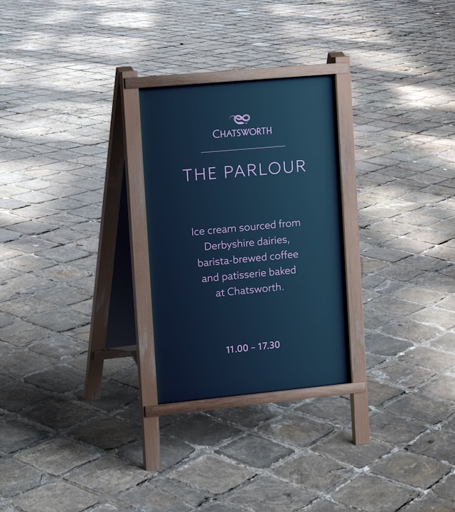
As part of the new brand identity, the team developed a range of different serpents that could be used to identify four key parts of the Devonshire Group (Chatsworth, Bolton Abbey, Lismore Castle and the Devonshire Group itself). The use of several variations of the same object (the serpent emblem) to provide brand architecture is quite unusual within this sector and perfectly balances heritage with modernity.
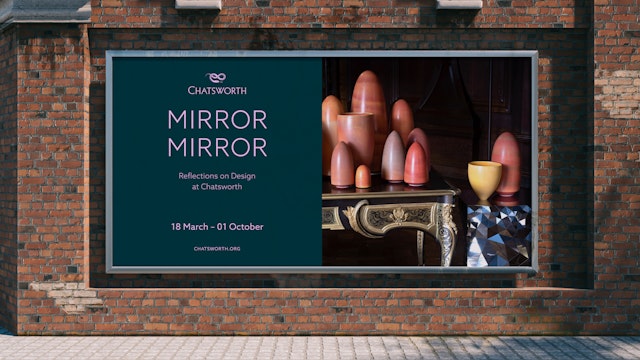
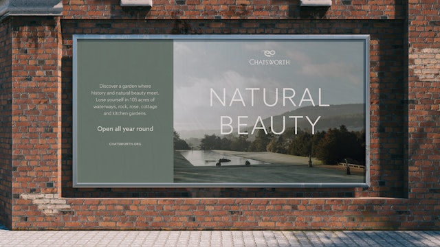
The primary typeface used throughout is Azo Sans by Rui Abreu. A clean, highly legible, geometric sans-serif typeface and inspired by the constructivist typefaces of the 1920s, its nuances soften the strictness of pure geometry and make it more pleasant to read in longer texts. This is joined by the secondary typeface Baskerville URW, alongside Roboto Condensed as an additional typeface.
The colour palette is unique in the sector and creates a key element of differentiation from the competition. ‘Earth Tones’ embody Chatworth’s rich history and serve as a reflection of its connection to nature and the land. These colours are inspired by the diverse landscapes, cultural heritage and traditions and convey a sense of authenticity and timelessness. ‘Estate Blue’ is a colour found consistently across the Chatsworth Estate and can be used as a default colour. The vibrant ‘Accent Tones’ add a modern twist and bring a pop of energy and vibrancy, reflecting Chatsworth’s forward-thinking approach.
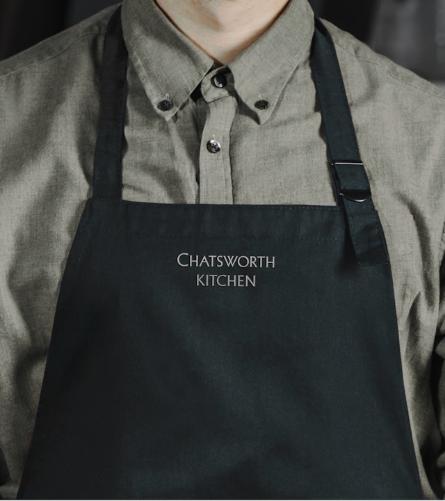
Photography is core to the brand language and provides a visual representation of the Devonshire Group’s offer and experience. The different image sections (which include Community, Tourism and Hospitality, and Art) aim to provide emotional representations of people, places and experiences across the entire Devonshire Group
The tone of voice used throughout aims to engage the group’s many different audiences by using language in a way that is honest and memorable, amplifying the voices of its customers, partners and colleagues.
Encompassing signage, apps, films, campaigns, social assets, publications and a comprehensive set of brand guidelines, the final brand identity is both highly distinctive and flexible. It combines new and old, fun and formal, and in turn, has the capability to communicate the various estates’ offers and impact to a wide and diverse range of audiences.
Office
- London
Partner
Project team
- Mariona Alegre
- Karolina Alvekrans
- Ruth Jamieson
- Ashley Johnson
- Eoghan McMahon
- Alice Murray
- Ishaan Pamnani
- Daniela Perez
- Kimaya Sarin
- Charlotte Selby
- Alex Wright
Collaborators
- Federico Gaggio (strategy)
- Roger Taylor (artworking)
- Akio Morishima (illustrator/draftsperson)