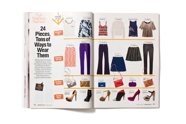
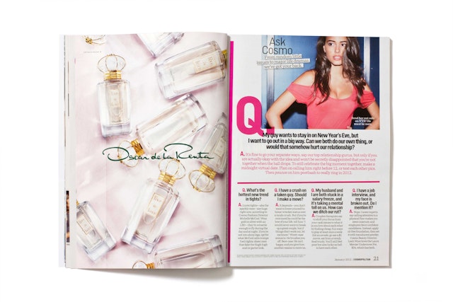
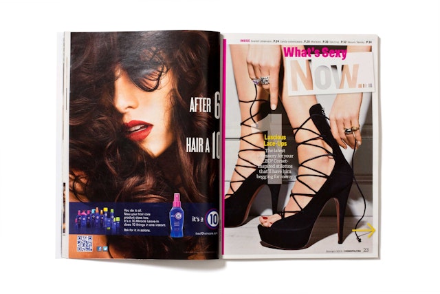

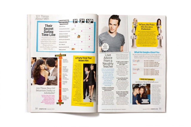

The designers responded to this with a design that is spontaneous, spirited and dynamic, capturing the humorous, sassy tone of the content.



Cosmopolitan is the most popular women’s magazine in the world, a publishing powerhouse with 63 international editions, printed in 32 languages and distributed in more than 100 countries. With a circulation of over 3 million in the U.S. alone, the magazine is one of Hearst’s most valuable properties and longest-running titles; it was first introduced in 1886 as a family magazine before transitioning in the 1970s under legendary editrix Helen Gurley Brown to become the sexy women’s “Cosmo” of today. Currently led by editor in chief Kate White, the magazine enjoys its status as a pop-cultural mainstay and trusted go-to source for information on topics like sex, relationships, fashion, health and beauty.
Working closely with White and Cosmo design director Ann Kwong, Pentagram has redesigned Cosmopolitan to create a bold new version of the iconic magazine. The refresh launches with Cosmo’s January 2012 issue, on newsstands today.
Cosmo is well loved by its readers, and rather than fix something that is decidedly not broken, the redesign accompanies an editorial shift that distills the best elements of the magazine and brings it up to date for the age of tabloids and Twitter. The new direction makes the tone of the magazine more irreverent, light and accessible. Stories are shorter and are told with more visuals. In the words of editor Kate White, the goal was to “not look like a magazine,” to better capture the smart, sexy attitude of Cosmo’s audience.
The designers responded to this with a design that is spontaneous, spirited and dynamic, capturing the humorous, sassy tone of the content. White is extraordinarily prescient in knowing what her readers want and regularly implements new editorial ideas and departments; as a result the magazine is in a constant state of flux, and the core design grew diluted over time. The redesign establishes a supple, easy framework that sets off the variety in the pages and better connects with readers.
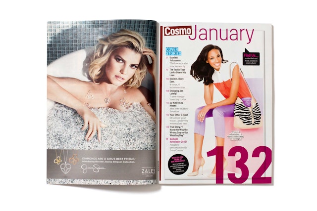
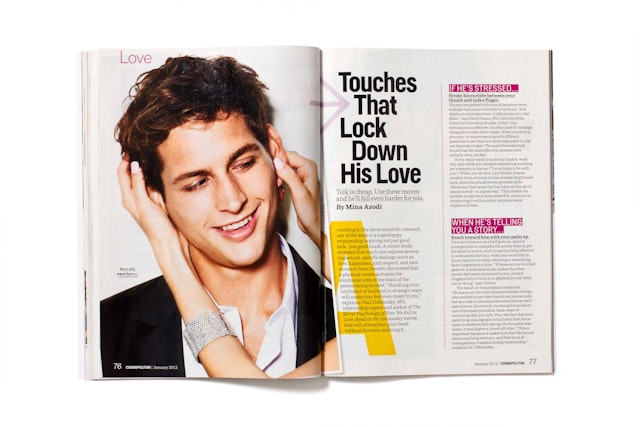
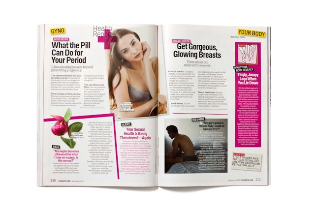
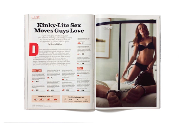
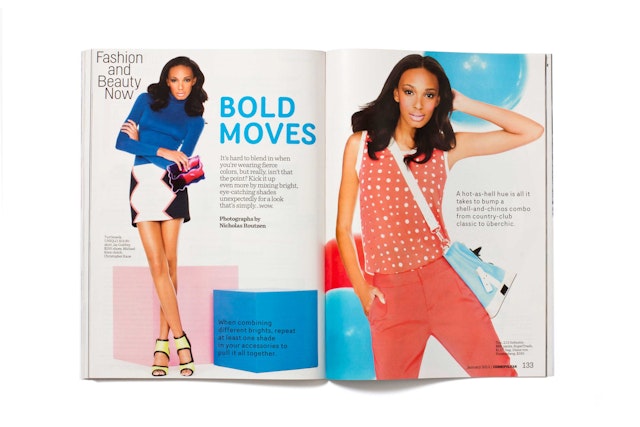
In the new design, beautifully implemented by design director Ann Kwong and her team, the magazine’s pages have an added sense of depth and vitality, with layered elements of transparency, underlining, cutouts, shadows, titled angles and tinted boxes. Section openers almost function as mini-covers, with bold images that lead into sections of health and beauty. Single editorial pages are separated from adjacent advertising with a vertical line the designers refer to as “the chopstick”—a tapered graphic bar slightly wider at top than at the bottom.
With fewer words on the page, the formerly tight columns of justified text have been jettisoned for a looser, more relaxed grid that keeps the layouts lively. The redesign employs a mix of fonts that includes Helsinki, Router, and the typewriter-esque Parry and Tiempos (used for text), which communicate a sense of immediacy.
The look of the magazine’s photography has also been updated, with less of the gauzy, self-consciously “sensual” imagery of the past and more of a bold, brash and heightened sensibility that creates a mood of sexy, anything-can-happen spontaneity. The redesign makes playful use of infographics; in the January issue, a meter rates responses from “Mild” to “Freaky” for a “How Kinky He Thinks It Is” feature.
Office
- New York
