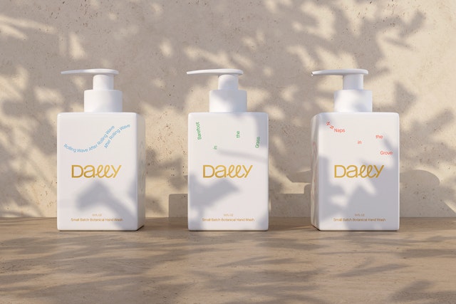
The brand links personal care with taking time to reflect, ramble and wander—even if it’s to your bathroom sink.
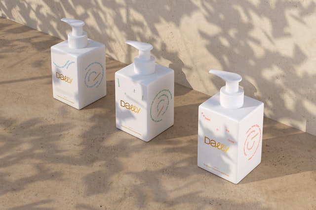


The white cube of Dally’s distinctive square dispenser elevates the packaging to a design object.
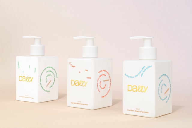


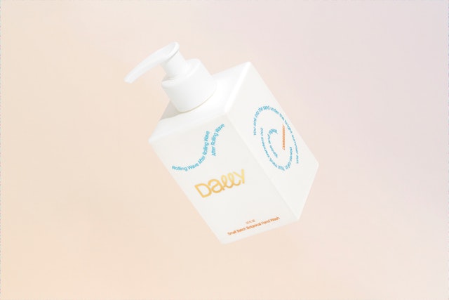

The packaging graphics feature poetic phrases in lines of type that flow across the surface like water that ripples, swirls and eddies.



Brand imagery appears in ringed geometric patterns inspired by mandalas, the circular symbols that represent harmony in the universe.


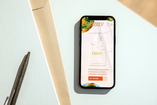
Taking a little time to pause, linger and clear one’s mind can be a refreshing break from the activity of the day. Dally is an original, premium line of botanical hand wash soaps, made in small batches from all-natural essential oils, that encourage users to slow down and make handwashing a pleasant respite. Pentagram has created a brand identity framework, naming, positioning, packaging and digital design for Dally that finds the joy in lollygagging and getting lost in one’s thoughts.
The Pentagram team collaborated closely with Dally founders Kevin Egan and Elizabeth Walton Egan, who saw a need for taking a break whenever possible. The brand strategy is built around the idea of “dilly-dallying” and “seizing the slow” to enjoy the small, personal moments, linking personal care with taking time to reflect, ramble and wander—even if it’s to your bathroom sink.
This calming quality extends to the soaps themselves, which are made locally in NYC using an extremely gentle, tear-free formula without any synthetic or harmful ingredients. Dally’s launch happened to coincide with the stress of the Covid-19 pandemic, when washing up was recognized as an essential line of defense against the virus and the soap dispenser became one of the most important items in our homes.
The branding is lively and playful, with a quirky personality that celebrates doing nothing. Pentagram helped develop the Dally name, inspired by dilly-dallying, as well as the names of the three signature scents. These reference nature and lived experience with evocative details: “Barefoot in the Grass” (fresh, wild and herbaceous); “Naps in the Grove” (bright, sunny citrus and floral); and “Rolling Wave After Rolling Wave After Rolling Wave” (refreshing coastal). Customers can order the full “Slowdown Set” of all three or sign up for a recurring “Easy Breezy Subscription.”
The Dally wordmark features looping lowercase “L”s that can be dynamically extended to suggest an interlude in time. The packaging graphics feature poetic phrases in lines of type that flow across the surface like water that ripples, swirls and eddies. The words follow their own twisting circular paths that meander and break off. The typography is set in the clean and contemporary sans serif Maison Neue (designed by Milieu Grotesque), with supporting type in the warm, organic serif Feijoa (by Klim Type Foundry).
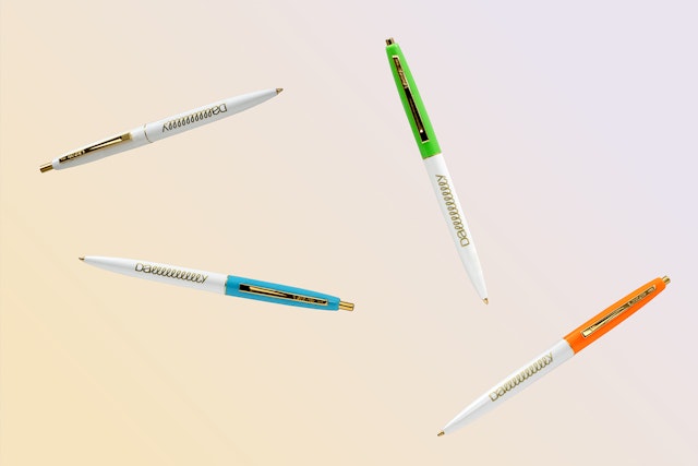
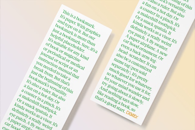
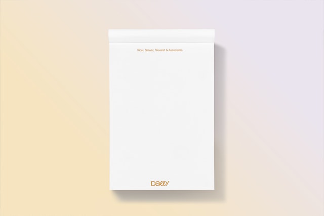
Brand imagery appears in ringed geometric patterns inspired by mandalas, the circular symbols that represent balance and harmony in the universe and that are used as an aid in meditation. The rings are formed of photographs of nature that have been abstracted with a halftone dot pattern effect. The graphics brighten the website, promotional swag and slow-friendly accessories like totes, notebooks, postcards and bookmarks.
The curves of the branding are set off by Dally’s distinctive square dispenser. Working with product designer Piotr Woronkowicz, Pentagram developed a custom white cube that elevates the packaging to a design object. The clean, simple form integrates into almost any environment and looks great on countertops. The recyclable bottle is made of high quality materials and feels premium with a matte finish, debossed type and the logo printed in gold foil.
The soaps and a limited edition collection of goods and accessories including totes and notebooks are available to order at dallygoods.com.
Client
DallySector
- Fashion & Beauty
- Consumer Brands
Discipline
- Brand Identity
- Packaging
- Brand Strategy
- Naming
Office
- New York
Partners
Project team
- Brankica Harvey
- Mary Kate Henry
- Raoul Gottschling
- Dana Reginiano
Collaborators
- Saundra Marcel, strategy
- Matthew DeLuca, digital artist
- Sam Morgan, developer
- Claudia Mandlik, photography
