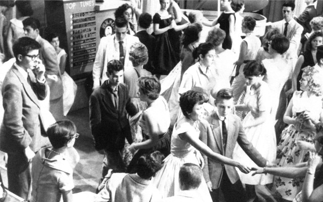
As the host and founder of American Bandstand from 1956 to 1989, Clark is credited with introducing rock and roll to the American teenager and thus the country.


The three circular parts of the lowercase letterforms line up nicely, creating a pleasing rhythmic pattern – like musical notes on a scale.


Pentagram’s Austin office has rebranded Dick Clark Productions (DCP), an American multinational television production company founded by radio and television impresario Dick Clark, one of the most influential figures in popular music. Based in Hollywood, California, DCP is primarily known for its productions of televised award shows including the American Music Awards, Golden Globe Awards, Academy of Country Music Awards and Billboard Music Awards.
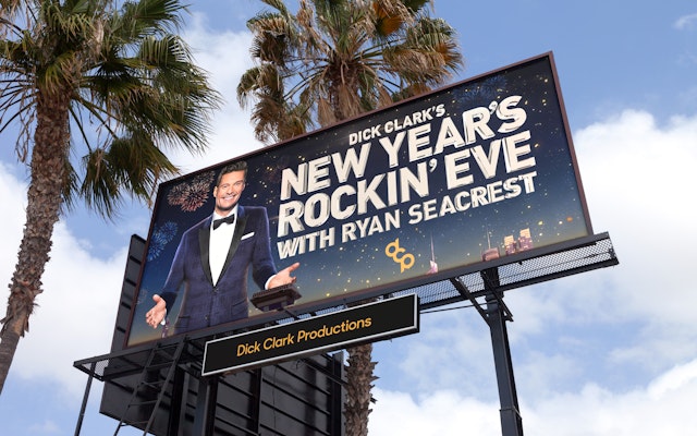
Dick Clark is a genuine American icon. As the host and founder of American Bandstand from 1956 to 1989, Clark is credited with introducing rock and roll to the American teenager and thus the country. With the variety show, he helped advance the careers of countless artists, including Ike and Tina Turner, Smokey Robinson, Barry Manilow, Stevie Wonder, Simon & Garfunkel, Iggy Pop, Prince and Madonna. Dick Clark was a fixture at American Bandstand for 33 years and then became famous for hosting his namesake show, Dick Clark’s New Year’s Rockin’ Eve, an annual television program consisting of live segments featuring Clark, his co-hosts, and different entertainment acts in and around New York City’s Times Square. The performances continue until the clock counts down to midnight, at which time New York’s traditional New Year’s Eve ball drops, signaling the new year. The long-running special began in 1972 and became synonymous with the celebration of the new year in the United States. Handsome and remarkably youthful looking for most of his career, Dick Clark was known as “America’s Oldest Teenager” and continued to host Dick Clark’s New Year’s Rockin’ Eve for 40 years.
Clark founded his production company in 1957 and adopted a logo consisting of a lowercase letter “d” with a lowercase letter “c” inside it. It’s been said that Clark admired the iconic logo of the American Broadcasting Company (American Bandstand’s host network) featuring the acronym ABC set in a circle and liked the way the logo’s lowercase letters seemed humble and approachable compared to the all-cap logotypes of the other two major television networks at the time–CBS and NBC. In 1976, he adopted a revised, symmetrical mark featuring the lowercase letters “d” and “c” smooshed together so that the two circular parts of the letterforms share the vertical stem of the lowercase letter “d.” To Clark, the humble, lowercase configuration of his logo matched his personality, but through the lens of modern sensibilities it began to look dated.
Pentagram Austin’s objective was to remedy those issues and maintain the use of the lowercase letterforms in an updated logotype. The design team looked at a range of design directions but eventually landed on a custom diagonal configuration of the three letter acronym DCP locked-up with a simple upper-and-lowercase wordmark set in Sharp Sans. The three circular parts of the lowercase letterforms line up nicely, creating a pleasing rhythmic pattern – like musical notes on a scale – and the interconnected vertical stacking of the three letterforms feels like a contemporary evolution of the previous two-letter acronym.
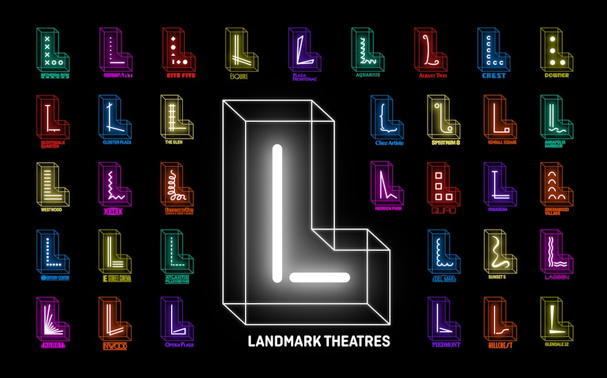
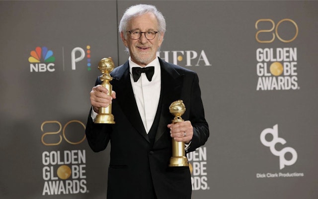
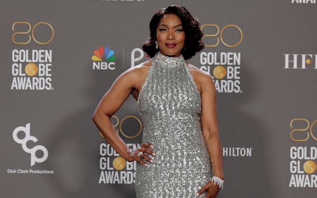
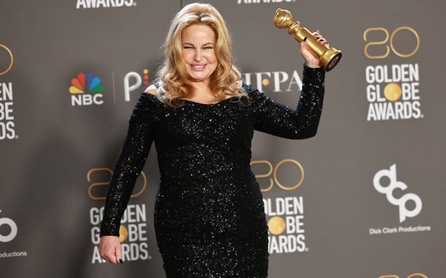
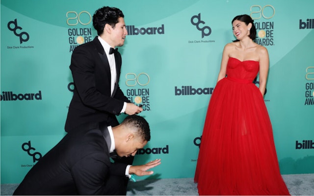
The new DCP identity system includes several vertical and horizontal lockups for the company’s main signature and establishes an updated gold and black primary color palette with two secondary colors for the brand. The style guide offers a set of application examples including several choices for the traditional awards show “step-and-repeat” photo-backdrop.
The final identity tool for the DCP rebrand was the development of a short animation of the new mark that can be tagged on to the end of awards shows. The new animation is accompanied by a short but memorable sonic I.D. created by Pentagram partner Yuri Suzuki and his team in the London office.
The team wanted to acknowledge the brand’s legacy whilst making sure tonally that the sonic I.D. was very modern. Playing on the initials of ‘D’ and ‘C’ as the main DNA notes, an aspect that was already present with previous sonics, the team progressed the idea by using a third note that ascends to give the identity more upward motion and energy.
To honor DCP’s legacy, the arrangement was created by using layers of instrumentation that feel organic from a rock sound but were then placed in a more modern, inclusive and timeless setting through the use of chamber orchestra, synthesisers, percussion and foley.
Applying techniques such as tape loops, vintage reverbs, phasing and sampling produces a rich mixture of modern sound design that subtly gives a nod to the past.
Working closely with the brand team, the sonic was harmonised to the logo animation by building a short and dynamic sonic range that allowed for the sonic to also be heard, and understood, as quickly as the visual.
Office
- Austin
Partners
- DJ Stout
- Yuri Suzuki
Project team
- Stu Taylor
- Tyler Cogburn
Collaborators
- Ology Studio, animation
- Yuri Suzuki (audio composition)
- Tiffany Hultgren
- Maxwell Sterling