

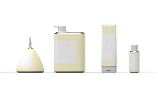
The Dr. Jart+ containers combine the classic forms of cosmetics and beauty products with unexpected industrial objects like oil and kerosene cans.




Dr. Jart+ is a global skincare brand that features innovative products designed to address specific dermatological needs. Pentagram has developed new bottles, dispensers and other containers that highlight the brand’s specialized sense of care and set it apart at retail. The project also introduces an identity system that helps differentiate the many product lines. The new look has just launched in Korea, where the company is based, and will roll out in the U.S. and other countries later this year.
Dr. Jart+ positions itself as a unique fusion of dermatological science and art, as reflected in its name, inspired by the phrase “Doctor Joins Art.” The new product design captures this balance between the physical and aesthetic, housing remedies with serious dermatological impact in custom containers that feel good to the touch, important for a skincare brand.
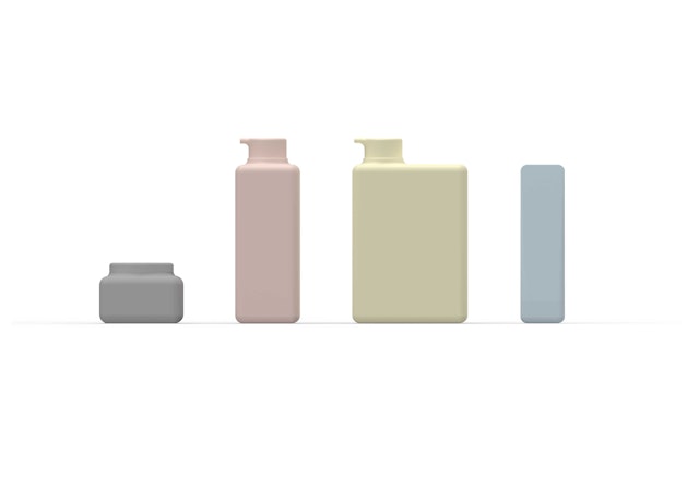
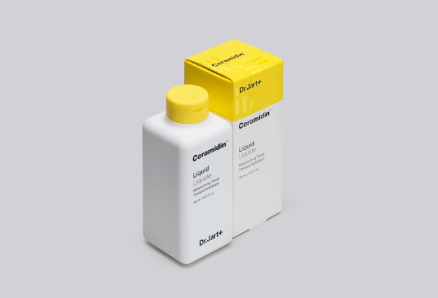
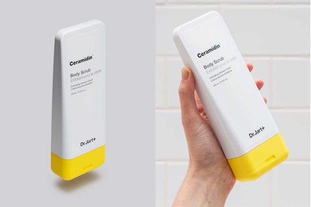
The previous containers changed the structural form, material, typography and color for every product line, diluting the brand. Pentagram has created a system that gives the dispensers a cohesive look and feel. The forms remain consistent, but the materials and colors change for various lines. First to launch is the hydrating Ceramidin line, and the new look will be extended through the nine other product lines.
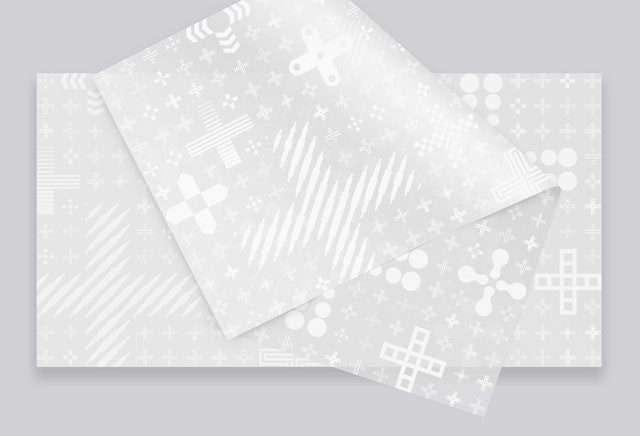
The brand utilizes a distinctive “+” in its name, but this symbol means different things in different countries. As Dr. Jart+ expanded globally, the plus sign was being misread and hard to own as a branding element. The new approach changes the “+” into a flexible, expressive mark that helps signify what each of the product lines does. The designers refined the existing Dr. Jart+ logo, and unified and systematized the brand’s use of Helvetica.
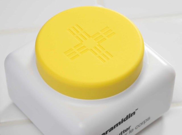
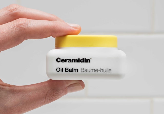
The new containers combine the classic forms of beauty products and cosmetics with unexpected industrial objects like oil cans, kerosene cans and paint tubes. The bottles and dispensers stand out on store shelves, where the stackable shapes maximize every square inch, increasing visibility in a crowded category. At home, the stylish containers are designed to be left out on the counter and not hidden away in a drawer.
Every element has been reconsidered to holistically balance the containers for intuitive function, manufacturing efficiency and design details. The thoughtful attention to detail carries through to the construction of the pumps and dispensers, which employ a minimal amount of parts. The language of forms helps indicate each product’s use: A wide pump signals a product with more viscosity, like lotion, while a round pump is used for oils and liquids. The containers have rounded edges and a soft touch matte finish that evokes the smoothness of skin.
