The brand identity captures the constant evolution, responsiveness and optimization of the platform.

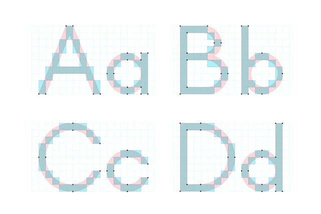
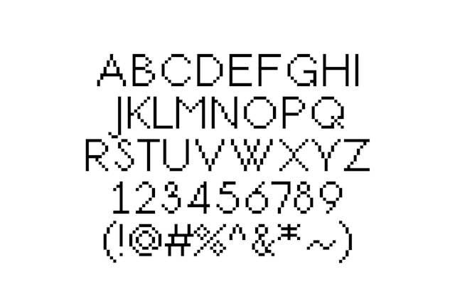
The logotype combines two custom typefaces, showing both the transformation and the final result.


To develop the concept, the designers focused on the contrasts between the volatile nature of the fintech industry and Droit’s smart, safe and responsive solution.
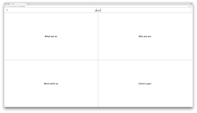
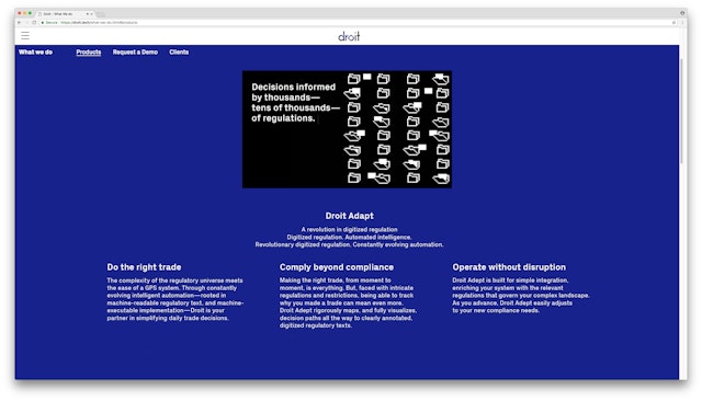
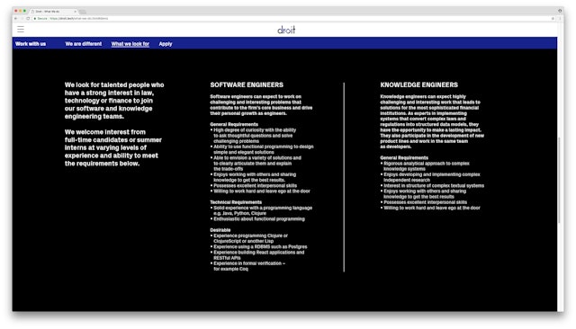
Founded in 2012, Droit is a global financial technology company that has pioneered computational law and automated real-time decision-making that helps investors navigate the complex financial regulatory system. The company‘s innovative technology supports billions of dollars of global trading decisions made by many of the world’s most prominent financial institutions, including Goldman Sachs, Morgan Stanley and UBS, among others. Pentagram has developed the brand identity, messaging, tone of voice, website and brand animation for Droit, as well as the name for its award-winning product platform, Droit Adept.
Droit Adept automates the intelligence behind decisions that guide transactions from banks, asset managers, hedge funds and execution venues through the thousands of rules and regulations necessary for compliance. These global legal frameworks are always changing, and Droit, working in real time, changes along with them. The platform is engineered to analyze the intricate rules behind transactions as they happen, incorporating digitized legal texts, machine-readable regulations and machine-executable implementation.
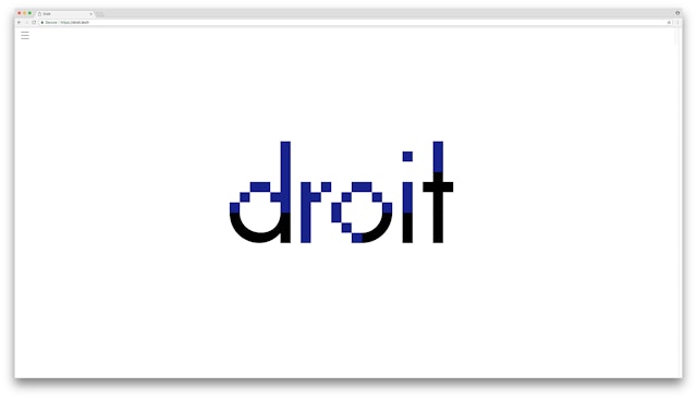
Pentagram's brand identity for Droit captures the constant evolution, responsiveness and optimization of the platform. To develop the concept, the designers focused on the contrasts between the volatile nature of the fintech industry and Droit’s safe, responsive solution: complexity versus simplicity, regulation vs. freedom, virtual vs. actual. The identity balances these dualities in a logotype that combines two different custom typefaces, intersecting at various contact points.
The wordmark merges a bitmap typeface—suggesting technology and the platform’s meta quality—and a geometric, sans serif typeface that is “finished” and visible. The semi-pixelated logo is caught in flux, showing both the transformation and the final result at the same time, in a state of interchange.
The pair of typefaces were developed together and echo each other’s forms: The bitmap font was built on a simple grid system, and provided the basis for the sans serif. Even though they look drastically different, they share common characteristics, including the x-height, each letter’s width and the margin space. After creating the typefaces, the designers isolated a specific moment of “evolution” to make the hero logotype.
The partially pixelated look extends through the applications, including brand animations, stationery, signage and the website. A strong color palette of blue and black helps the brand stand out in the fintech category. Supporting typography is set in the sharp sans serif PX Grotesk (designed by Optimo).
