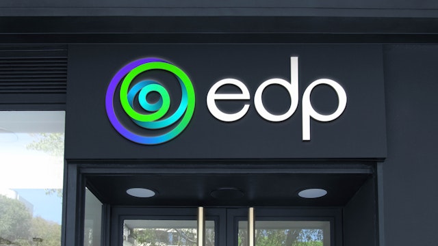
Founded in Portugal, now operating across 28 markets and listed on the Dow Jones Index, EDP is the fourth-largest wind energy producer in the world.
The brand designed by Pentagram needed to express EDP’s brand strategy and convey its strong values and ambition, as well as reinforce EDP’s position as a global leader in the renewable energy field.
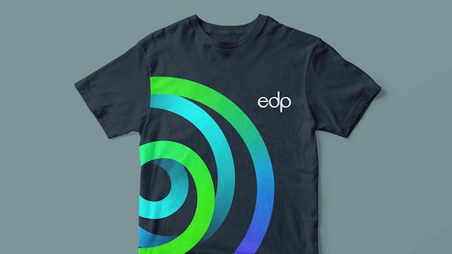
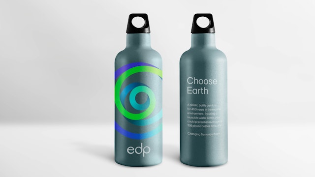

The spiral as a symbol indicates transformation and growth, making an explicit reference to the renewable energy generation of wind farms, and the intricacy of the task ahead to reach EDP’s commitments.
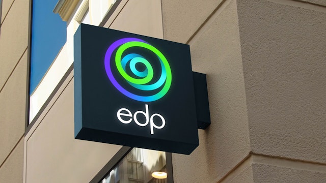
Following the brand architecture Pentagram established a common design for all the logos within the group, repositioning it as one single brand with a clear purpose. Different descriptors identify the many parts of the offer.

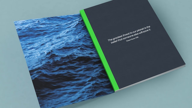

The identity focuses on imagery that show the epic power of nature and our humble position within that, emphasized through the scale of landscapes and the sea as a constant theme.

All of the elements are combined with a colour palette that ranges from grounding natural tones, to vibrant and energetic highlights, creating a full language referencing the precious natural world and our indisputable responsibility to protect it.
EDP is a global leader in the renewable energy sector. Founded in Portugal, now operating across 28 markets and listed on the Dow Jones Index, EDP is the fourth-largest wind energy producer in the world.
EDP is committed to leading the energy transition and creating a positive impact on the planet, within the current climate emergency. It’s a unique energy company which currently operates across five global business platforms including Renewables, Generation, Networks, Client Solutions and Energy Management. With impressive commitments of 100% renewable generation by 2030 and coal-free by 2025, all of these platforms strive for one goal, one vision and one voice.
The brand designed by Pentagram needed to express EDP’s brand strategy summarized as ‘Changing tomorrow now’. It had to convey its strong values and ambition, to inspire change both in people within the business, customers, and partner organisations, as well as reinforce EDP’s position as a global leader in the renewable energy field.
A key requirement for the new brand was to unify all of its companies towards a common vision. Firstly the team developed the brand architecture logic establishing one coherent approach to all of the dimensions of the business.
Pentagram created a full identity system to work across all channels with motion design and film as a core part of the brand language
Building on its core commitment, the brand needed to change from its red palette and fragmented system towards one single brand that stands for planet positivity.
Pentagram originated this brand identity and its logo through motion design. The spiral was generated by placing a dot on a circulating surface, triggered by the circular movement, the dot naturally draws a line that creates the spiral shape without any human interference. That spiral movement represents the connection between everything in nature.
The spiral as a symbol indicates transformation and growth, making an explicit reference to the renewable energy generation of wind farms, and the intricacy of the task ahead to reach EDP’s commitments. It forms part of a dynamic brand language that constantly adjusts to embrace change and innovation.
Following the brand architecture, Pentagram established a common design for all the logos within the group, repositioning it as one single brand with a clear purpose. Different descriptors identify the many parts of the offer.
The custom-drawn wordmark in lower case is friendly, open and inviting, using each letterform to compliment the circularity of the spiral. The supporting type is FT Base, a family of fonts with modernist principles that express humanist values, it’s both accessible and direct.
The identity focuses on imagery that shows the epic power of nature and our humble position within that, emphasized through the scale of landscapes and the sea as a constant theme.
All of the elements are combined with a colour palette that ranges from grounding natural tones to vibrant and energetic highlights, creating a full language referencing the precious natural world and our indisputable responsibility to protect it.
Office
- London
Partner
Project team
- Marta Gaspar
- Hamlet Auyeung
- Kate Blewett
- Charlotte Harmsworth
- Wayne Martin
- Natalia Witwicka
- Laura Phillips
- Jeremy Downes
Collaborators
- Dave Whyte (motion design)
- Nomad (film production)
- Molecular (sound design)
- Debbie Taffler (strategy)
- Frost (typeface customisation)
- Nata Schepy (illustration)
