It was important that the book aligned with Flow’s distinctive aesthetic, which is rooted in the sensibility of its owner.
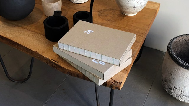


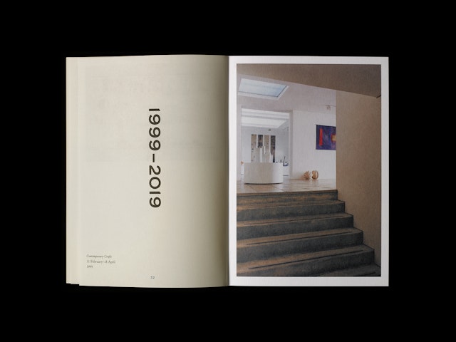
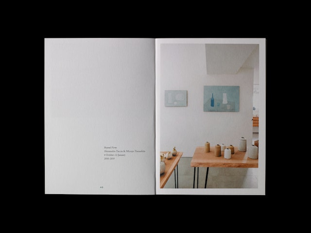
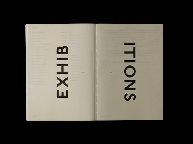
While the book is restrained in its overall approach, playful typography and unexpected layouts give an element of surprise and a change of pace.

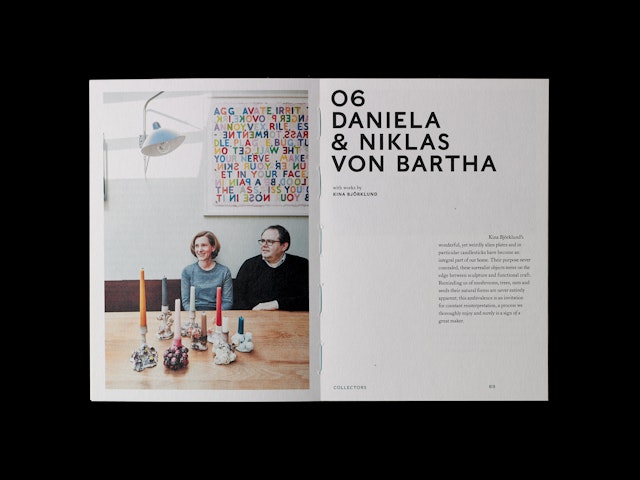
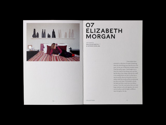
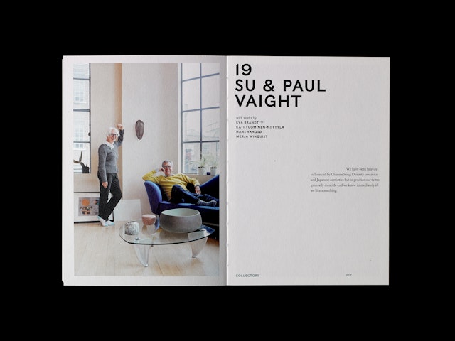
In the collectors’ section, the layout is more classical, but the quotation marks in a duck egg blue jump around the pages as you progress through the book.
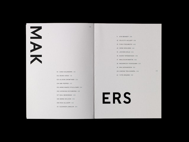
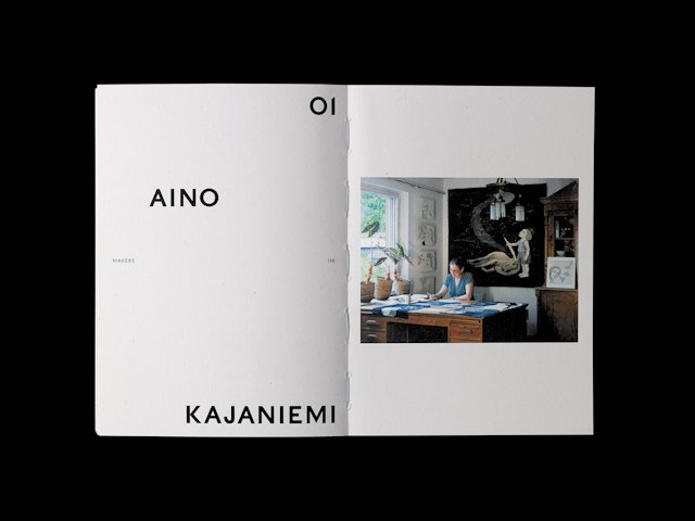


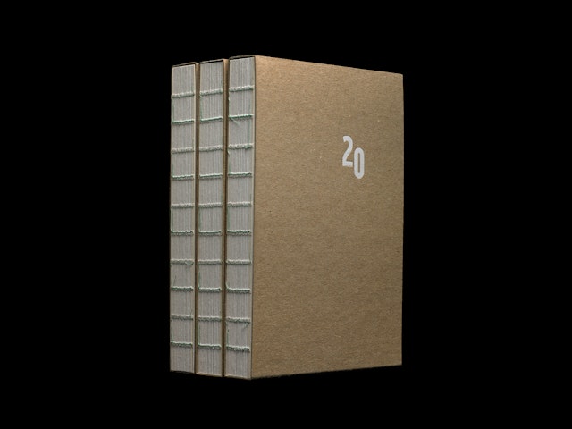
The open binding, combined with the use of recycled cotton-based papers, adds textural elements, again emphasising the handmade, imperfect qualities on the pieces created by the makers and on show in the gallery.


Pentagram has designed a publication for Flow, a West London gallery space which acts as an atelier, representing contemporary craft makers working in ceramics, glass, paper, wood, textiles, metal and jewellery. Founded in 1999 by Yvonna Demczynska, as well as representing its group of makers, Flow works with individuals and corporate clients, helping them to establish their own collections.
Influenced by Scandinavian and Japanese design, both the space and all the objects within it are carefully curated by Demczynska. Pentagram designed Flow’s brand identity in 2016—featuring woodblock letters set in a playful arrangement, the logo has a handmade feel which reflects the gallery’s craft-based approach.
In 2019 Flow celebrated its twentieth anniversary, and Demczynska decided to make the occasion with a special limited edition publication to showcase the work of its makers and celebrate some of its valued collectors.
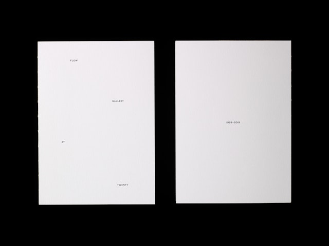
It was important that the book aligned with Flow’s distinctive aesthetic, which is rooted in the sensibility of its owner. The book has an open binding that emulates the craft process, three different uncoated paper stocks, restrained typography and beautifully-considered layouts all work together to give the publication an intimate and very personal feel.
The book opens with an introductory essay by Emma Crichton-Miller (a writer who specialises in art, craft and design), and a foreword by Demczynska. This section is on a lightweight stock, and the single-column text layout makes a feature of, rather than fights against, any show-through. The stock becomes heavier for the first section showing photographs of the opening show in 1999, and the sections with the twenty featured collectors and twenty-one featured makers.
While the book is restrained in its overall approach, playful typography and unexpected layouts give an element of surprise and a change of pace. In the collectors’ section, the layout is more classical, but the quotation marks in a duck egg blue jump around the pages as you progress through the book. This is reversed in the makers’ section, where the typography becomes more playful, and the page numbers remain static. Sensitive portraits of the collectors and makers in their own spaces with the pieces they collect or make were shot by photographer Beth Evans.
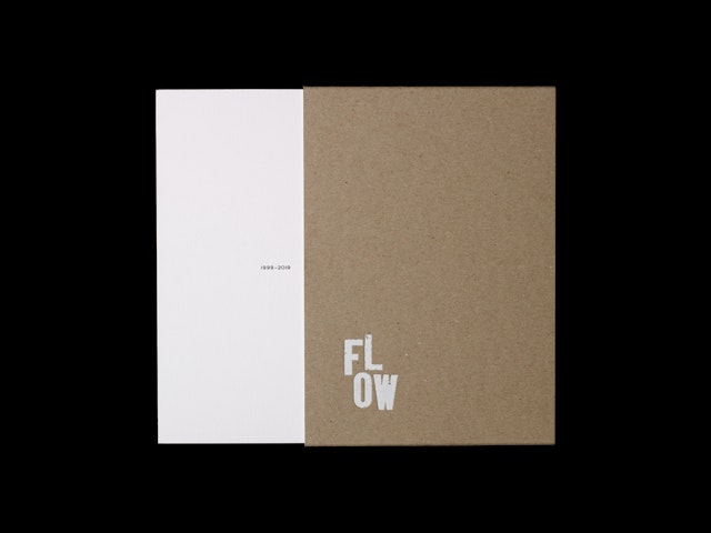
The book ends with an index of makers and collectors and a colophon. The open binding features duck egg blue stitching to tie in with the page numbers, and the book is housed in an open-sided board cover, with foil-blocked type. This, combined with the use of recycled cotton-based papers, adds textural elements, again emphasising the handmade, imperfect qualities on the pieces created by the makers and on show in the gallery.
Printed in Sweden, only 300 copies of the book were produced, some of which were gifted to clients and makers, with some for sale to visitors to the gallery space. Yvonna Demczynska comments: “Pentagram have captured Flow’s aesthetic and ethos so well in their design of the book. It is been appreciated by friends of the gallery and further afield, with copies being sent to Japan…”.
