

Photographs of contemporary applications are juxtaposed with vintage images to illustrate how color has unified the company throughout the years.






This year Formica Group celebrates the 100th anniversary of Formica® Laminate, the iconic and ubiquitous material that surfaces millions of spaces around the world and is loved by architects, designers and consumers for its versatility and high performance. Pentagram has designed Formica Forever, a commemorative book that tells the story of Formica's century-long evolution through cultural shifts, technical innovations and global growth.
Designed for a wide readership, Formica Forever functions as a serious history but also captures the inherent playfulness and modernity of a material that is synonymous with bright colors and highly graphic patterns. The design of the book is inspired by a Formica brand laminate swatch book from the 1960s with perforated pages, and features over 400 archival images that include advertising, photographs and other brand ephemera from all over the world, culled from the Formica archives and the Library of Congress.
Formica Forever is the latest in a special campaign designed by Pentagram that pays homage to Formica and its century of innovation, design and cultural impact. Pentagram has also designed the Anniversary Collection, a series of Formica laminates that are inspired by the company’s long history and the seamless quality of its product. The book is published in association with Metropolis Books.
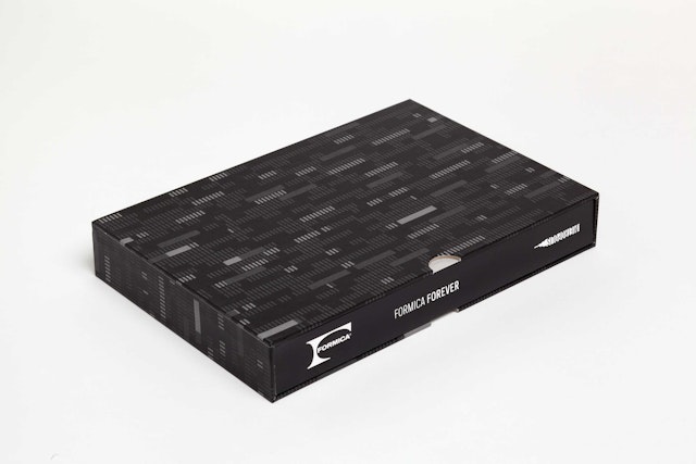
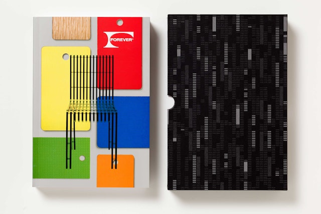
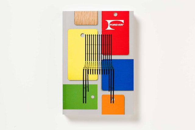
The cover introduces a graphic motif that is used throughout the book: a pattern of colorful Formica specification chips. In the table-of-contents other section openers, the chips feature titles and other information; on the contents pages, these include titles in other languages, indicating the book is multi-lingual and Formica is a brand with global reach. The softcover book comes packaged in a slipcase that reproduces the Endless pattern designed by Miller for the Anniversary Collection. The special “Formica Forever” anniversary logo developed by Pentagram appears on the spine of the case and the cover of the book.
The book is loosely comprised of three sections. The first third focuses on essays that look at various aspects of the company’s story over the past century, followed by an illustrated chronology from 1913 to 2013. This leads into an illustrated portfolio of company’s history as seen through the lens of color, featuring perforated pages inspired by a color spec book. The book closes with a section of translations in six languages.
The book opens with a preface by Pentagram partner, Abbott Miller, and an introduction by Mark Adamson, former CEO of Formica Group and current CEO of Fletcher Building, parent company to Formica Group. The design critic Phil Patton contributes the first essay, “Growing Global: A Century of the Formica Brand and Business,” a highly readable history that contextualizes the evolution of the company from its Cincinnati origins (where it was invented by Daniel J. O’Conor and Herbert A. Faber as substitute for the mineral mica, hence the name), to its current status as an internationally recognized brand that continues to expand around the world, especially in Asia. The history documents the use of Formica laminates through landmark interiors and environments like the 1964 World’s Fair and the QE2, as well as the company’s economic ups and downs and continued resurgence. Infographics presenting subjects like Formica’s manufacturing process and global market share have been illustrated with laminate patterns from the company’s collections.
This history is followed by “The Glamour of Utility: Formica Laminate, Design and Luxury,” in which Alexandra Lange examines the dialogue of modern architecture and Formica, and how the adoption of this new material by architects and designers like Charles and Ray Eames and George Nelson helped give it a modernist pedigree.
Formica’s cultural impact is considered in the final essay. Written by Peter York, “Toward a Wipe-Clean World: Formica Brand in Context” looks at how Formica’s rise coincided with concern for modern surfaces, and how it influenced standards of cleanliness and hygiene. The section wraps up with a timeline of the company illustrated with period advertising, product images and other corporate ephemera.
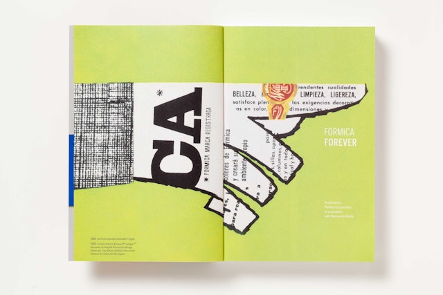
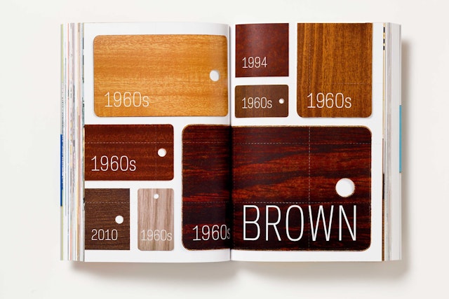
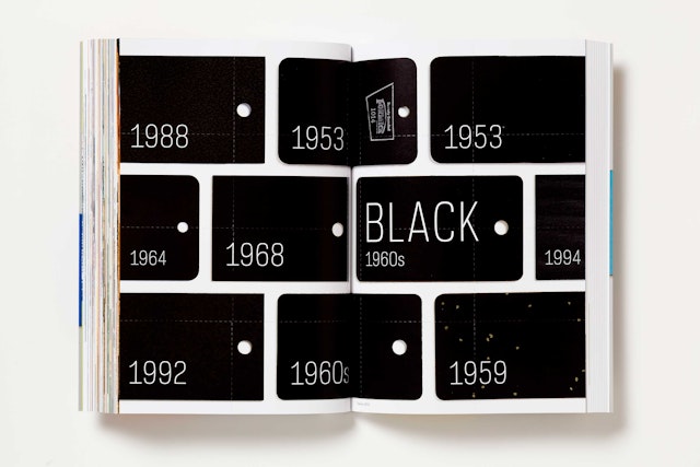
Formica is known for its colors, and the book’s central section, “100 Years of Color and Pattern,” tells the Formica story in a series of portfolios that organize hundreds of archival images by color: Yellow, Red, Blue, Brown, Green, Pink, White, Orange, and Black. The opening spread of each section presents chips for each color through the years, allowing readers to compare the changing hues. The pages of the section have been perforated like a pattern specification book, inspired by a sample the designers found in Formica’s archives during research. Photographs of contemporary applications are juxtaposed with vintage images to illustrate how color has unified the company throughout the years. Historic interiors like the QE2 are seen alongside modern designs by architects like Thom Mayne and Zaha Hadid.
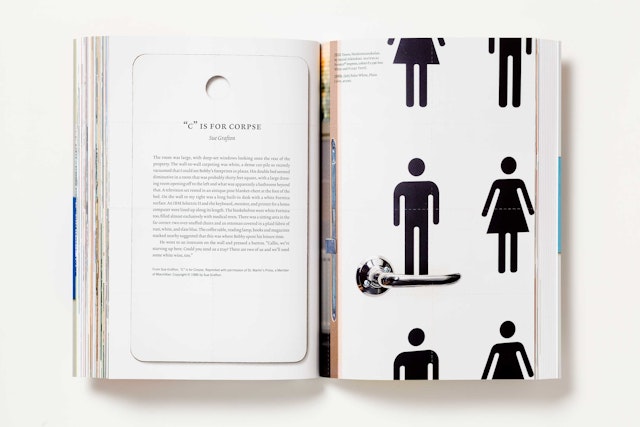
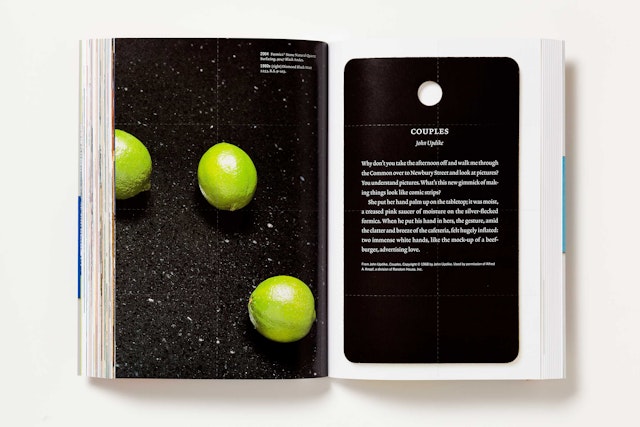
Throughout the section, the ubiquity of Formica laminate is underscored by passages from a range of fiction writers who have used the material to provide detail and character, demonstrating that Formica is part of the public imagination. The literary references range across genres, and include authors like John Updike (“She put her hand palm up on the tabletop; it was moist, a creased pink saucer of moisture on the silver-flecked formica”), Margaret Atwood (“Charis is already there, sitting in the corner at a red formica table with gold sprinkles baked into it and aluminum legs and trim, which is either authentic fifties or else a reproduction”); Ian Fleming, Harlan Ellison, Jhumpa Lahiri, Monica Ali, and Sue Grafton, among others.
The final section translates the preceding essays and chronology into six languages: Chinese, Finnish, French, Spanish and Thai. The range shows the company’s international importance and continuing growth; the book will be distributed around the world. Running over 100 pages long, the six translations are presented concurrently in a series of color-coded columns. The layout was a challenge for the designers, who used artwork and images from the Formica archives to help make up for the different lengths of the languages.
Office
- New York
