
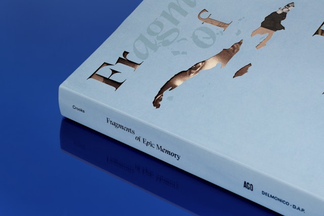
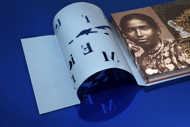
A die-cut slipcover integrates the cartographic silhouette of the Caribbean islands with the title typography, with some letters cut out to reveal portions of artworks underneath.

Juxtapositions show how the region’s histories are constantly revisited and reimagined through artistic production.


An eclectic mix of typefaces reflect the marriage of different eras and types of artistic expressions within the book.


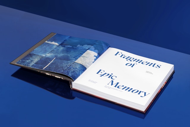
The Caribbean is a cultural crossroads with a turbulent history that has comprised colonization, slavery, and ultimately emancipation and independence. The region’s artists continue to navigate the weight of this past and incorporate it into a shared sense of the future. Presented by the Art Gallery of Ontario in Toronto, Fragments of Epic Memory is a major exhibition that invites viewers to experience multiple ways of encountering the Caribbean and its diaspora, from the period following emancipation through today. Pentagram has designed a companion book that highlights this unique artistic legacy fused between the old and new worlds.
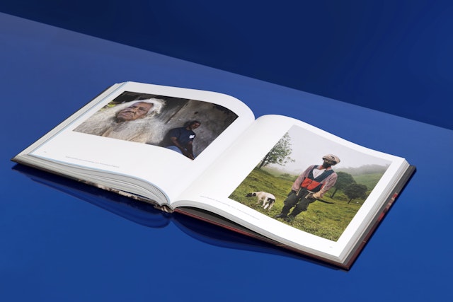
Toronto is home to some of Canada’s largest Caribbean communities, and Fragments of Epic Memory is the inaugural exhibition of AGO’s newly structured Department of Arts of Global Africa and the Diaspora. Curated by Dr. Julie Crooks, the show presents more than 100 photographs from the Montgomery Collection, a trove of rarely seen glimpses of life in the Caribbean between 1840 and 1940 that was acquired by AGO in 2019. The exhibition places these images in dialogue with paintings, sculptures, and other works by over 30 contemporary artists of Caribbean descent who represent diverse geographical, cultural, and linguistic perspectives. Following its run at AGO from September 2021-February 2022, the exhibition travels to the Minneapolis Institute of Art in January 2023.
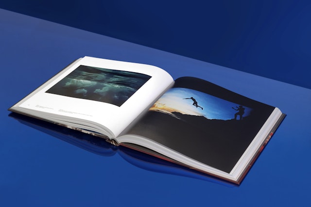
The Pentagram team welcomed the opportunity to collaborate on a project that would raise the profile of these underseen artists and their works. The exhibition explores the past and present through themes such as forced migration and servitude, the legacy of colonialism, and post-emancipation culture and craft. The juxtaposition shows how the region’s histories are constantly revisited and reimagined through artistic production. There is a noticeable contrast between the 19th-century black-and-white photographs and the radical modern pieces, and this proximity creates a cultural thread that weaves through the eras. The resulting effect is not a dichotomy, but a marriage of the contemporary and the historical.
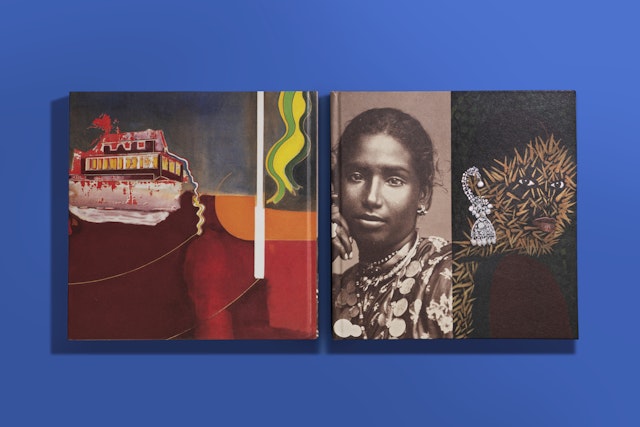
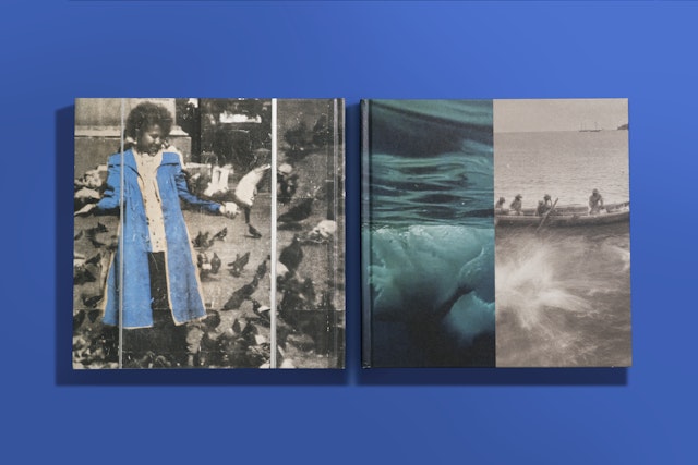
This merging is reflected in the book’s design. A die-cut slipcover integrates the striking cartographic silhouette of the Caribbean islands with the title typography; some letters are cut out to reveal portions of artworks underneath, while the others are spot varnished with a high sheen. (Echoing the islands that make up the archipelago, the exhibition’s title references the Nobel Prize speech of the St. Lucian poet Derek Walcott, who contributes the opening essay in the book.) The team designed two different variations for the cover beneath, each with an image spliced down the middle that combines a photograph from the Montgomery Collection on one side with a contemporary work on the opposite.
The pairings were carefully selected to convey the visual evolution of Caribbean history. One cover features a mirrored set of portraits, with the eyes visible through the slits in the slipcover: Kelly Sinnapah Mary’s Notebook of No Return, a portrayal of an imagined ancestor shielded in sea urchin thorns, matched with Felix Morin’s Woman, Trinidad, a traditional and dignified portrait of a young Trinidadian woman. The alternate cover contains a still from Circa no future by Nadia Huggins reflected against Boys Diving for Coins, St. Lucia, a print from 1887. Both photos illustrate moments of aquatic serenity, one in black and white and the other in a deep hue of oceanic blue.
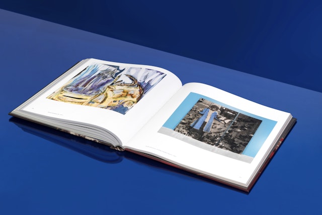
The exhibition adopts a non-linear approach, and this carries through to the book’s interior, which has a subtle, almost imperceptible structure that intersperses essays, poems and narratives among reproductions of the artworks. This fragmented rippling of content throughout the book evokes the passing of time and the rhythm of island life, and allows the reader to take in the works and consider how they are connected to each other. Sections of the book are printed on pale green, blue, and orange pages, keyed to the three different sections of the show.
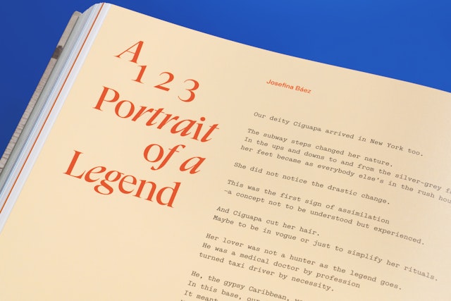
An eclectic mix of typefaces are used to reflect the span of eras and different types of artistic expressions featured in the book. The display type on the cover and section openers shifts between regular and italicized letters set in the serif GT Super Display and the neo-grotesk GT America (both by Grilli Type). Body copy appears in the modern sans ABC Diatype (by Dinamo Typefaces), while poems, writings and other excerpts are set in the contemporary typewriter typeface Simon Mono (also from Dinamo), giving them the feel of coming directly from the artists.
