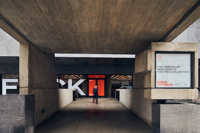
The brand identity embraces the contrast between the building and the artworks to make the move a special event—the rare opportunity to see the collection in an unusual setting.

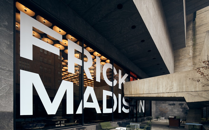
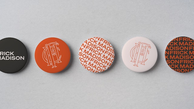
The Frick Madison wordmark acknowledges the modernist heritage of the Breuer building with a bold, sans serif typeface.
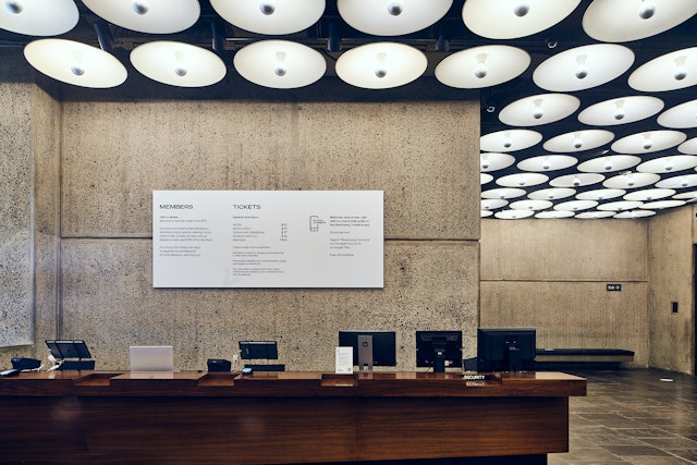
A visual prelude on a media wall in the lobby prepares visitors to experience the collection outside the context of the Frick mansion.
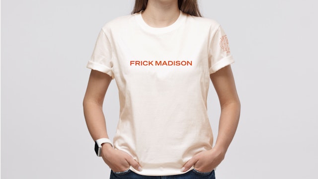
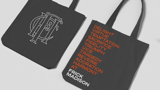


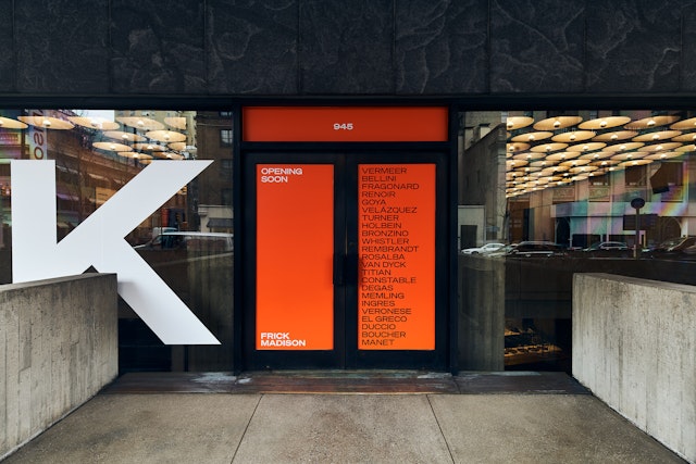
The bright orange of the identity serves as a counterpoint to the deep, subtle palette of the stone and bronze materials of the architecture.
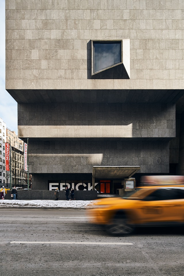
The Frick Collection offers one of New York’s most unique art experiences—Old Master paintings and European fine and decorative arts displayed in the opulent 1915 mansion of Henry Clay Frick, with many pieces in the same halls they’ve called home for almost a century. When the museum closed for a two-year renovation and expansion in 2021, the works were temporarily relocated five blocks north to the Marcel Breuer-designed building at East 75th Street, a 1966 landmark of Brutalist architecture that was originally conceived for the Whitney Museum of American Art and that couldn’t be more different from the Frick mansion.
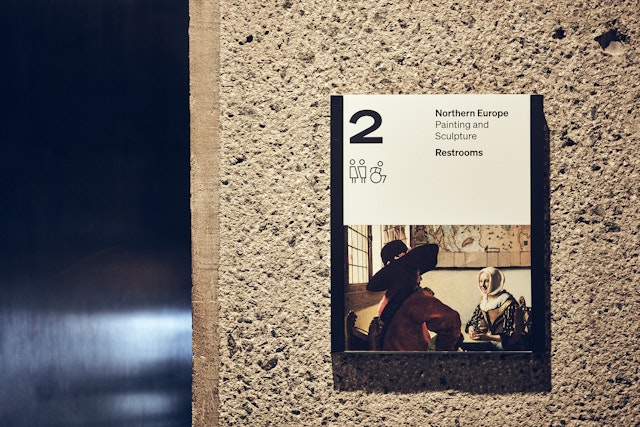
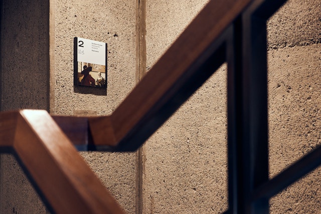
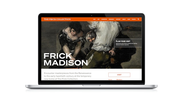
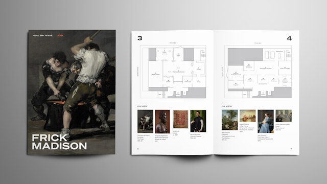
Pentagram developed a brand identity for Frick Madison that embraces this contrast and helps make the move a special event—the rare opportunity to see the works anew in an unusual setting. The Frick Madison wordmark acknowledges the modernist heritage of the Breuer building with a bold, sans serif typeface that stands in juxtaposition to the artwork. The identity appears in a bright orange that serves as a counterpoint to the deep, subtle palette of the stone and bronze materials of Breuer’s architecture. The system also includes a refresh of the Frick Collection logotype and a redrawn “HCF” monogram (for Henry Clay Frick) that will play a greater role when the mansion reopens.
The identity extends to signage and environmental graphics that have been integrated with the architecture, most dramatically in a two-story high logo announcing the “pop-up” in the windows of the museum’s façade on Madison Avenue. To help usher visitors into the very different experience of the Breuer building, Pentagram created a visual prelude for a 45-foot-long media wall in the lobby that functions as a transition from the bustle of Madison to the contemplative atmosphere of the galleries. Details from works in the collection are organized into thematic modules and presented in a lyrical dialogue that connects artists and cultures across time, geography and medium.
Client
The Frick CollectionSector
- Arts & Culture
Discipline
- Brand Identity
- Signage & Environmental Graphics
Office
- New York
Partners
Project team
- Katie Rominger
- Kim Walker
- Gabriel Smoller
- Wenjie Lu
- Tamara McKenna
- Michelle Brown
Collaborators
- Zeph Colombatto, photographer