

The different colors of the converging train lines and the changing light of Sky Reflector-Net inspired a dynamic approach to the color of the identity, which varies according to season, ranging across hues of orange and red for fall, to green and yellow for spring, to sky blue for summer, to magenta and purple for winter.


Fulton Center is the busiest subway interchange in Lower Manhattan. Located at the intersection of Fulton Street and Broadway, the Center provides a landmark gateway and transfer point for five major subway lines and 11 different trains served by the Fulton Street, Chambers Street–World Trade Center/Park Place and Cortlandt Street stations, as well as connections to the PATH system. The complex is projected to be used by 300,000 passengers daily and is also home to a new retail destination with shops and restaurants.
Working with the Metropolitan Transit Authority, Pentagram has designed an identity for Fulton Center that conveys its role as a transportation crossroads—and spotlights the unique artwork at its center.
With its convergence of multiple train lines, Fulton Center functions as a downtown “Grand Central,” and like the starry ceiling of the Main Concourse of the famed terminal on 42nd Street, the new downtown hub has a ceiling that will keep passengers looking skyward. Fulton Center has been designed around a mammoth domed oculus that contains Sky Reflector-Net, a new sculpture by James Carpenter that has been integrated into the building’s architecture, designed by Grimshaw Architects and Arup.
The largest artwork ever commissioned by MTA Arts for Transit and Urban Design, Sky Reflector-Net consists of a curving, 79-foot-high net of 952 reflective diamond-shape panels held in place by a delicate system of cables in the conical interior of the Center. Resembling the rippling surface of a giant soap bubble, the sculpture captures the quality of the light, changing by season and time of day. The structure redirects sunlight to lowest levels of the building and provides a dramatic point of orientation for commuters as they pass through the building. An iconic location for the neighborhood, the grand interior is already being promoted by MTA as “New York’s Next Great Public Space.”
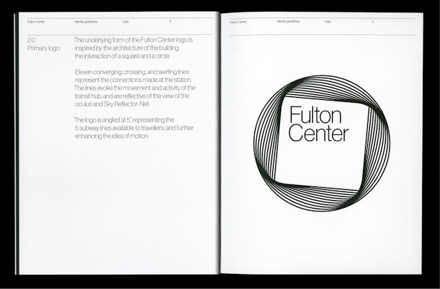
The underlying form of the Fulton Center logo is inspired by the architecture of the building: the interaction of a square and a circle. Eleven converging, crossing, and swirling lines represent the connections made at the station. (Specifically, the 2, 3, 4, 5, A, C, E, J, N, R and Z trains.) The lines evoke the movement and activity of the transit hub, and are reflective of the view of the oculus and Sky Reflector-Net. The circular form of the logo also echoes the circles of the subway line emblems and the MTA identity.
The logo is angled at 5 degrees, representing the five subway lines available to travelers, and further enhancing the idea of motion. (The lines include the IRT Broadway - Seventh Avenue Line [the "red" line], the IRT Lexington Avenue Line [green], IND Eighth Avenue Line [blue], BMT Broadway Line [yellow] and BMT Nassau Street Line [brown].)
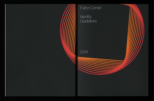
The different colors of the converging train lines and the changing light of Sky Reflector-Net inspired a dynamic approach to the color of the identity, which varies according to season, ranging across hues of orange and red for fall, to green and yellow for spring, to sky blue for summer, to magenta and purple for winter. The primary typeface is Neue Haas Grotesk.
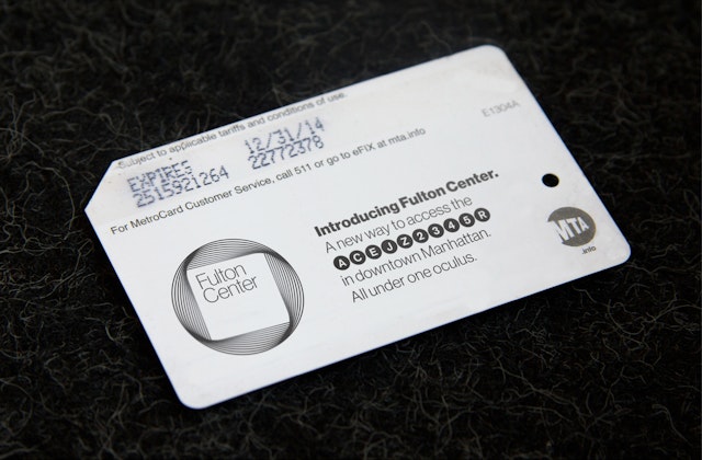
The designers also developed a system of guidelines for consistent application of the identity across a range of items, from collateral like stationery and MTA MetroCards to dimensional signage at Fulton Center.
In the past few years, Pentagram has worked on a range of transportation projects for the city, including the identity for Grand Central, the WalkNYC pedestrian wayfinding system, the redesign of New York's parking signs, and the LOOK! transit safety campaign.
