



The identity responds to the Mediterranean food concept but transplants it to a downtown setting.
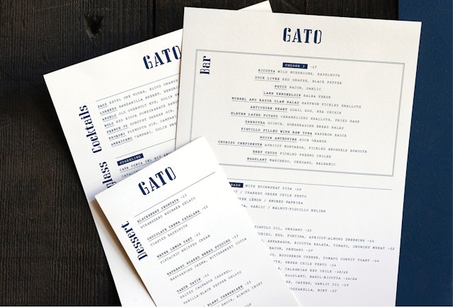


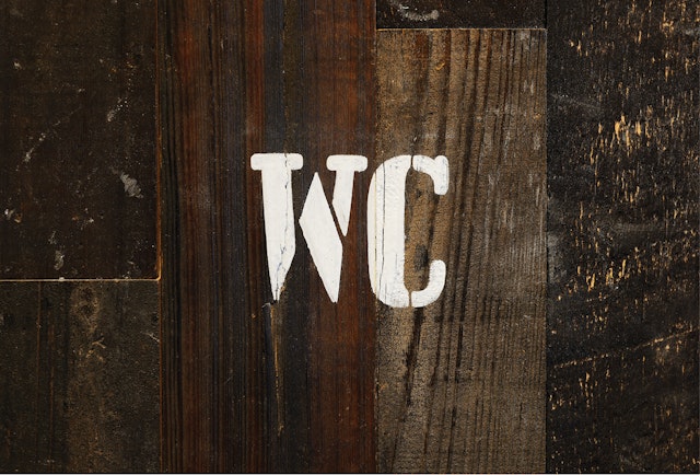
The stencil-like wordmark sets off the tactile textures of Rockwell's interior design, as well as the building's former life as a warehouse.
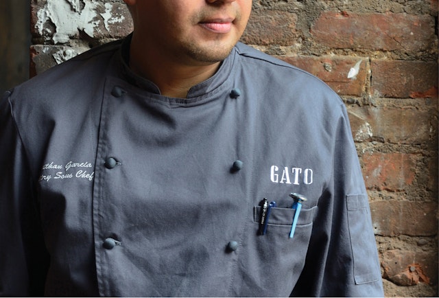


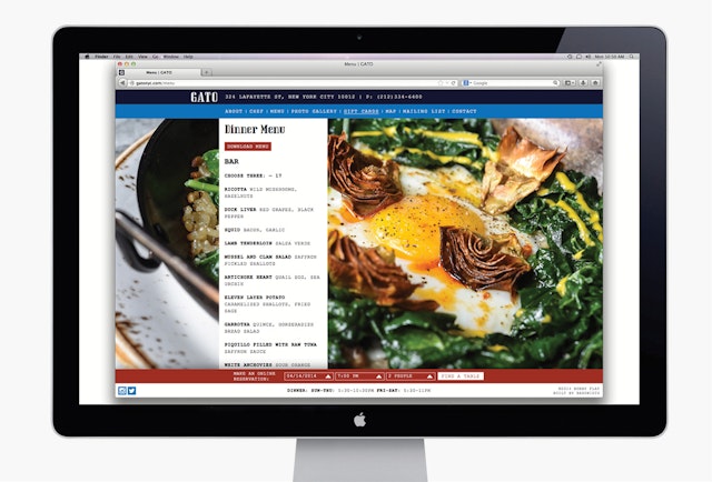
In Spring 2014, legendary chef Bobby Flay made his long-awaited return to the New York dining scene with Gato, his first restaurant to open in the city in nine years. Gato serves a Mediterranean menu inspired by the flavors of Spain, Italy, France, and Greece. For the restaurant's identity, Flay turned to Pentagram, who previously designed graphics for Flay's popular fast-casual chain Bobby's Burger Palace. The Gato graphics complement the restaurant's bold cuisine and industrial-chic NoHo setting with strong typography and a factory aesthetic.
Gato is housed in a historic 1897 warehouse building on Lafayette Street that has been recast by architects Rockwell Group in a “rough luxe” mix of wood, metal and stone. The effect of the raw space was powerful, and Rockwell introduced a few simple elements to tie together the cavernous 3,640-square-foot interior, including lighting suspended on a massive metal framework and a floor of distinctive hexagonal tile specifically designed for Gato and custom made in Vietnam. Gato is Spanish for cat and Flay chose it for the restaurant name after he saw an orange tabby run through the space during an early scout.
The identity responds to the Mediterranean food concept but transplants it to a downtown setting. We developed several logo sketches in the process of creating the identity, including ideas that played off the red awning on the restaurant façade, the unusual blue and white hexagonal tile, and typography inspired by the Catalan Spanish painter Joan Miró.
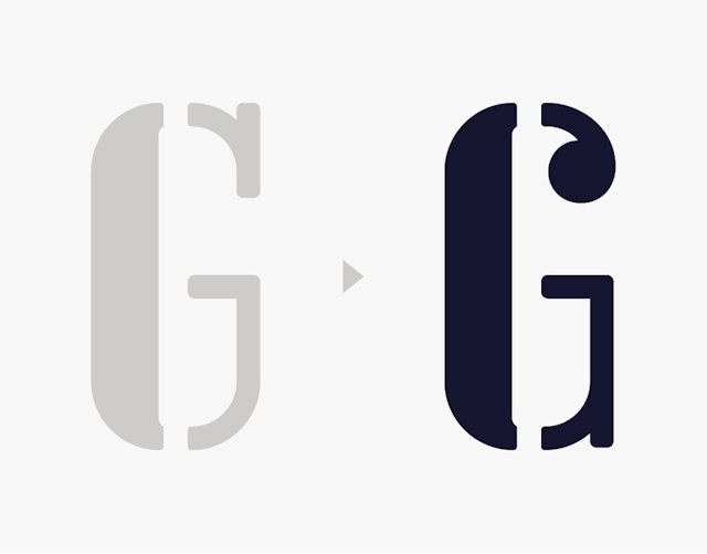
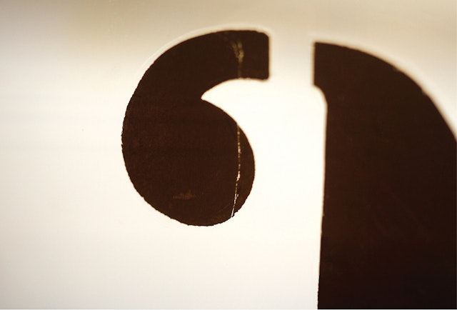
The fact that Gato is an unfamiliar word is one of the reasons that the most legible solution was the winner. The final logo has been set in the stylish-but-tough typeface Lisbon, the design of which was originally inspired by the tile street addresses of its namesake city and other Mediterranean locales. We've customized the curl of the "G" with a unique ball terminal. The color blue is borrowed from the tile work of Gato's floors. The contemporary typewriter font Pitch was selected as a secondary typeface, adding a little downtown industrial flavor to stationery, menus and other print collateral.
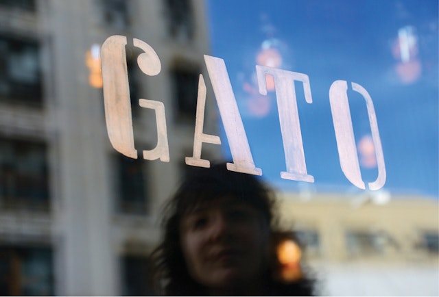
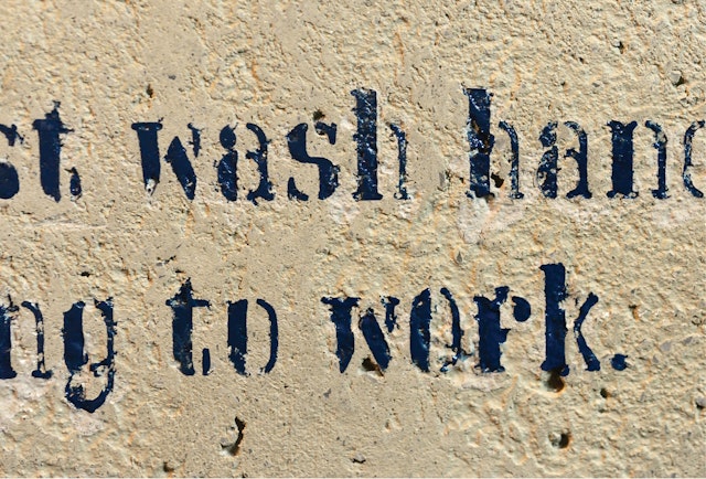
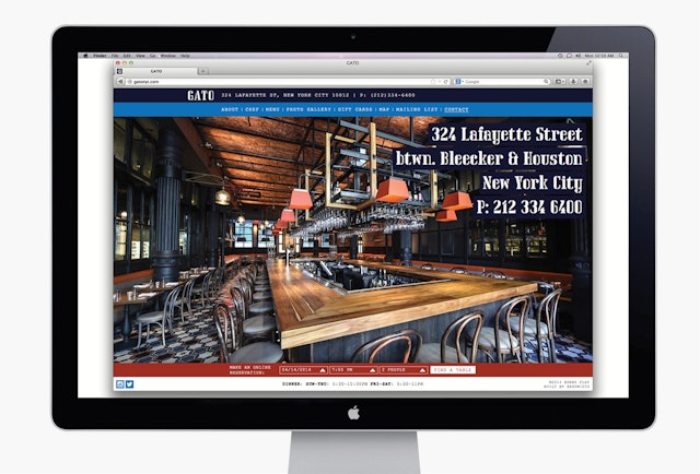
The stencil-like wordmark sets off the tactile textures of Rockwell's interior design, as well as the building's former life as a warehouse. The sign painters okMitch Studio hand-painted the logo in copper foil on the restaurant windows, and did an amazing job approximating Lisbon for "employees must wash hands" signs on the bathroom walls. Pentagram also designed a website for the restaurant that highlights the striking interiors and mouth-watering food in beautiful widescreen images.
Client
Bobby FlaySector
- Food & Drink
Discipline
- Brand Identity
- Signage & Environmental Graphics
- Digital Experiences
Office
- New York
