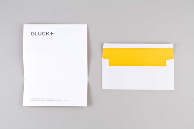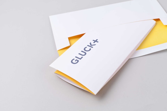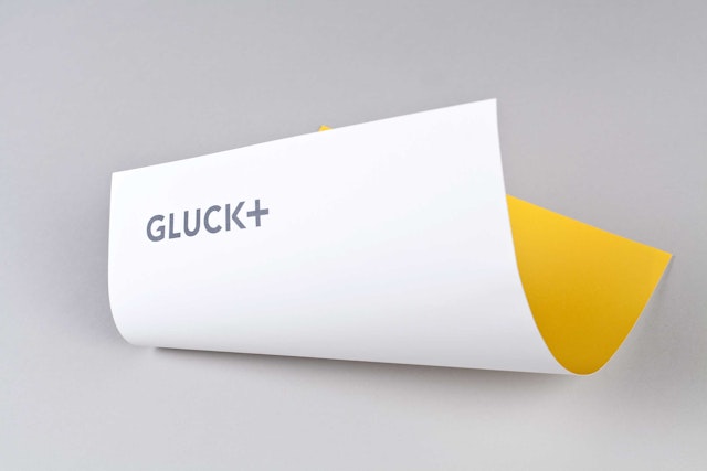


For the graphic identity, the designers created a bold, contemporary mark that expresses a sense of vitality and innovation while also maintaining the firm’s legacy.


The innovative New York based architecture firm GLUCK+ is a pioneer of Architect Led Design Build (ALDB), an integrated strategy that makes architects responsible for all aspects of the architectural process, from conception to construction. An alternative to the traditional design-bid-build process, ALDB puts the same people in charge of an entire project, resulting in better quality and cost of the finished building. Pentagram has collaborated with GLUCK+ on a comprehensive rebranding that highlights the firm’s multi-disciplinary approach in the new GLUCK+ name and identity, as well as a dynamic new website.
Established in 1972 by the acclaimed architect Peter L. Gluck, GLUCK+ was formerly known as Peter Gluck and Partners Architects. The firm has designed buildings throughout the United States, ranging in type from houses, schools, religious buildings and community centers to hotels, mixed-use/housing, corporate interiors, university buildings and historic restorations. Recent high-profile projects include The Stack, New York’s tallest modular residential building, and the remarkable Tower House, which received multiple honors in 2013. The firm has just been named to Fast Company’s list of the World's Top 10 Most Innovative Companies in Architecture.
In conjunction with the design of a new website, Peter Gluck asked Pentagram to help develop the new GLUCK+ name and visual identity for the company. Like other architecture firms originally organized around a founding partner, the practice faced the challenge of being closely identified with its namesake as leadership passed to a new generation of architects. The existing name was seen as limiting as the firm's scope had already expanded in the 1990s with the addition of construction management and development, and a cohort of new leadership.
The evolution of the firm name to GLUCK+ recognizes that the practice has always been inclusive. (As the firm puts it: “‘Outside our scope’ is not in our vocabulary.”) As part of the project’s development, the team brought in the design strategist Rachel Abrams to help define the language around ALDB, including an extensive article posted on Wikipedia.
The added “+” in the new GLUCK+ name suggests a wide-ranging, dedicated practice with state-of-the-art expertise and an expansive point of view. For the graphic identity, the designers created a bold, contemporary mark that expresses a sense of vitality and innovation while also maintaining the firm’s legacy. The logo utilizes the font Avenir (specifically the 95 Black weight) with custom cuts inspired by forms found in the firm’s designs.
The new website utilizes a modular design that echoes the modernist forms of the firm’s work, as well as its multi-faceted methodology. The homepage of the site functions as a kind of viewer into the firm’s practice, with content divided into three streams: Projects, Process and News. Individual projects and different aspects of the GLUCK+ process are presented as a strip of images, like frames in a film. Clicking on one takes the user into a case study of the project, opening up a widescreen “cinematic” presentation of images or video.
The allusion to film is appropriate, as the site makes significant use of video to showcase the firm’s work and design thinking. In the same spirit of reinventing the role of the architect, the firm has produced over 20 short films in-house for the site that explore signature projects and various aspects of ALDB, and the video library will continue to grow. Many of the films feature GLUCK+ personnel interacting with the environments they helped create. (The firm is no stranger to the moving image: Peter’s son Will Gluck is a successful Hollywood director and producer, and Peter often appears in his films.) The new branding extends to typography in the videos, and the designers also contributed direction and the title motion graphics to the video shorts that help explain the firm’s working methodology.
The structure of the site is flexible, with all content close to the surface, creating what the design team calls a “serendipitous canvas” or overview of the firm’s work. The website is organized in three view sets: a film strip, a list view (sorted by project name or other factors), and a tile view that appears as an engaging grid of images. Content can be filtered by project type, and predictive search helps users quickly find what they’re looking for. Project images can be annotated with notes or links to related content, and the back end of the site is built in Drupal, so the firm can easily upload its own projects and information.
