Glyndebourne’s long-term ambition is to attract the next generation of curious culture seekers by inspiring a love for the art form, while continuing to resonate with its loyal members and core audience.

An expressive version of the typeface created for unique and special brand-led moments conveys the full operatic performance, referencing when lights hit the stage, bringing drama to life.
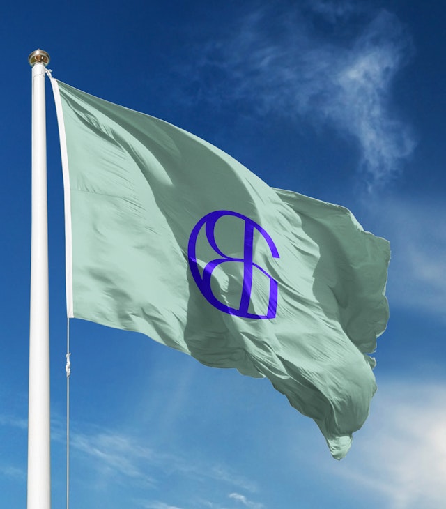
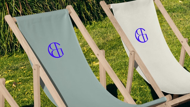
The new brand needed to work across the Opera’s different activities and touchpoints, with a change of tonality between the Summer Festival and Autumn Season.

The new visual identity reflects the sensational and idiosyncratic spirit of Glyndebourne, conveying its independence, heritage and unique setting as a world-class, forward-thinking opera house that’s both cosmopolitan and quintessentially English.
An opera company like no other, Glyndebourne is positioned amongst extraordinarily beautiful scenery, within the grounds of a 600-year-old Grade II listed country house in East Sussex.
Owned by the Christie family, the manor house first became a venue for opera in 1934 when John Christie started hosting special performances for friends and neighbours. Since then it has become an unmissable destination for both opera makers and opera lovers from around the world. As well as its intensely creative productions and exquisite attention to detail, Glyndebourne is renowned for its ‘out of this world’ setting surrounded by history and nature.
Independently funded and recognised internationally as one of the world’s leading opera houses, its annual summer Festival presents over 70 world-class opera performances in an award-winning 1,250-seat opera house. The event is famous for the long intervals between acts, when opera-goers dress for the occasion picnicking across Glyndebourne’s historic grounds. All together, the entire Glyndebourne experience is a performance like no other.
Glyndebourne’s long-term ambition is to attract the next generation of curious culture seekers—including those yet to experience opera—by inspiring a love for the art form, while continuing to resonate with its loyal members and core audience
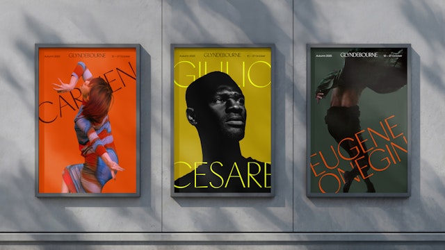
Following a year where the flagship annual Festival smashed box office targets, Glyndebourne was challenging the prevailing media narrative that opera is an artform in decline. As part of the plan to open the house to a wider audience, it now presents an Autumn Season of opera and concerts, with more accessible prices to attract younger audiences in addition to the opera aficionados. The program for the Autumn Season puts rising stars centre stage, opening doors to new and exciting talent.
Glyndebourne also has an award-winning learning and engagement programme that’s active all year-round, staging new work and delivering projects to enhance the understanding and enjoyment of opera among a broad and diverse audience.
As it approaches its centenary, Glyndebourne asked Pentagram to create a new identity that would challenge and refine the Glyndebourne brand, ensuring it remains at the forefront of opera’s story for new and loyal audiences, artists, donors, policy makers and the diverse workforce that makes it possible.
Pentagram created the internal positioning statement ‘Only at Glyndebourne’ to convey the deeply unique nature of the experience—where opera comes to life in harmony with the natural landscape, and the act of dressing for the occasion becomes part of a ritual shared between both performers and audience.
The new visual identity is iconic, uplifting and transformative. It reflects the sensational and idiosyncratic spirit of Glyndebourne, conveying its independence, heritage and unique setting as a world-class, forward-thinking opera house that’s at the same time cosmopolitan and quintessentially English.
The new brand needed to work across the Opera’s different activities and touchpoints, with a change of tonality between the Summer Festival and Autumn Season. To facilitate this, Pentagram’s team developed a logic and design system that can be applied to all of Glyndebourne's constituent parts, including festivals, sub brands, activities, partnerships and awards.
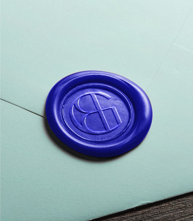
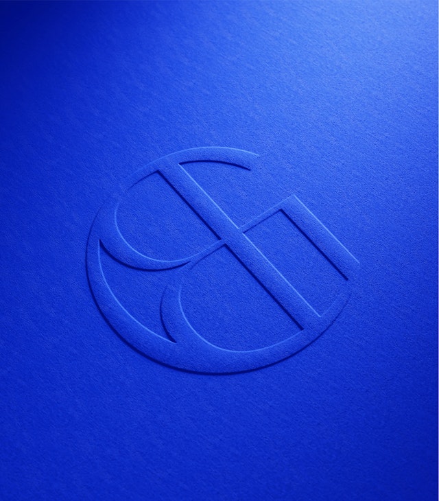
Pentagram‘s new identity includes a unique new monogram and logotype which acts as a pure expression of the brand. Using Heavyweight Digital Type Foundry’s Pacific as a headline font family, the typography system varies from its classic form to include an expressive version of the typeface for unique and special brand-led moments. This conveys the full operatic performance, referencing when lights hit the stage, bringing drama to life. The system combines customised headline and supporting typefaces to create the right balance of dramatic, contemporary, artistic and practical.
The team created a sophisticated colour palette that draws from everything unique to Glyndebourne, from elements of nature, to the fabric of the building to the natural dyes used in the costumes. Inspired by Klein Blue, the hero colour represents the pinnacle of artistic expression that runs through everything.
For the Festival Opera titles, to convey the authorship brought by those behind each production, Pentagram proposed a specific handmade type style, using the handwriting of people who create Glyndebourne opera productions. This appears as the feature type in Festival campaigns, enhancing the sense of artistry and ‘Only at Glyndebourne’ narrative. For communications, the Festival design style is more composed and dramatic, whilst the Autumn Season uses a more playful, experimental approach.
The photography and film style flexes for different aspects—from the drama of the performances themselves, to the idiosyncratic style of Glyndebourne audiences, the architecture and gardens, and the dedication, passion and craft behind the scenes. A different, more experimental tone is used for the Autumn Season, conveying a sense of discovery designed to attract new audiences.
The team also created the imagery for the summer Festival 2025 launch campaign and a brochure design that became part of the new brand guidelines. Inspired by the central positioning Only at Glyndebourne, the approach reflects the theme of each performance, reflecting the dreamlike quality of the experience in such a unique location. Each image is built from two layers: the main theme of the opera combined with textures from Glyndebourne’s gardens, nature, and lake. The result is evocative, sparking a sense of possibility and engaging the viewer’s imagination.
At Glyndebourne opera is experienced in its total form, bringing together stage performance and audience in an idyllic setting. With the new visual identity, Pentagram has captured the spirit of Glyndebourne—its magic, its artistry and its soul—creating an identity that captures its unique experience and invites a new generation to fall in love with opera.
Client
Glyndebourne Festival OperaSector
- Entertainment
- Arts & Culture
Discipline
- Brand Identity
- Campaigns
Office
- London
Partner
Project team
- Marina Willer
- Hamlet Auyeung
- Rita Desport
- Martin Grigorov
- Cam Evans
- Fenella Rogers
- Charlotte Harmsworth
- Kate Blewett
Collaborators
- John Grant (strategy)
- Mel Duarte (image treatment)
