Pentagram was asked to create a new single-tier identity system for the constellation of museums that would work seamlessly across all its different activities, establishing it as a leading global cultural brand.
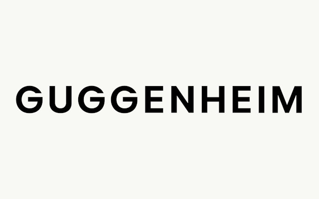
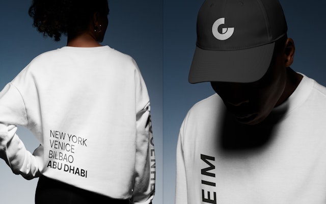
At the centre of the brand identity, the new Guggenheim logo is simple and authoritative and builds on the brand’s clear heritage of geometric typography. Strong, modern and impactful, it is designed for a global audience while firmly rooted in the Museum’s history.


Developed to work in perfect harmony with the new logotype, the primary typeface, Guggenheim Sans is a modern, human-looking geometric Open Source typeface.
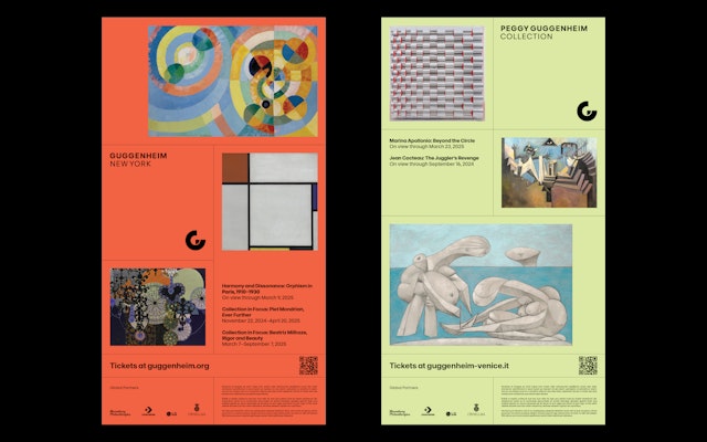
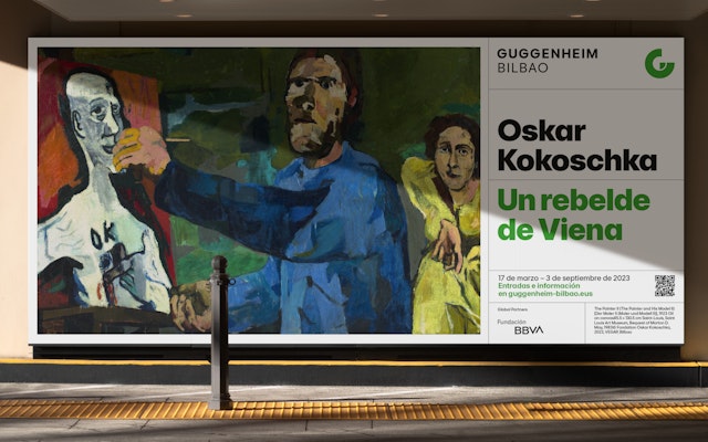
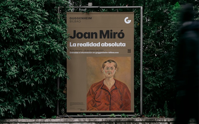

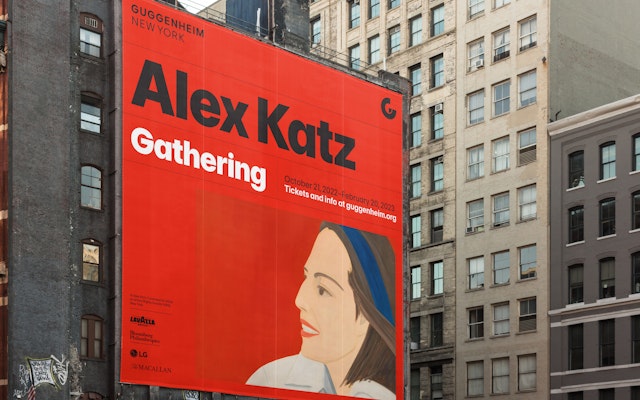
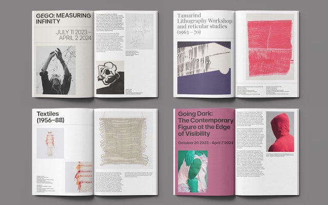
Following Museum guidelines, artist imagery is never cropped without consent, and graphics and typography are always kept separate and never overlaid onto the artworks.

Founded in 1937, the Solomon R. Guggenheim Foundation is dedicated to collecting, preserving, and interpreting modern and contemporary art, inviting audiences worldwide to explore its architecturally and culturally unique museums, exhibitions, publications, and digital experiences.
From the groundbreaking visions of Frank Lloyd Wright and Frank Gehry to the stately Palazzo Venier dei Leoni, each Guggenheim museum offers more than a setting for contemporary art—they are celebrated architectural masterpieces in their own right.
Known as the Museum of Non-Objective Painting, the first Guggenheim Museum opened in New York in 1939. The need for a permanent building to house Solomon R. Guggenheim’s art collection became evident and, on October 21, 1959, The Solomon R. Guggenheim Museum opened in New York City in a stunning building designed by renowned architect Frank Lloyd Wright.
Until 1982, the Museum operated without a formal visual identity, when its first brand identity was designed by Massimo Vignelli. After several evolutions, Pentagram’s Abbot Miller designed the most recent identity in 2013.
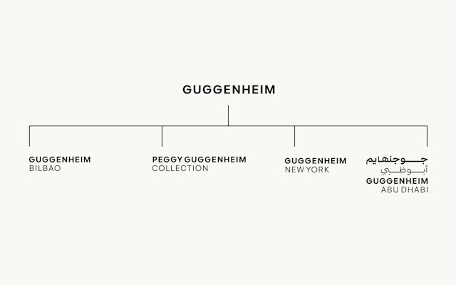
The Guggenheim now spans four locations: New York, Venice, Bilbao and Abu Dhabi, which is set to open in 2025. Pentagram was asked to create a new single-tier identity system for the constellation of museums that would work seamlessly across all its different activities, establishing it as a leading global cultural brand that provides unique art experiences across three continents. As well as unifying the organisation, it was important that the new identity would create a shared sense of purpose, aligning the Museum’s vision and values.
The Pentagram design team was supported throughout the project and worked closely with the inhouse team at Guggenheim. After meeting the team in each location, and working with Jane Wentworth on the brand strategy and positioning, Pentagram set about creating a modern, cultural brand for the Guggenheim constellation. Centered on the idea of ‘one brand, one constellation, one vision and many experiences’, the tone of voice and language used throughout (devised and written by Pentagram's Brand Narrative team) explain why art is important and communicate that the Guggenheim is a museum for everyone.
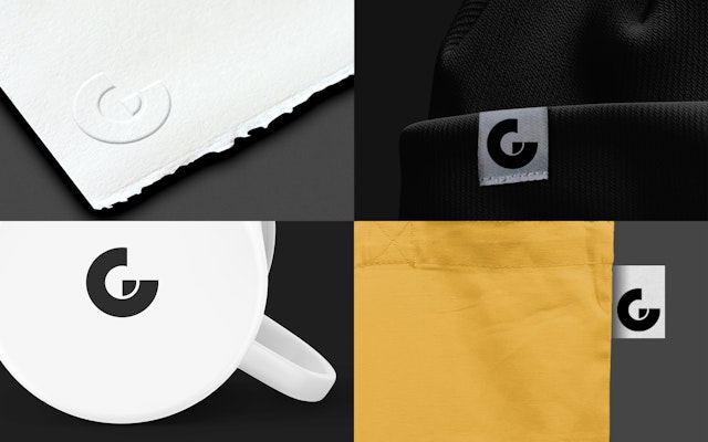
At the centre of the brand identity, the new Guggenheim logo is simple and authoritative and builds on the brand’s clear heritage of geometric typography. Strong, modern and impactful, it is designed for a global audience while firmly rooted in the Museum’s history.
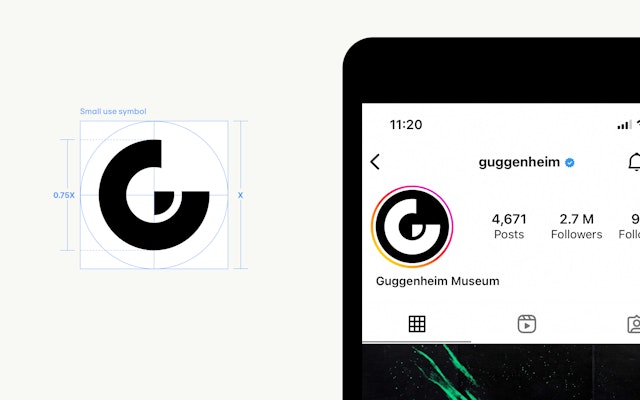
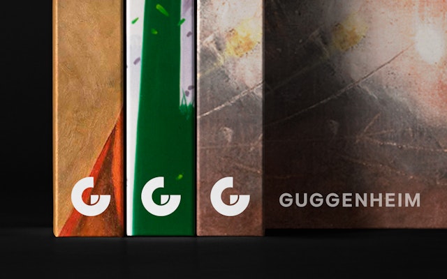
Based on an abstract form of the letter G, the new symbol is a singular and powerful mark that consolidates the different locations in a single unit, ‘holding’ the constellation together and reflecting the Museum’s new unified spirit. The symbol provides a simple, iconic sign-off, echoing the architectural form of the museums, and providing brand recognition across a wide range of varied touchpoints.
The symbol can also appear as an outline, and beyond the formal version, a series of free-form iterations of the mark can also appear as animations and static images allowing the museums to have a more expressive side to their visual language.
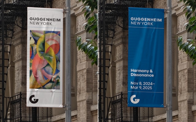
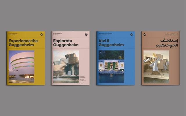
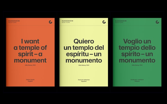
Developed to work in perfect harmony with the new logotype, the primary typeface, Guggenheim Sans is a modern, human-looking geometric Open Source typeface. Adapted from the Open Source typeface Inter, which was originally drawn by Rasmus Andersson, two versions were created, Guggenheim Sans, and Guggenheim Sans Display.
Additionally, a specific Arabic version of the typeface has been created by Debakir and TB.D. Studios to work alongside this. The secondary typeface, Playfair (an Open Source typeface by Claus Eggers Sørensen), provides a refined contrast to the modernity of Guggenheim Sans. A set of bespoke icons was also created, echoing the brand’s bold geometric forms and strong contrast.
Following Museum guidelines, artist imagery is never cropped without consent, and graphics and typography are always kept separate and never overlaid onto the artworks. Layouts for assets such as posters and ads are built on a flexible framework, with modular components, to ensure consistency across diverse formats and touchpoints. Colour is used strategically as an accent for emphasis, or as a full background to highlight information.
Motion plays a significant role in the identity, guided by the concept of ‘Amplification,’ creating a cohesive family feel for Guggenheim animations and linking to the Museum’s brand strategy, ‘We amplify the power of many imaginations.’
Pentagram’s new identity brings cohesion to the Museum’s global locations, honouring each museum’s unique character while reflecting their shared legacy. With the refined Guggenheim Sans typeface and the distinctive “G” symbol, the brand subtly echoes the architecture of each museum. Its new unified and accessible presence reminds us that the Guggenheim is truly ‘a museum for the world’.
Client
Guggenheim FoundationSector
- Arts & Culture
Discipline
- Brand Identity
- Typefaces
- Brand Strategy
Office
- London
Partner
Project team
- Johannes Grimmond
- Hyo Lee
- Tiffany Fenner
- Ashley Johnson
- Sarah Krebietke
- Ben Rawlinson-Plant
- Jiminie Ha
- Guggenheim Global Communications Team
Collaborators
- Jane Wentworth (Positioning strategy)
- Tom Baber (Western typeface)
- TB.D. Studio/Fahad Al-Hunaif (Arabic typeface)
- Debakir Studio/Khajag Apelian (Arabic typeface)
- Pilar Morquillas Azpiazu (Merchandising)