Halma worked with Pentagram to create a new group identity that would express their purpose more accurately.


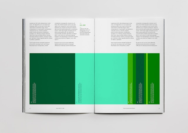
The solution required a new brand system that was flexible, allowing the group’s voice to support its companies and their activities, but also to take the lead where needed.
Pentagram has delivered a new holistic system that unified this complex and diverse group and added a sense of continuity to all brand communications.
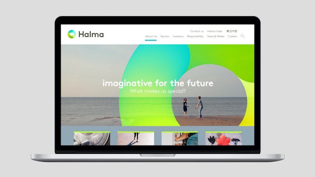
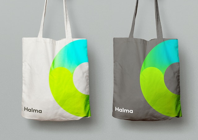

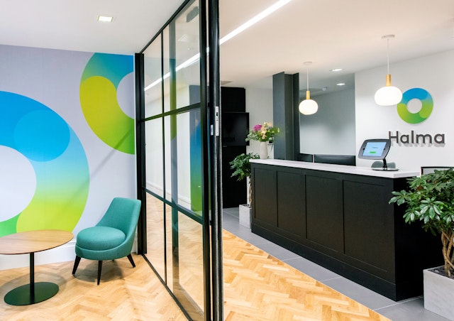
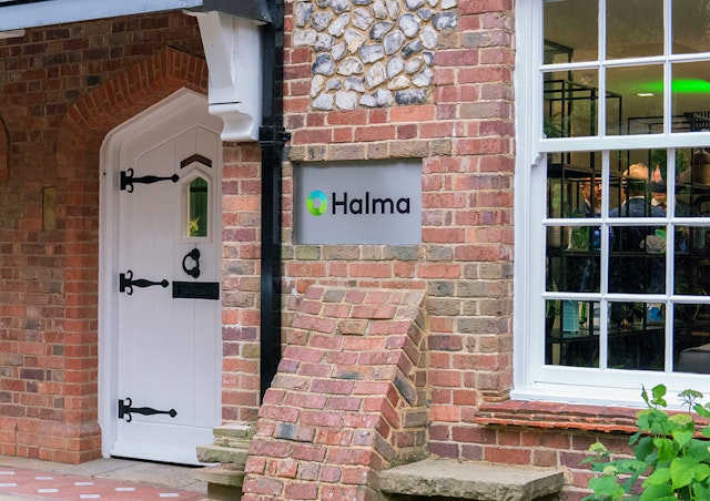
This new, circular brand symbol articulates the business of protecting and nurturing life.
Halma is a global group of life-saving technology companies driven by a clear purpose: to grow a safer, cleaner, healthier future for everyone, every day.
The group’s mission is to lead innovation and provide solutions to many of the critical safety, health and environmental problems facing the world today. Halma’s expertise covers three main areas: safety – protecting life as populations grow and urbanise; improving food, water and air quality; and meeting rising healthcare demand.
Halma worked with Pentagram to create a new group identity that would express their purpose more accurately. Beginning with the group’s brand purpose – ‘a safer, cleaner, healthier future’ and working closely with the company’s internal team, the goal was to develop a new brand strategy, brand architecture and identity that would clarify Halma’s ecosystem of over 40 companies and concisely communicate their various activities.
Through these explorations, it became clear that Halma, as the umbrella organisation, needed more visibility. The solution required a new brand system that was flexible, allowing the group’s voice to support its companies and their activities, but also to take the lead where needed.
Pentagram has delivered a new holistic system that unified this complex and diverse group and added a sense of continuity to all brand communications. This new symbol has both the stature to indicate experience and a track record of success but also conveys the kind and responsible nature of Halma’s approach, which respects the environment and is aware of the group’s social responsibilities.
This new, circular brand symbol articulates the business of protecting and nurturing life. It communicates both the scale of the movement, from the smallest manifestations through to its larger, life-changing projects. It also conveys the universal and interconnected nature of life, and a business that has experience and scale. The graphic language uses layers of transparency to suggest a respectful and non-imposing business practice.
Photographs of Halma offices by Richard Hanson
Office
- London
Partner
Project team
- Kate Blewett
- Jenni Kaunisto
- Marta Gaspar
- Stuart Gough
- Ian Osborne
