

The brand positioning and flexible, transformative identity focuses on Halstead as ‘agents of change’ in people’s lives.


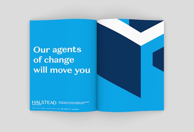
The reimagined “H” icon is architectural and spatial, and can be used in endlessly changing forms, expanding patterns, as a window for photography, and even as a directional arrow.
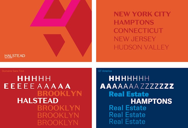
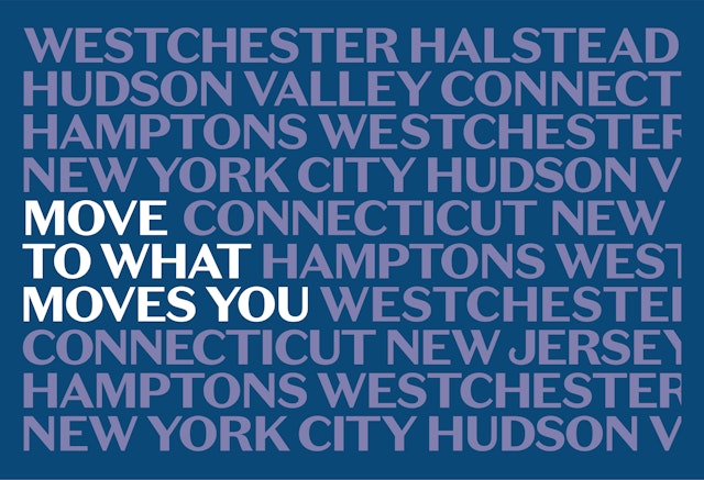
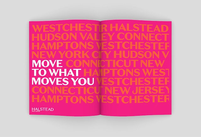


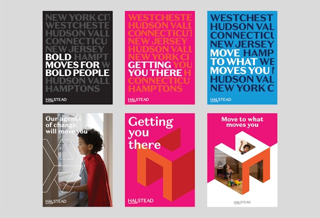

Market-specific color sets allow neighborhood characteristics to shine while maintaining a strong connection to the core Halstead brand.


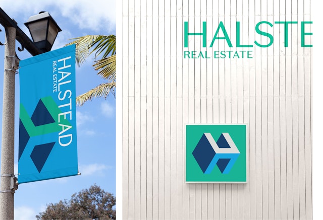
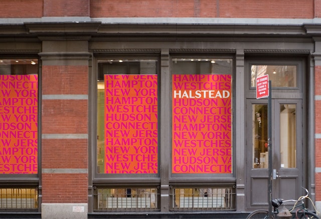
Halstead is a leading residential real estate brokerage firm in the New York metropolitan area. Pentagram has created a dynamic brand identity that captures Halstead’s unique position and transformative role in its clients’ lives. The program centers on a dimensional, changing “H” and a vibrant system of color, and encompasses brand positioning and messaging, environmental graphics and marketing campaigns, as well as the website.
Pentagram worked closely with Halstead leadership to develop the branding. New York real estate is one of the most crowded and competitive markets in the world, and Halstead was looking for an identity that would stand out to the public and agents alike. At the same time, the firm wanted to showcase its forward-looking perspective and one-of-a-kind breadth of capabilities and depth of knowledge. The identity needed to go beyond the familiar symbols of houses and staid typography to something more active, robust and integral. The new look is bold, contemporary and memorable, and speaks to the firm’s most powerful brand attributes while staying true to its core values and strengths.
“Halstead is at a pivotal moment, and our rebranding is comprehensive, reflecting where we are today and where we are heading. Over the years, we have evolved from a boutique New York City firm to a force operating in urban, suburban and second home markets across New York, Connecticut and New Jersey. We have built an internal foundation of incredible technology, marketing services and support companies without forgetting our mission as a real estate company based on relationships and skill. It is time to turn this outward,” says Diane M. Ramirez, Chairman and Chief Executive Officer of Halstead.
This starts with the brand positioning, which focuses on Halstead as “agents of change” in people’s lives. Halstead agents play a critical role in helping their clients make some of the biggest, most exciting and challenging changes in their lives. The work of the agents represents more than a simple transaction––they are trusted advisors, interpreters of the market, community builders, and much more. This supportive point of view is captured in the new tagline, “Move to what moves you,” encouraging clients to find what inspires them. Throughout the branding, the messaging speaks with an aspirational tone of voice that is smart, positive, passionate and helpful.
Strong, smart, robust and pragmatic, the identity’s visual language is built of a layered system of elements that can adapt and evolve for various applications and brand expressions. Like Halstead’s agents, the firm’s new logo is multidimensional and flexible. The reimagined “H” icon is architectural and spatial, offering the ability to stand alone as well as the flexibility for rotation, use in endlessly expanding patterns, and as a window for photography, or even as a directional arrow.
The logotype is set in Domaine Sans, a sleek, refined sans serif (designed by Klim Type) that is simultaneously historical and contemporary, bridging the past and future. The company name has been changed to simply “Halstead,” which can be accompanied by “Real Estate” to provide context when needed.
The vibrant and systematic approach to color sets the brand apart and evokes the dazzling diversity of New York and its neighborhoods. The corporate color set consists of an elegant palette of grays that anchors the brand, while three additional color sets reflect the company’s various markets throughout the tri-state region––Manhattan, the outer boroughs and the suburban areas. Each market has its own distinct character and qualities, and the different color sets allow these characteristics to shine while maintaining a strong connection to the core Halstead brand.
“Our variety of palettes taps into a growing movement in design that redefines the role of color in corporate branding. Alongside strong visual elements, this use of color allows you to appeal in a deeper way to audiences by tapping into more visceral connections that people may have to things like regions, seasons and emotions. We look forward to this exploration,” said Matthew Leone, Chief Marketing Officer of Halstead.
“We have developed a brand that truly represents our strengths and this will carry us into our next chapter––the best one yet,” says CEO Diane M. Ramirez.
Office
- New York
Partner
Project team
- Brankica Harvey
- Pedro Mendes
- Paul Yoon
- Steven Merenda
- Saundra Marcel
