Rooted at the intersection of comedy and culture, Hartbeat is the entertainment company founded by prolific comedian, actor, and entrepreneur Kevin Hart.


Hartbeat wanted a brand identity that expressed its mission—to unite a diverse, global audience around the essential connective tissue of laughter.
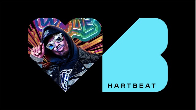


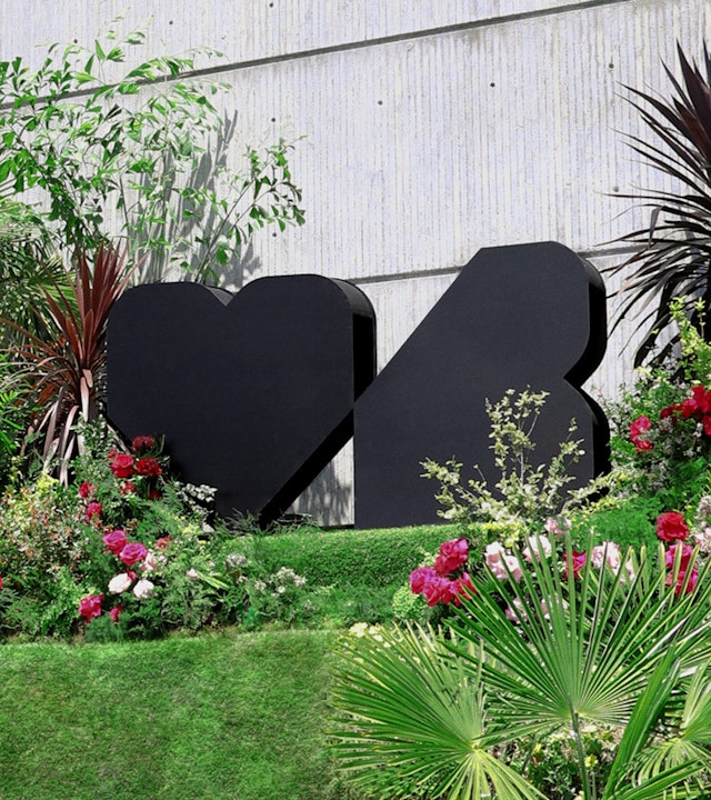
The logo features a sharp angle to convey their elevated edge, and it also creates a delicate but powerful point of connection at the center, highlighting the intersection of humor and heart where this brand lives.
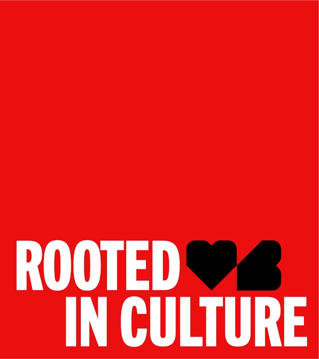


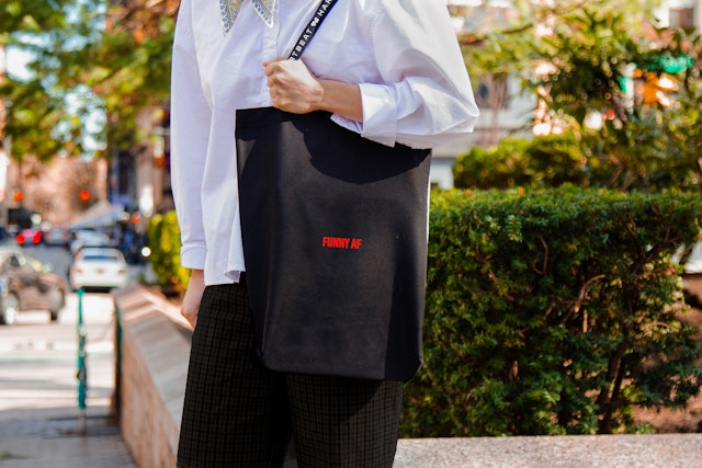
The primary color palette of white, black, (for simplicity) and red (for heart) is combined with a suite of secondary pop colors and neons.


Rooted at the intersection of comedy and culture, Hartbeat is the entertainment company founded by prolific comedian, actor, and entrepreneur Kevin Hart. With a vision to be the biggest, most influential multi-platform entertainment brand in the world, Hartbeat needed an identity bold enough to match its ambitions.
The Hartbeat team approached Pentagram with an intriguing challenge: after a decade of building two high-growth media companies—Laugh Out Loud and Hartbeat Productions—they needed to unite these two legacy brands into one entertainment enterprise, while telling the story of each arm of the business.
The theme of unity ran throughout the project, as Hartbeat also wanted a brand identity that expressed its mission—to unite a diverse, global audience around the essential connective tissue of laughter.
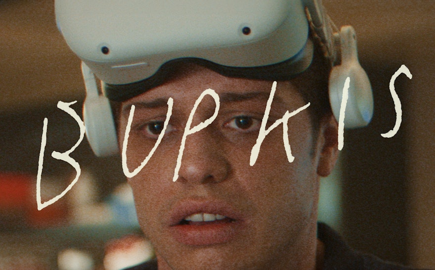
Although laughter is at the heart of the brand, both the Hartbeat team and the design team agreed that the brand identity should not feel funny or jokey, but rather should be something with grace and gravitas that could support the wide range of entertainment properties within.
The design team began with articulating Hartbeat’s brand ethos—“elevated edge.” This phrase captures the balance of premium quality and confident swagger the brand wants to be known for.
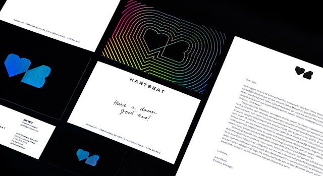
With this idea as the north star, the team designed a simple, strong mark that acts as a rebus for the brand name. The logo features a sharp angle to convey their elevated edge, and it also creates a delicate but powerful point of connection at the center, highlighting the intersection of humor and heart where this brand lives.
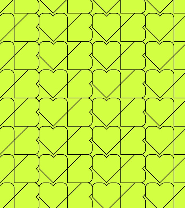
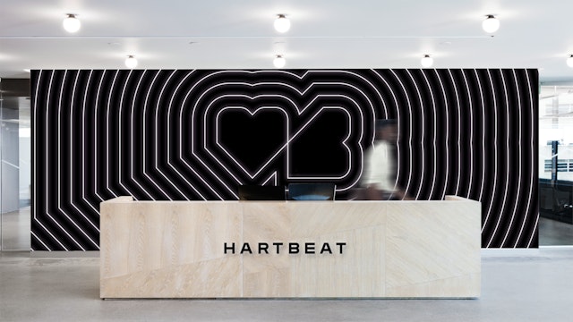
Pentagram expanded the identity into a complete visual language, including a division branding system and a suite of animations. The intersecting shape is used throughout the brand to create patterns, dividers, and containers for color and image, bringing dynamic energy to the brand’s collateral. Radiating linework also evokes an abstract representation of a pulse or heartbeat.
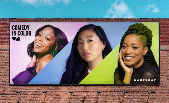
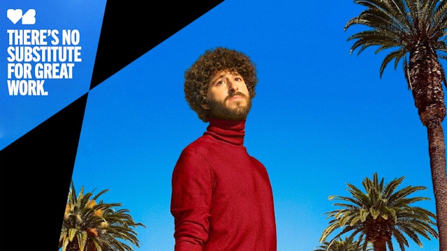
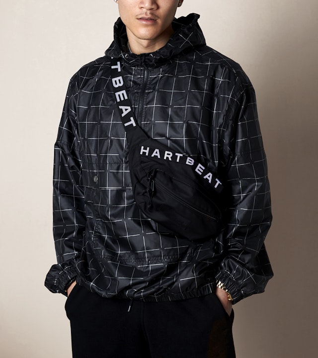
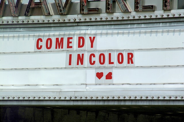
The primary color palette of white, black, (for simplicity) and red (for heart) is combined with a suite of secondary pop colors and neons. To show Hartbeat’s diversity of voices, an animated gradient representing “comedy in color” is used for special cases.
Hartbeat’s new wordmark is set in Trade Gothic Next Bold, surrounded by a typographic system composed of various weights of the same typeface. For headlines, Heavy Compressed is always styled in upper case, giving the brand its signature typographic style.
The design team rounded out the project by designing a teaser site and full website, a suite of social media templates, email newsletters, stationery & presentation templates, a studio open, and a company sizzle reel.
With an iconic identity leading the charge, Hartbeat is poised to expand its global reach and bring the unifying power of laughter to every corner of the world, at a time when laughter—and unity—are needed more than ever.
Office
- New York
Partner
Project team
- Mira Khandpur
- Anastasia Kharchenko
- Meredith Zerby
- Renee Freiha
- Greg Morrison
- Matt Varner
- Jase Hueser
- Samantha Infante
- Lisa Grant
Collaborators
- Steven Merenda, website design
- Steven Guas, 3D rendering
- Ben Law, 3D rendering
- Alex Trierweiler, sizzle editing