The identity positions Hologram as a disruptor in the category and builds on the company’s belief in the power of science for the good of humanity.


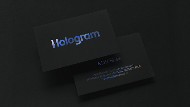
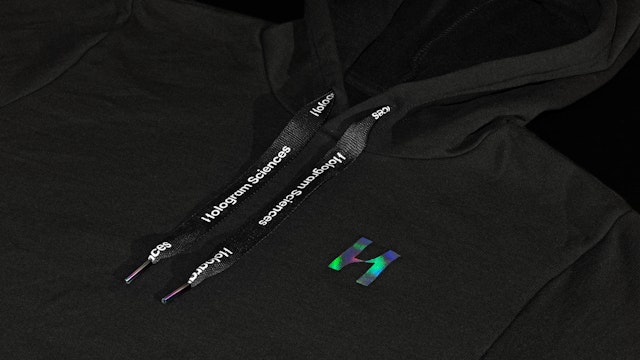
The Hologram logo combines the letter ‘H’ with a strand of DNA, and true to the name, appears with a vibrant holographic treatment.
Hologram Sciences is a new company pioneering the development of personalized nutrition. The B2B company combines data-driven science, powerful technology and habit building to create customized solutions that help people optimize their health and wellbeing. Pentagram has created a new brand identity, brand strategy, messaging and digital design for Hologram that captures its dynamic mix of science, technology and nutrition.
The Challenge
Hologram is backed by DSM, one of the world’s leading producers of essential nutrients as well as solutions for the pharmaceutical and personal care industries. Hologram has the mission of making everyone’s health goals achievable through personalized nutrition, and it sought a brand identity that was simple, straightforward and accessible. At the same time, it wanted the branding to project a futuristic mystique that would hint at its tech-driven ethos and appeal to the scientific community and potential collaborators as the company continues to grow.
The Strategy
The brand identity positions Hologram as a disruptor in the nutritional category and builds on the company’s belief in the power of science for the good of humanity. The brand strategy and messaging are framed around the concept of “fearless empathy”—the idea that Hologram is driven by bold technological innovation while also being compassionately focused on creating products that make lives better. This inspiring point of view is expressed in the brand line, “Reimagining the future of nutrition.”
The Solution
The identity translates this approach into a visual language that is clean, crisp and modern—with a twist. The logo combines the letter “H” with the double helix of a strand of DNA, with the crossbar twisting between the two stems. The two halves are used as frames to juxtapose images of science (chemistry, technology) and nature (human activity, the natural world, healthy lifestyles), turning the logo into a visual metaphor for Hologram as a bridge between them. The contrast comes to life on the website, where moving images play within the “H” monogram.
True to the Hologram name, the logo appears with a vibrant holographic treatment where possible—foil stamped on printed items like business cards, or with the effect recreated as a gradient on digital applications. The wordmark is modified from the geometric sans serif Roobert (from Displaay), and primary typography is set in the friendly but sharp neo-grotesque font ABC Diatype (from Dinamo), used only in its lightest weights to relate to the thinnest part of the twist in the logo.
Photography is an important element of the identity, and beautiful and slightly abstract images are thoughtfully used to balance the scientific expertise with warmth and approachability. These images are central to the website, where they fill the full frame of the homepage and stand out against the black and white of the identity. The site is organized in a navigational framework that nods to the scientific process. When the cursor hovers over a clickable element, it transforms into a circle inspired by a microscope viewfinder.
Client
Hologram SciencesSector
- Health
- Technology
Discipline
- Brand Identity
- Digital Experiences
- Brand Strategy
Office
- New York
Partner
Project team
- Mira Khandpur
- Greg Morrison
- Elizabeth McMann
- Katherine Killeffer
- Renee Freiha
- Lisa Grant
