


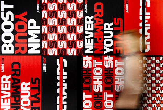
The muscular wordmark treats the name as a palindrome that hinges on the central S.


Muscle cramping can be a troublesome pain for performance athletes, and depending on the activity, potentially life-threatening. HOTSHOT is a new sports shot that prevents and treats muscle cramps by stopping them where they start, at the nerve. Pentagram designed the brand identity and packaging for HOTSHOT.
HOTSHOT was invented by Dr. Rod MacKinnon, MD, a Nobel Prize-winning neuroscientist and endurance athlete, in collaboration with Bruce Bean, PhD, a neurobiology professor at Harvard Medical School. MacKinnon used his expertise to identify natural ingredients that enhance Neuro Muscular Performance (NMP) by targeting a specific set of neurons called TRP ion channels. Drinking HOTSHOT before and after exercise boosts an athlete’s NMP to stop cramps, so the athlete can push harder, train longer and finish stronger. The product been endorsed by several top endurance athletes, including Craig “Crowie” Alexander, a five-time triathlon world champion.
The HOTSHOT identity stands out from other athletic brands while also fitting smoothly into the sports category. The muscular wordmark treats the name as a palindrome that hinges on the central “S.” The logotype is set in the brawny font Torque, designed by Type Supply, with an inline that alludes to the nervous system. The word “HOT” is set off in a bright, hot red, a clear-cut reference to pain and medicine, as well as the peppery taste of the shot. On canisters, the name is stacked, with the word’s orientation flipped at the central “S” between “HOT” and “SHOT” so it can be read both ways. The team also designed a visual language for the brand, including custom icons that represent the things HOTSHOT does, like treat, prevent and recover.
The small bottle packages HOTSHOT in a canister-like shape. The molded cap features the “S” at its center. The team also designed 12-packs that open up to double as point-of-purchase displays and distinctive shipping crates that wrap the wordmark around the entire box.
