
The monogram features three dots inspired by the trio of co-founders as well as the three pillars of IFW.
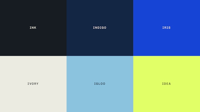
The bright and contemporary color palette goes beyond the pastels ubiquitous in branding for women.

IFundWomen is a startup funding platform that provides female entrepreneurs with access to capital through crowdfunding and grants, expert business coaching and a growing network of women business owners. Named one of Nasdaq’s 10 Best Sources of Funding for Women Entrepreneurs, IFW is the go-to marketplace for women-owned businesses and the people who want to fund them. Pentagram has worked with IFundWomen on a brand identity that captures the platform’s empowering and collaborative approach. The project encompasses brand strategy, positioning and messaging, as well as the redesign of the IFW website, newsletters, social media assets, and other brand applications.
Pentagram first met the IFW co-founders Karen Cahn, Kate Anderson and Sarah Sommers when the designers led a session on branding at Wingable, a six-week startup accelerator program presented by The Wing, the network of co-working and community spaces for women, and _able, an investment partnership with a focus on women-led brands. (Pentagram previously designed the brand identities for both The Wing and _able, as well as the graphics for Wingable.)
Before starting on the visual identity, the Pentagram team worked with IFW on developing brand strategy and positioning that would set it apart as the only crowdfunding ecosystem designed specifically for early-stage, female entrepreneurs. The team developed a brand manifesto that emphasizes the platform’s role as smart, passionate coaches and mentors––“We empower women to realize their vision”––and messaging that highlights core themes of opportunity, access and acceleration. The branding is confident, sophisticated and approachable, conveying IFW’s unrivaled expertise in putting female-led startups on the road to success.
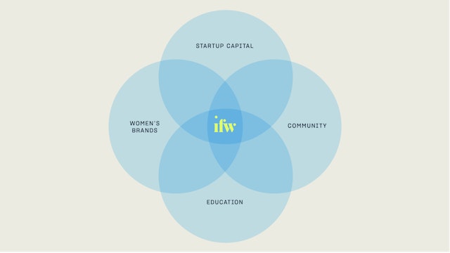
This dynamic spirit of enterprise is reflected in the identity, which centers on a monogram that is sharp, clean and stylish. IFundWomen’s previous logotype featured a lowercase “i,” a treatment that didn’t feel right for an industry leader and financial powerhouse. The new identity makes the “I” officially uppercase in the name but preserves the lowercase “i” in the monogram, which turns the dot of the “i” into a graphic motif. The three dots in the logo stand for the trio of co-founders as well as the three pillars of IFW––capital, coaching and connections.
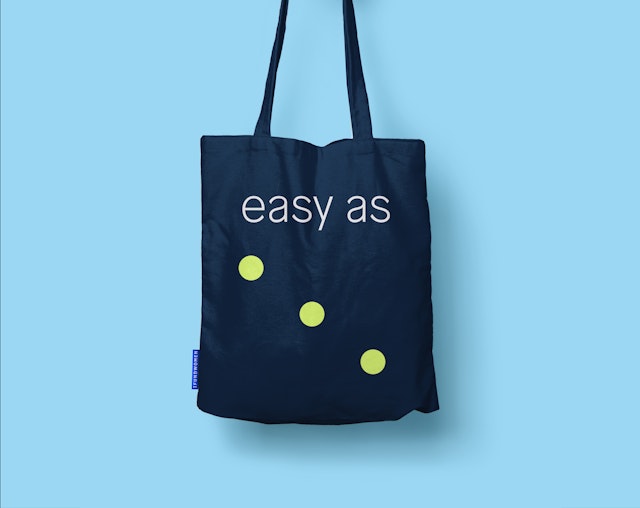
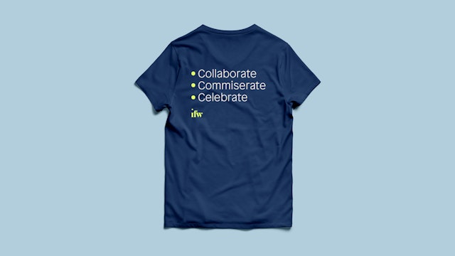
Outside the logo, the dots can be used to create simple abstract graphics, patterns and symbols that allude to the power of networks and community. The dots also function as part of the brand architecture, utilized as organizing elements (like bullets in a to-do list) and as a connector to co-brands and partnerships.
Brand typography is set in a pair of expressive neo-grotesks, Sharp Grotesk and Patron. The identity introduces a bright and contemporary color palette that goes beyond the pastels ubiquitous in branding for women, including a lime yellow that is a twist on the green typically associated with crowdfunding.
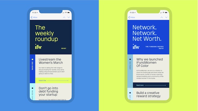
The identity has a flexibility that functions across an array of applications. The clean geometry of the logo is echoed in the modular design of the website, which combines vibrant blocks of color and images. As part of the new look, the designers developed new guidelines for IFW’s photography style, moving away from stock images to more authentic photos that are warm, candid and joyful, and when possible, feature the IFW community of project founders who have participated in and benefitted from the platform.
Office
- New York
Partner
Project team
- Mira Khandpur
- Shira Inbar
- Beatriz Congar
Collaborators
- Eva Green, strategy