Fluid photography alluding to satellites is central to the visual identity: Nature is brought to the fore, merged and distorted much like satellite technology which surveys the Earth piecemeal and reconciles each fragment into coherent yet pixelated outputs.
The Iltchi logo is a bespoke sans serif grotesque accentuated by sexagesimal degrees. 1 degree equates to 60 minutes (1° = 60') while 1 minute equals 60 seconds (1' = 60").
Sexagesimal degrees (degrees, minutes, and seconds – collectively DMS) are used to express latitude and longitude geographic coordinates around the globe. Decimal degrees are the alternative form and are decimal fractions of a degree.
Iltchi’s colour story is redolent of azure oceans, indigenous crafts, sun-drenched summer days and the momentary sluice of shadows enjoyed underneath billowing palm fronds. The deepest midnight blue lies in the depths of a night-time ocean and calm of a black canopied sky. The lull of the waves and softly crashing tides beckoning rest and smooth sailing.
When the blue of the sky above and calm blue of the ocean below acquiesce on long sea voyages, it is a safe adventure at sea – from island to island and coast to coast.

For collateral and editorial use, Iltchi’s modern serif typeface suite contrasts elegantly with the sans serif grotesque logomarque through placement that is at once bold and central. The sans serif typeface is marked by narrow apertures and a modulated stroke width, punctuating body text and melding seamlessly as a display font.
Iltchi’s visual language is a manifestation of the reality at sea, often punctuated by stormy and rainy weather, and is a far cry from typical sun-washed and tropical haven imagery common to the yachting world.
An invitation to set the sails with Iltchi from Bremerhaven’s harbours in the North Sea or the shorelines of Mexico’s scenic coasts. The golden hour is on Iltchi.
The serif typeface is marked by a protracted vertical axis, elegantly contrasted with broad and flattened serifs on the horizontal plane.
The distorted and wind-blown imagery is speckled with sun-drenched locations, meandering shorelines, the piercing gaze of palm trees, sky-blue skies, great plains, archipelagos and botanical life.
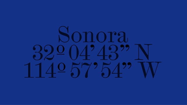
The printed tabloid "Iltchi, Towards the setting Sun" explores both Sonora (32°04'43"N, 114° 57'54"W) and the North Sea’s Bremerhaven (53°33'00"N, 8°34'36"E) with editorials on each of the cities. Bremerhaven, specifically, ranks amongst the top 30 busiest seaports in the North Sea.
The North Sea is a key location for sea trade and its shipping lanes rank amongst the highest in terms of traffic. The largest ports strung across the North Sea’s coastline include Rotterdam, Antwerp ranked 16th, Hamburg 27th and Bremen/Bremerhaven and Felixtow which are among the top 30 busiest seaports.
Pentagram’s branding for Iltchi is a direct reference to geographic coordinate and compass systems with the theme of wind embodied in the design language of the Iltchi branding, scattering accompanying imagery like grains of sand.
The Wordmarque and Colour Swatch
The wordmarque is a bespoke sans serif grotesque font accentuated by latitude and longitude glyphs depicted in degrees, minutes and seconds. 1 degree equates to 60 minutes (1° = 60') while 1 minute equates to 60 seconds (1' = 60"). In nautical miles (nm), 1 nm is equal to 1' of arc length of latitude or 1' of arc length of longitude at the equator.
Iltchi’s colour story is redolent of azure oceans, sun-drenched summer days and the momentary sluice of shadows enjoyed underneath billowing palm fronds.
The Visual Identity
The visual identity is central to the branding and is underscored by pixelated photography alluding to satellites. The beauty of nature is merged and distorted altogether through the mechanics of satellites, which scan the Earth piecemeal and patch each fragment into coherent, yet pixelated perspectives.
These concepts animate the deepest expanses of sea travel, charting far-off destinations and nautical culture while de-emphasising traditional travel photography. The distorted and wind-blown imagery is speckled with sun-drenched locations, meandering shorelines, the piercing gaze of palm trees, sky-blue skies, great plains, archipelagos and botanical life.
The visual language symbolises, to some extent, a romantic desire for a simpler life in close contact with nature. It also resonates with the extraordinary rush of unraveling unknown lands and topographies.
Storytelling and Print Ephemera
Iltchi’s print ephemera brings to life the Iltchi wordmarque, typography, colour palette and visual identity in a rich editorial format. Iltchi’s printed tabloid explores the North Sea’s Bremerhaven (53°33'00"N, 8°34'36"E) with an editorial on the city. Bremerhaven, specifically, ranks amongst the top 30 busiest seaports in the North Sea and is a nod to the European roots of Iltchi yachting.
The tabloid also touches upon the essence of travel and its promise of newfangled friendships with unknown peoples, cultures and inhabitants – whether setting the sails for Bremerhaven or any place else the wind takes us.
Sector
- Hospitality & Travel
Discipline
- Brand Identity
- Publications
- Campaigns
- Typefaces
Office
- London
Partner
- Sascha Lobe
Project team
- Johannes Spitzer
- Louis Meeus
- Rommina Dolorier
- Shawden Sheabar
- Miltos Bottis
- Michel Bütepage
