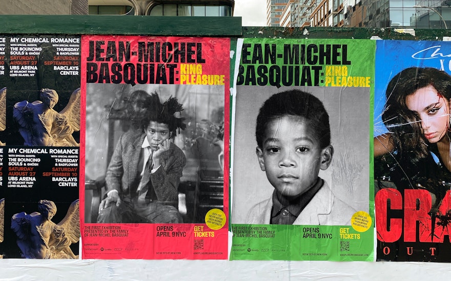
The exhibition is the first major retrospective to be curated and executive produced solely by the Estate of Jean-Michel Basquiat.


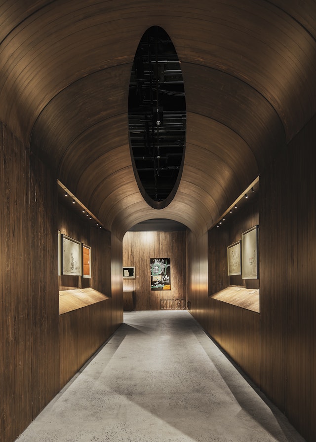
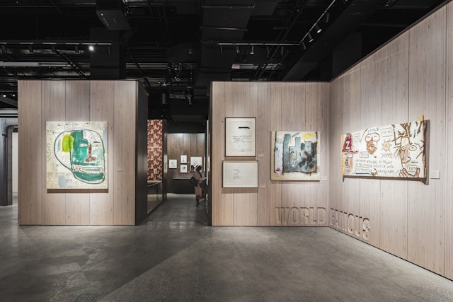
Over 200 paintings, drawings, ephemera and artifacts create an intimate and multidimensional portrait of Jean-Michel that can only be told by his family.

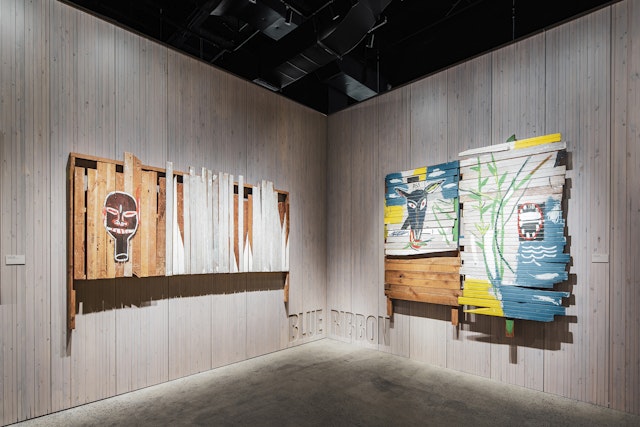
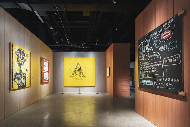
The striking exhibition design includes immersive recreations of Basquiat’s childhood home and Great Jones Street studio.


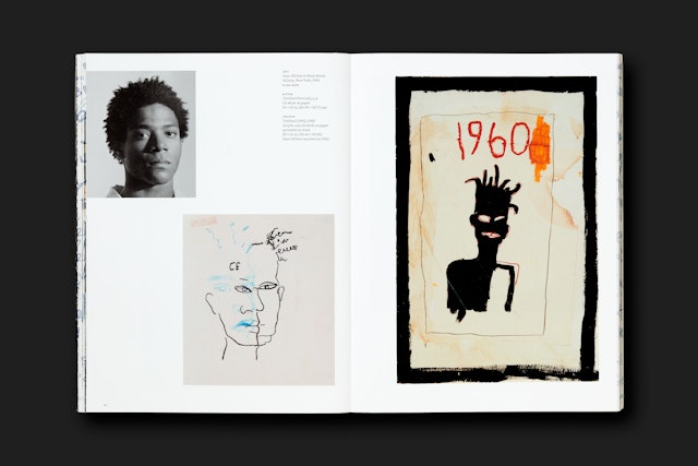
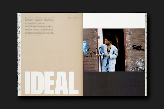
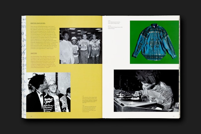
The design of the accompanying book has an improvised, organic feel, like a scrapbook or family album.



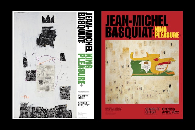
The graphics utilize a vibrant palette inspired by the bright, pure color the artist used in his paintings.


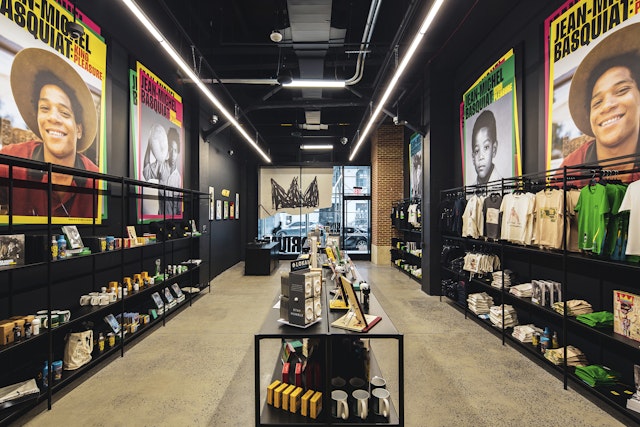


Jean-Michel Basquiat: King Pleasure© is a celebration of the life and legacy of the visionary American artist, tracing his personal history from his childhood in Brooklyn through his meteoric early success in 1980s New York and posthumous cultural impact as a witness to social and racial injustice. The exhibition is the first major retrospective to be curated and executive produced solely by the Estate of Jean-Michel Basquiat and features over 200 never-before-seen and rarely exhibited paintings, drawings, ephemera and artifacts to create an intimate and multidimensional portrait of Jean-Michel that can only be told by his family. The show opens to the public on April 9 for a yearlong run at NYC’s landmark Starrett-Lehigh Building in West Chelsea.
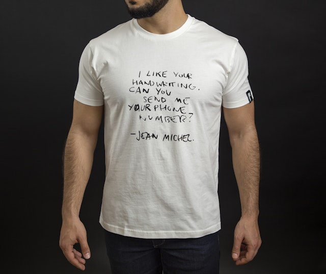
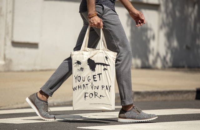
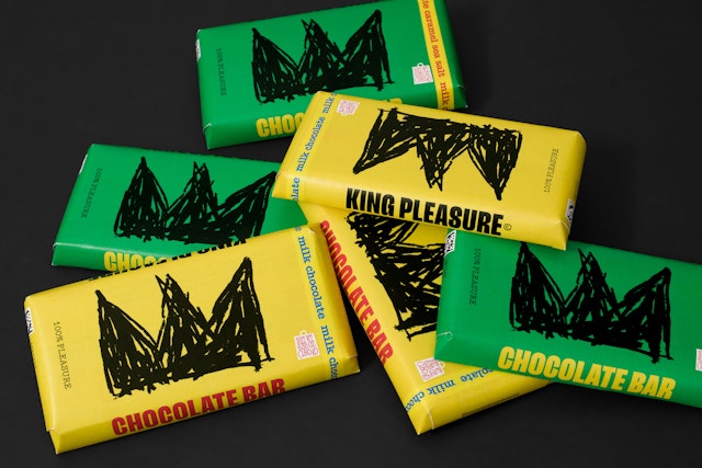
Pentagram’s Abbott Miller and team developed the visual identity for Jean-Michel Basquiat: King Pleasure©, including the exhibition graphics and promotional campaign, merchandise and book design. The cohesive system complements the striking exhibition design, which shares the artist’s story and works in a series of thematic galleries and immersive spaces, including recreations of Jean-Michel’s childhood home and Great Jones Street studio.
Jean-Michel’s sisters Lisane Basquiat and Jeanine Heriveaux and his stepmother Nora Fitzpatrick produced the exhibition with Ileen Gallagher, principal of ISG Productions, with whom Miller has previously collaborated on projects for The Rolling Stones, Harley-Davidson and the Rock and Roll Hall of Fame and Museum. The designers worked closely with the Basquiat family, the Adjaye team, and Gallagher to develop a visual framework that is closely calibrated to the different moods of the exhibition.
The promotional graphics feature strong portraits of Jean-Michel at various ages. The artist is himself an iconic figure in pop culture, and the campaign uses a series of portraits, rather than his paintings, to signal that the retrospective is taking a different, more personal approach than the many other exhibitions of his work. The idea was embraced by the family, who wanted to highlight the son and brother they knew, and the principal poster features a photo of Jean-Michel as a child.
The identity utilizes a vibrant palette inspired by the bright, pure color the artist used in his paintings. The primary typography is an emphatic sans serif called Lektorat (designed by Florian Fecher) with body copy set in Typewriter (by A2).
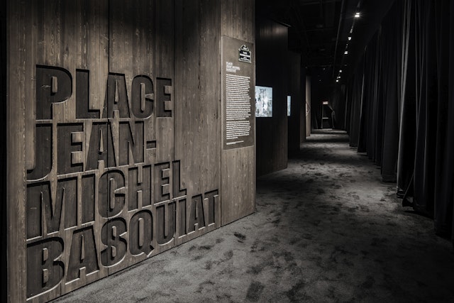
The graphics are closely integrated throughout the 15,000-square-foot-exhibition, which is organized by distinct periods in the artist’s career. Adjaye’s design features walls made of cross-laminated timber (CLT) whose vertical grooves recall the fence-like panels Basquiat used for several of his paintings. The section titles are incised into the wood in large-scale type, wrapping around corners to become part of the surroundings.
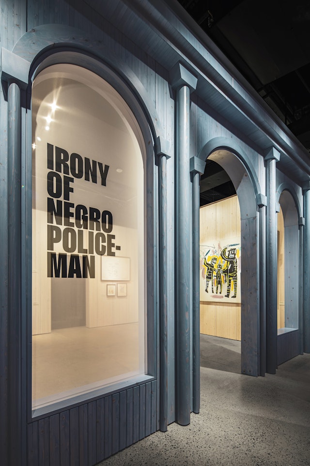
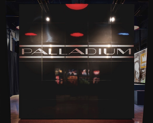
The centerpiece of the show is the recreation of Basquiat’s studio, complete with sketchbooks, notes, clothing, records, books and VHS tapes. Other environmental evocations include gallery storefronts and the cast-iron architecture of SoHo, as well as the Michael Todd Room at the Palladium nightclub, each with its own dedicated soundtrack. Digital screens feature filmed reminiscences by the sisters and other people who knew Jean-Michel.
Other moments include a wall-sized map of key locations in the artist’s life in Brooklyn and Downtown Manhattan as he grew up and became part of the NYC scene. The designers also developed textile and wallpaper patterns from photographic sources to recreate elements from the Basquiat childhood home, and recreated the lettering from the original Palladium building.
The exhibition’s firsthand point of view extends to the accompanying book, which was authored by the family and is published by Rizzoli Electa. The design has an improvised, organic feel, like a scrapbook or family album. Collage-like spreads are assembled from images of various artifacts and ephemera, and Basquiat’s distinctive hand-lettering runs around the book’s fore-edge.
Office
- New York
Partner
Project team
- Yoon-Young Chai
- Michelle Brown
Collaborators
- Adjaye Associates, exhibition design
- Ivane Katamashvili, exhibition photography
- James Shanks, product photography
