

The design goal was to create a bold and serious logotype that still retained a level of nuance and sophistication representative of the films themselves.


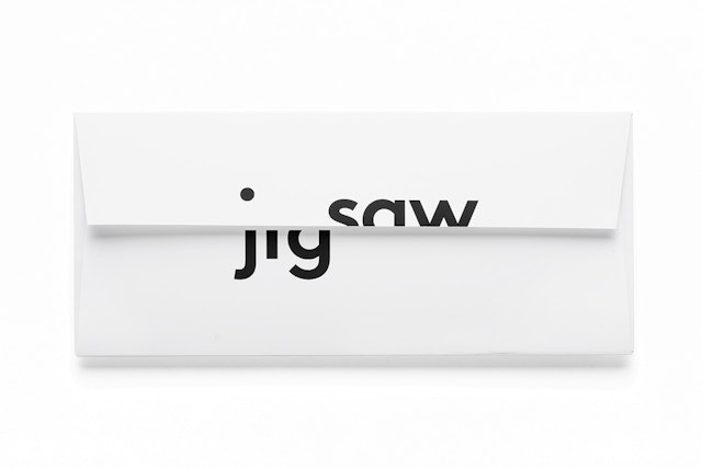
The logo plays with the physical edges of applications, capturing the tension in Gibney’s work while staying true to the meaning of the word “jigsaw.”
Jigsaw is the production company of the Academy Award-winning documentary filmmaker Alex Gibney, known for his gripping and insightful documentaries Taxi to the Dark Side, Enron: The Smartest Guys in the Room, We Steal Secrets: The Story of Wikileaks, and most recently, The Armstrong Lie, about Lance Armstrong. Pentagram’s Emily Oberman and team have created a new identity for Jigsaw that uses dynamic typography to convey the director's hard-hitting yet balanced approach.
Jigsaw's name is inspired by the "jigsaw" teaching technique, which makes each student in a class responsible for a different aspect of knowledge of a particular subject. The various perspectives come together to form a full picture and elevate the level of education for all. Gibney uses a similar collaborative strategy in his documentaries, assembling multiple points of view to tell complex stories.
Our goal with the design was to create a bold and serious logotype that still retained a level of nuance and sophistication representative of the films themselves. This was accomplished by distilling the graphics down to a few impactful elements: a strong, straightforward lowercase sans serif wordmark, a journalistic black-and-white color palette, and a simple, memorable concept. By removing sections of the letterforms, we were able to visually represent the interplay of different voices and perspectives that make up the narrative of each film. The viewer participates in the identity, filling in the blanks with the missing information. The two halves of the mark also strike a balance, suggesting a look at both sides of an issue.
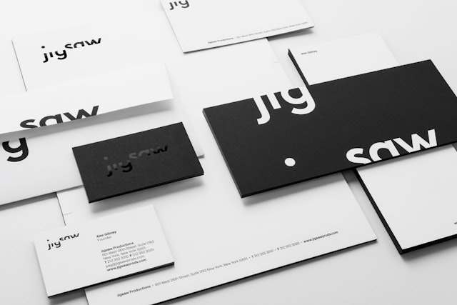
The logo plays with the physical edges of applications, capturing the tension in Gibney’s work while staying true to the meaning of the word “jigsaw.” Letterforms bleed on and off the frame to form expressive lockups that turn the logo itself into a kind of puzzle. On stationery the black-and-white color palette has been elevated through foil stamping, with black foil applied to the edges of letterhead, business cards and other collateral. This subtle and unexpected detail gives the pieces a powerful appearance when stacked together and a tactile and visual twist when seen apart from the system.
