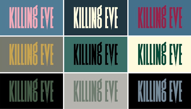
The elegant yet ominous typeface smothers the screen, used as large as possible for maximum visual impact.


One of the most critically-acclaimed thrillers on television, Killing Eve traces a mutually growing obsession between a glamorous assassin, Villanelle (Jodie Comer), and Eve Polastri (Sandra Oh), an MI6 operative who fantasizes about being a spy. Prior to joining Pentagram as partner, Matt Willey designed the identity and titles for the show. Adapted from an original novella by Luke Jennings for BBC America in 2018, the Emmy award-winning show will return for its third season in April 2020, with the fourth season in the works.
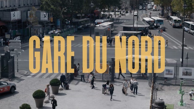
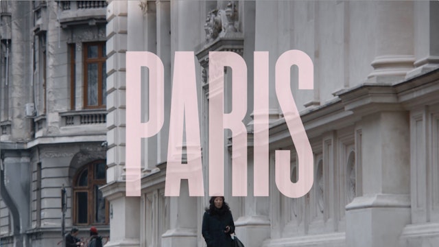
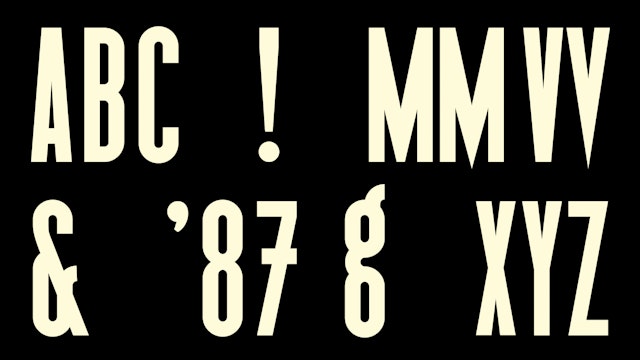
The first season was written by the talented writer and actor Phoebe Waller-Bridge, whose other credits include the BBC show Fleabag, with a female lead writer for every season since. The strong female-led show demanded an equally compelling identity. Pentagram custom-designed a condensed, tightly-kerned typeface that has knife-sharp edges and a subtle blood-drop animation that trickles down from the inverted points between the letters—a nod to the show’s chilling, bloody narrative. This elegant yet ominous typeface smothers the screen, used as large as possible for maximum visual impact. As the characters chase each other across the globe, the show announces each new chic destination—cities like Vienna, Moscow and Paris—with the same massive letters. A rich palette of muted, stylish colors, different for every episode, complements the distinctive typeface.
Matt worked closely with the producers and the show’s script to create the identity and title design, which received a Royal Television Society Craft & Design Award and a BAFTA nomination. The identity was also extended onto a limited-edition, blood-splattered LP packaging for the show’s BAFTA TV award-winning soundtrack, curated by DJ/composer David Holmes and Killing Eve’s music supervisor Catherine Grieves.
Office
- New York
