The identity has the flexibility to grow along with Landmark Theatres and convey the chain’s wide variety of entertainment experiences.


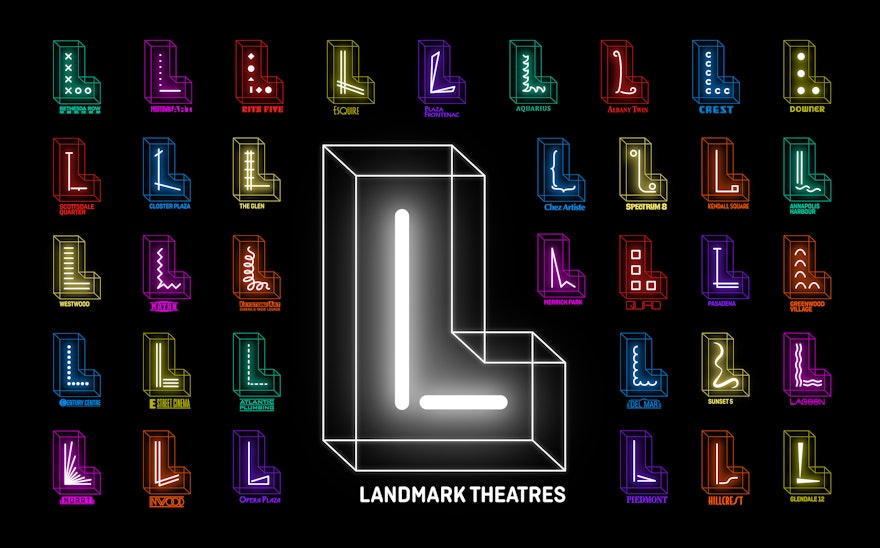
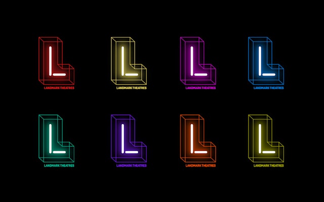
The identity centers on a dimensional letter ‘L’ with a smaller neon ‘L’ inside, in bright neon colors.


Founded in 1974, Landmark Theatres is a chain of movie theaters with 35 locations and 178 screens in 24 markets across the US. These range from small arthouses specializing in independent and foreign films, like Landmark’s historic flagship Nuart Theatre in Los Angeles, to state-of-the-art multiplexes showing mainstream box office hits.
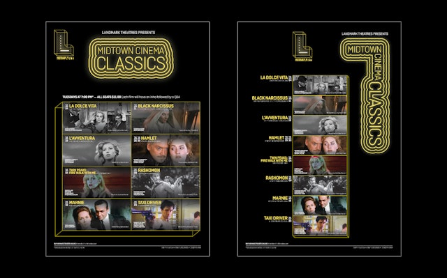
Pentagram has designed a bold new brand identity system for Landmark Theatres that has the flexibility to grow along with the chain and convey its wide variety of entertainment experiences. The identity centers on a dimensional letter “L” with a smaller neon “L” inside, in bright neon colors. The new look encompasses everything from Landmark’s website, promotional campaigns and social media to signage, environmental graphics and animations at its theaters.
The new identity follows the acquisition of Landmark Theatres by Cohen Media Group in 2018. Landmark wanted to introduce a stronger, more cohesive sense of branding that would increase overall visibility while also allowing each location to have its own identity. Pentagram previously collaborated with Cohen Media Group on its brand identity, as well as the graphics for the Cohen-owned Quad Cinema in New York, which is now part of Landmark but will retain its own identity.
“The goal for the Landmark Theatres rebranding was to open the brand to a younger generation and more diverse audience,” says Mark Mulcahy, Landmark’s Head of Brand/Marketing. “These are the frequent moviegoers that support the theatrical experience all year round.”
The branding is infinitely expandable, with a logo that can be customized for each location with its own individual neon “L.” Some of the theaters within the chain are already recognized by their own name and graphic identity, while others are simply known as Landmark; the identity had to be able to accommodate both. A theater’s existing logotype can be incorporated into the mark as a signature, or a new “L” can be created for the venue.
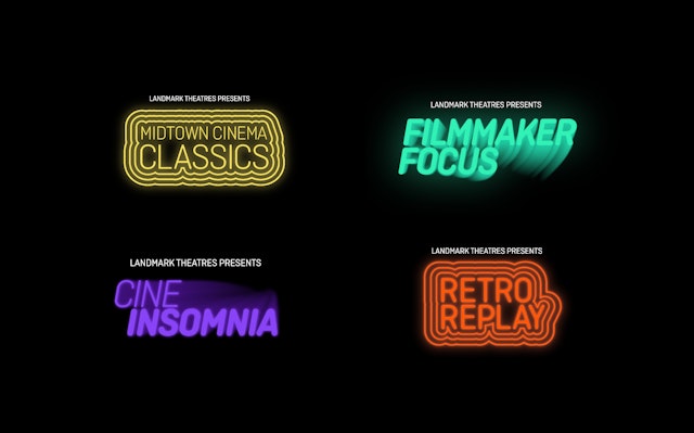
The identity changes colors and serves as the basis for a series of playful, neon-inspired custom icons for different aspects of the theatrical experience. The energetic typography extends to sub-brands for curated programming like film series, special screenings and other events.
“Pentagram nailed it, they have created a more inclusive brand that everyone can relate to and enjoy,” says Mulcahy.
The need for new signage at the theaters drove the project. Not all venues are the same, and it quickly became apparent that an open-ended approach was needed that could be adapted to different locations. As part of the program of environmental graphics, the logo will be rendered as a large-scale three-dimensional sculpture, with a neon “L” inside a larger glass “L,” to be placed near entrances or inside the lobby—a unique physical “landmark” that signals the venue is part of Landmark.
“Landmark Theatres is always creating immersive experiences for our guests—something every person on the planet needs,” says Mulcahy. “Pentagram has enabled us to reach a much wider audience with our new branding, which is truly a game changer for Landmark Theatres.”
