The titles hint at the surreal fantasy world the Edwards created for themselves and the shifting boundary of the real and the imagined in the series.


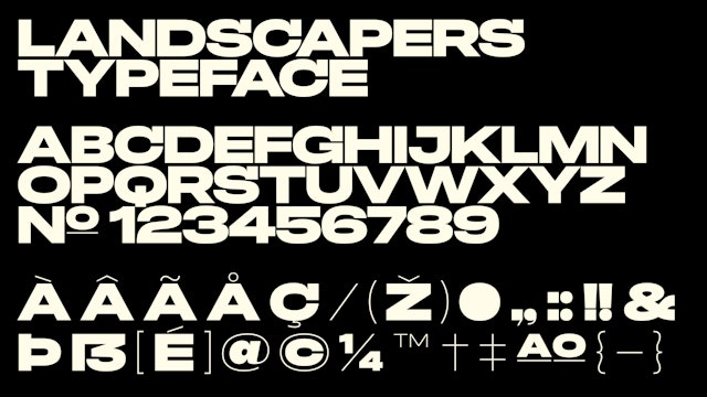
Drawing on Western motifs found throughout the series, the designers created a bespoke typeface that nods to the genre in the 1950s and 60s.


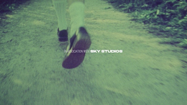
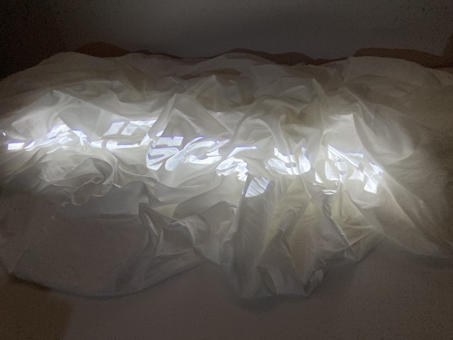
The designers played with projecting the title onto various types of fabric, causing the letters to travel over this ‘landscape’ before being fully realized.

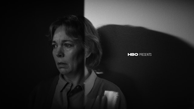
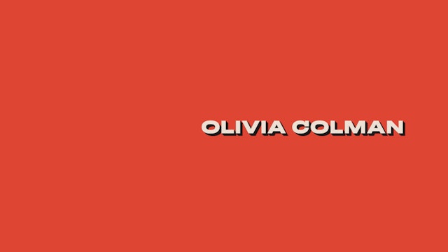
Inspired by real events, the HBO/Sky limited series “Landscapers” explores the lives of the convicted killers Susan and Christopher Edwards (played by Olivia Colman and David Thewlis), a mild-mannered couple who murdered Susan’s parents, William and Patricia Wycherley, and buried them in the back garden of their Nottinghamshire home, in a crime that remained undiscovered for over a decade. Pentagram partner Matt Willey and team have created title sequences and custom typography for “Landscapers” that hint at the surreal fantasy world the Edwards constructed for themselves and the thin boundary between the real and the imagined that is constantly shifting over the course of the series’ four episodes.
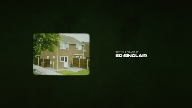
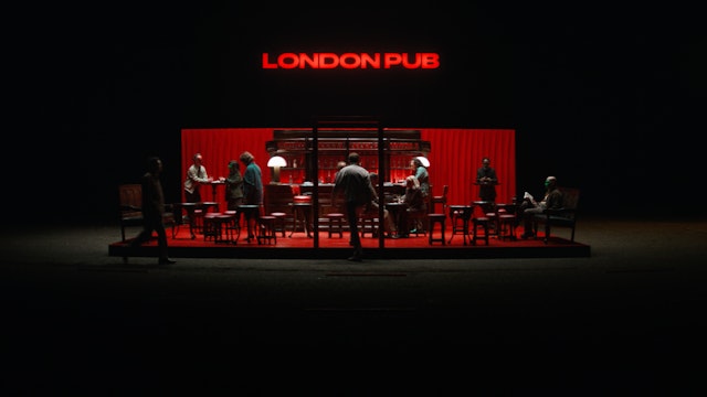
“Landscapers” has been conceived by writer Ed Sinclair and director Will Sharpe as an offbeat dark comedy and pivots through various perspectives from Susan and Christopher, to the police officers and lawyers involved in the investigation. Susan was obsessed with classic Westerns of the 1950s and 60s, and both she and Christopher imagined themselves as Hollywood heroes in stories of their own invention. Drawing on the Western motifs found throughout the series, Willey collaborated with typeface designer Diana Ovezea to create a bespoke typeface inspired in part by film titles from that genre and time, seen in movies such as “The Big Country,” “The Appaloosa” and “Ride in the Whirlwind.” The design nods to the typographic language of Westerns—wide and heavy typefaces that emphasize the cinematic format and expansive landscapes—but subverts the use of serifs on certain characters for a more distinctive look.
Building on the title and the hallucinations of the main character, Willey and team started playing with projecting the title onto various types of fabric, causing the letters to "travel" over this "landscape" before being fully realized. This play with materials that stretch and deform the title echoes the illusive grasp of reality and the slightly unnerving mood of the series. At several points in the show, Colman’s character Susan escapes into moments of dream-like reverie when she looks at a line formed where a sofa or blanket meets the wall and imagines a landscape and horizon. The folds and shapes of the fabric become rolling hills and valleys—the bedcover a ridgetop, the wall the sky.
The designers filmed more than 200 takes for the titles, casting the “Landscapers” logo on everything from burlap, canvas and a tarp to cotton sheets and silk scrim. The type was shot as it moved up the material, warped and fragmented by the folds as it flowed over the “mountains” before finally becoming fully legible when it hit the flat “sky.” Each fabric had a different quality as a surface for projection, and the distortion of the type was completely altered every time the material was rearranged.
The projected titles appear with the first three episodes; the fourth, and final, episode leans most heavily into the Western concept and got an entirely bespoke title sequence, designed with an exaggerated drop shadow and a yellow used most often in the color graphics of Westerns of the period. The end titles of each episode were also tailored to the content, incorporating montages of actual news coverage of the various stages of the case, as well as behind-the-scenes footage from the making of the show. The end credits of the final episode appear against a background of brilliant red, accompanied by music by Arthur Sharpe, Will’s brother.
Office
- New York
Partner
Project team
- Nick Marabella
- Avery Cross
Collaborators
- David La Spina, photographer
- Diana Ovezea, font engineer
- Ben Stechschulte, photographer
