
As well as looking different, the new Lenus brand had to encompass a much wider range of topics such as nutrition, mental and physical health and the benefits of a healthy lifestyle, reflecting its holistic approach.
Lenus’ offer extends way beyond purely its digital product, with human relationships and experiences sitting at the heart of its business model.


The new brand needed to stand out in a crowded and fast-paced digital health and wellbeing space while being careful not to appear too masculine or narrow. Art direction needed to be professional, holistic and energetic, avoiding any imagery that was too cliched or corporate.

Another key element of the graphic style is introducing signatures into the communications, a highly personal and unique moment which emphasises the individuality and trust amongst health coaches and Lenus.


Pentagram’s new graphic language, colour palette, photography and tone of voice all work together to position Lenus as a force for change within the health and fitness coaching industry.
Lenus is designed to help health coaches free up their time to grow their businesses by spending less time on admin and non-value-adding activities. The company has grown dramatically and now operates in Denmark, Sweden, Germany, the UK and the US.
Struggling to attract talented health coaches from outside the traditional weightlifting and stereotypical ‘gym bros’ demographic, Lenus was not perceived as a trustworthy fitness brand and was too focused on a narrow portion of the fitness industry.
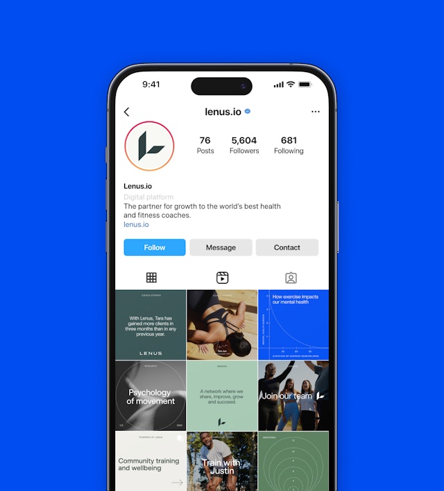
Pentagram was approached by Lenus to help create a total visual rebrand, including the tone of voice and UX/UI design, to help the brand become the leading online fitness coaching platform.
As well as looking different, the new Lenus brand had to encompass a much wider range of topics such as nutrition, mental and physical health and the benefits of a healthy lifestyle, reflecting its holistic approach. Lenus’ offer extends way beyond purely its digital product, with human relationships and experiences sitting at the heart of its business model.
Pentagram’s challenge was to create a brand that captured the dynamism and momentum Lenus was building. It needed to stand out in a crowded and fast-paced digital health and wellbeing space while being careful not to appear too masculine or narrow in its execution. Art direction needed to be professional, holistic and energetic, avoiding any imagery that was too cliched or corporate.
An additional challenge was creating a brand which could go beyond a B2B digital platform and combine technical, commercial and community value to forge something more trusted, more holistic and more aspirational within the fitness market.
Lenus was seeking to lead the way in health coaching by taking a new holistic approach, accelerating the global holistic health revolution and empowering, educating and growing the next generation of health coaches. Pentagram’s new graphic language, colour palette, photography and tone of voice all work together to position Lenus as a force for change within the health and fitness coaching industry.
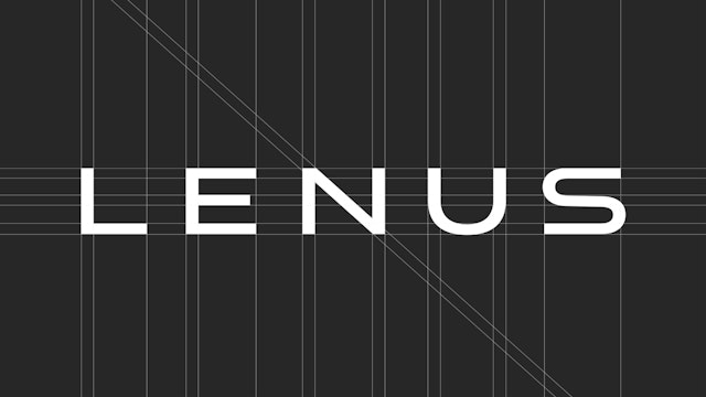
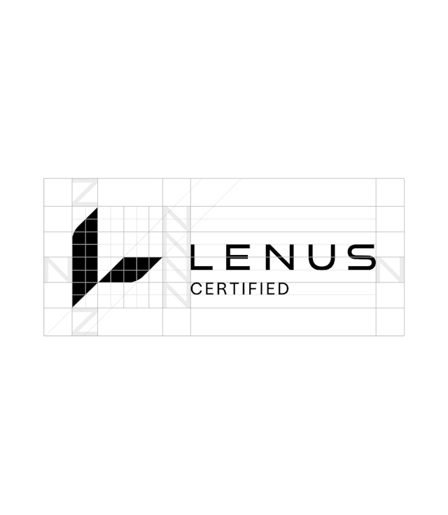
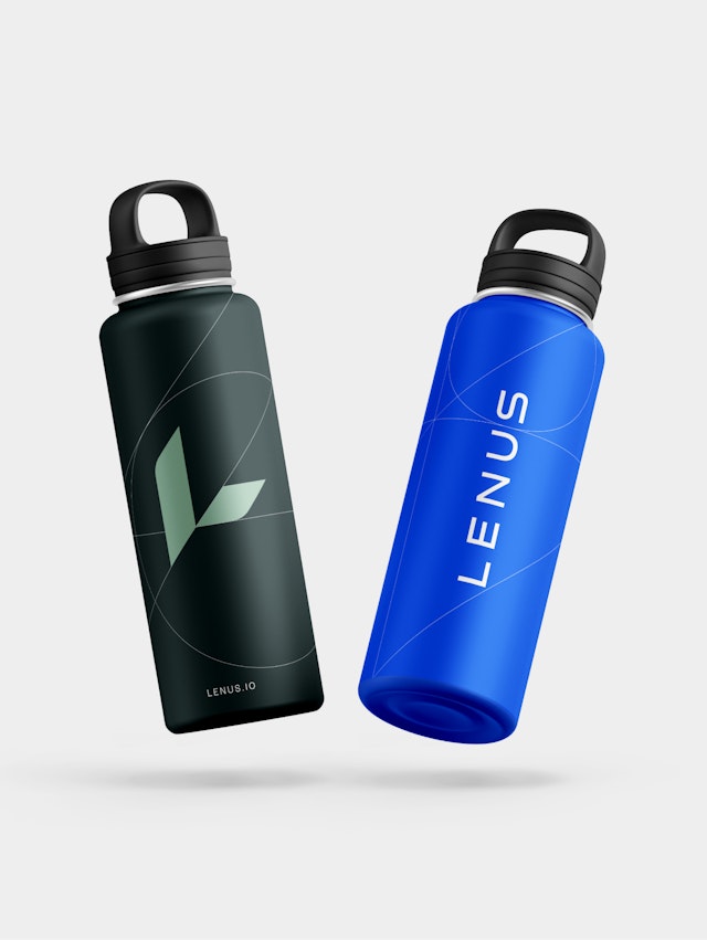
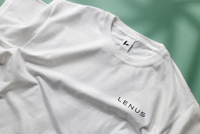
The new Lenus symbol captures the energy and movement while also creating a subtle ‘L’ shaped form. This sits harmoniously alongside the reimagined and re-drawn wordmark, also employing the 45° angle and strong geometric construction which forms the basis of a graphic system applied across the brand.
Another key element of the graphic style is introducing signatures into the communications, a highly personal and unique moment which emphasises the individuality and trust amongst health coaches and Lenus.
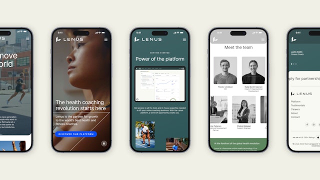
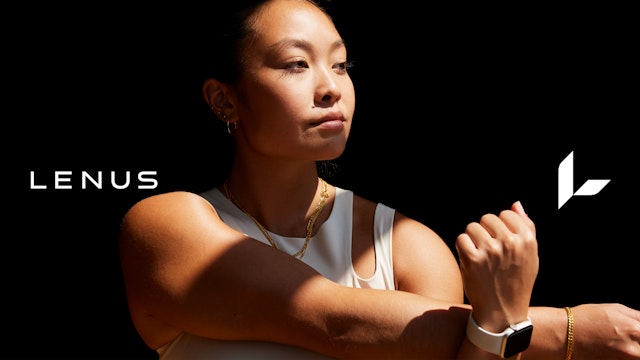
It was important the typography remained neutral enough to work across all applications and had a quietly professional and authoritative tone. Paired with rich lifestyle-inspired photography which places people at the very heart of the brand, it communicates the stories and motivations behind the brand.
The geometric graphic language which runs throughout the brand reflects the brand principles in a subtle, but highly distinctive and effective way.
Pentagram’s new brand identity takes Lenus from a company which was successful but had limited appeal, to a holistic global fitness community which will appeal to anyone involved in the health and fitness coaching industry.
Office
- London
Partner
Project team
- Karolina Alvekrans
- Jack Brown
- Eoghan McMahon
- Yorgos Panagopoulos
- Daniela Perez
- Charlotte Selby
- Alizee Taimiot
- Shirley Wang
Collaborators
- OD&A (artworking)
- Opening Line (tone of voice)
- Roger Taylor (artworking)
- Spurwing (website UI and development)


