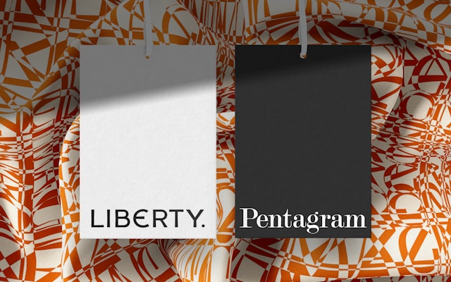
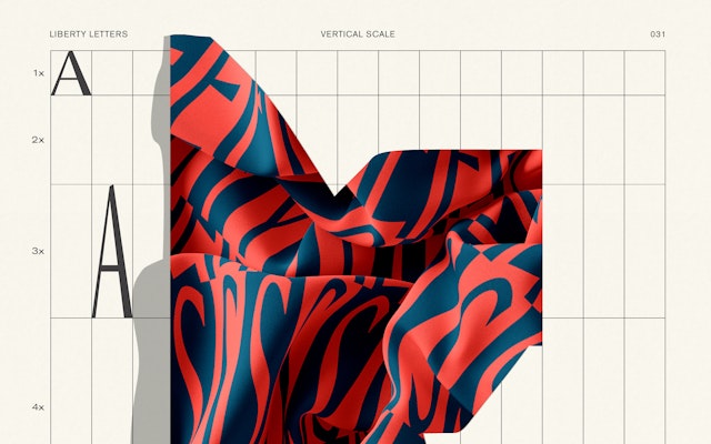
The process began with Pentagram creating dozens of experimental typographic patterns borne entirely from the bespoke Lasenby Sans font designed as part of the Liberty re-brand.


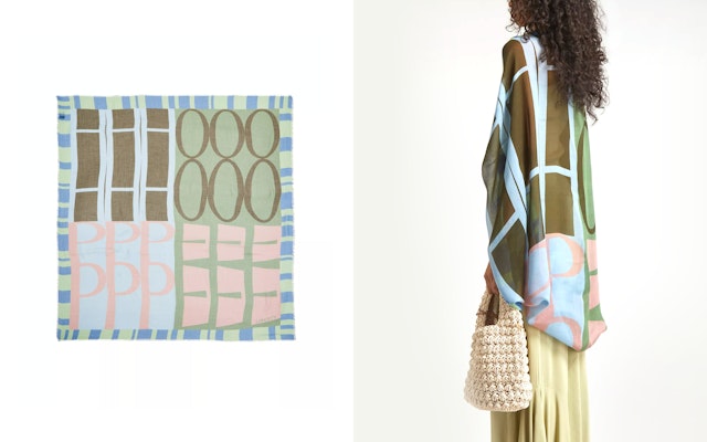
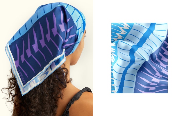
The collection is a bold collision of, colour and form, resulting in endless typographic patterns and builds upon the new visual identity that Pentagram designed for the 148-year-old brand.
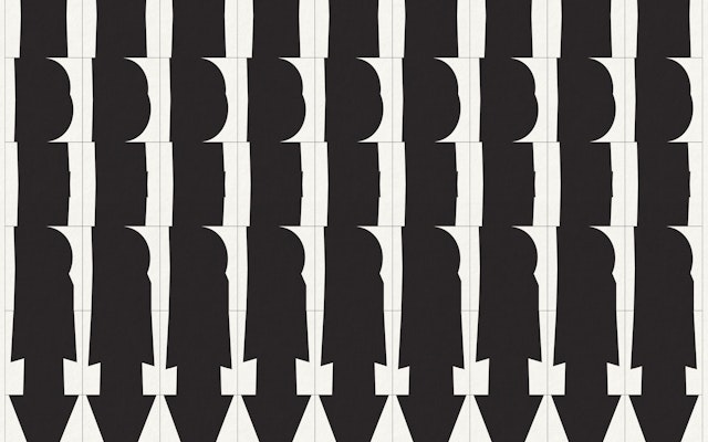
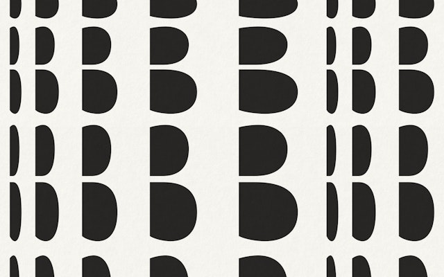
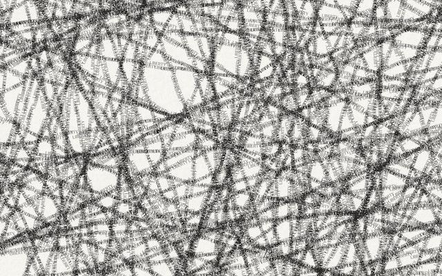
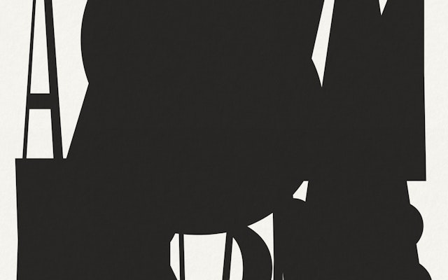
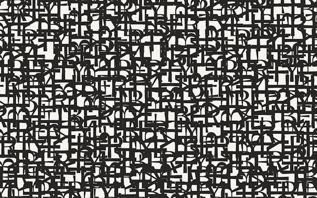
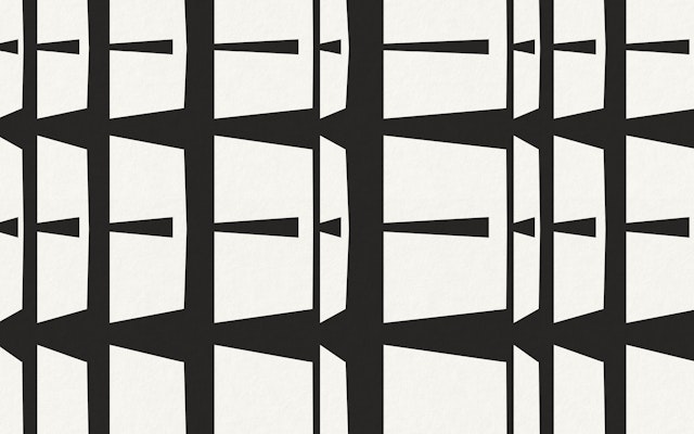
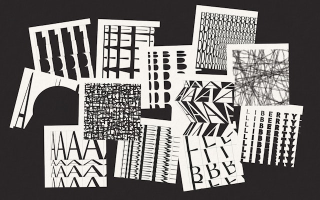

Pentagram’s design brief was simply to play without any strategic outcome in mind. The experimentation was undertaken in the spirit of ‘unapologetic eccentricity’ from the heart of the Liberty brand manifesto.

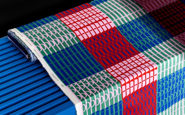


Liberty Letters is an exclusive capsule collection made up of 21 products including bags and scarves, plus a range of fabrics, the result of a collaboration between Pentagram and the Liberty fabric design team.
The process began with Pentagram creating dozens of experimental typographic patterns borne entirely from the bespoke Lasenby Sans font designed as part of the Liberty re-brand. These were then developed by the Liberty fabric design team.
The collection is a bold collision of colour and form, resulting in endless typographic patterns. It builds upon the new visual identity that Pentagram designed for the 148-year-old brand, which includes a new logotype adapted from the lettering in the original sign above the Great Marlborough Street storefront.
Pentagram adapted the letterforms of the new logotype into a custom display typeface named after Liberty’s founder Sir Arthur Lasenby Liberty. The font was created in collaboration with Colophon type foundry.
Pentagram’s brief from Liberty Fabrics Design Director, Mary-Ann Dunkley was simply to play without any strategic outcome in mind. The experimentation was undertaken in the spirit of ‘unapologetic eccentricity’ from the heart of the Liberty brand manifesto.
The Liberty Letters collection will be expanding over the coming years and launched with a special scarf created for Pride, as well as a collection of bags, scarves and fabrics, all of which will be available online and at Liberty’s London store.
Andrea Petochi, Managing Director at Liberty explains: “Liberty Letters new collection of fashion fabrics, silk accessories, bags and alphabet jewellery, were created by an extraordinary meeting between Pentagram's elegant human visionaries and Liberty's Design Studio. We are especially grateful to Harry Pearce, Johannes Grimmond, Tiffany Fenner, Mary-Ann Dunkley and their equips, for having ventured onto a ‘dadaesque theatre’ of dancing typography and wearable art, a contemporary oath to a lifestyle of evolving identities within a continuous sentiment of true love for the artistic form.”
Harry Pearce adds: “What’s so pleasing about this endeavour is the ability of the brand to be able to create authentic products directly from its core identity. The Lasenby Sans font adapts, allowing multiple re-interpretations of abstract typographic patterns into infinite numbers of fabrics. Liberty has always been as much a maker as a retailer and hopefully this project is the epitome of that spirit.”
This beautiful, modern and very wearable product range adds to the extensive Liberty archive of over 30,000 prints.
