
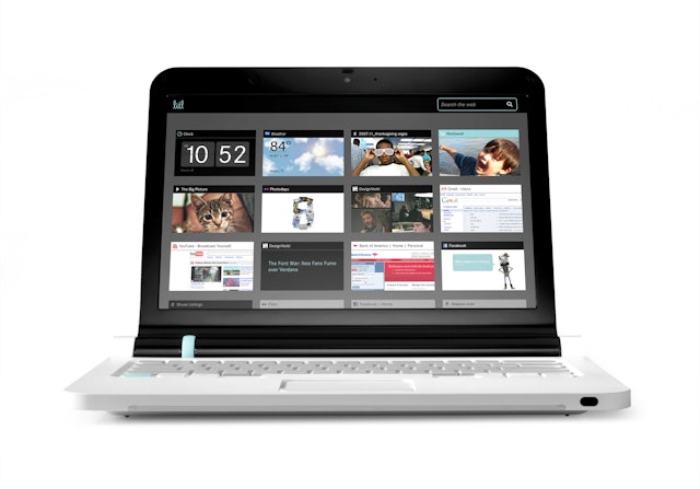
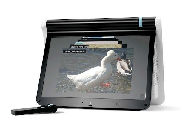
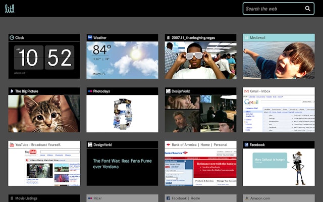
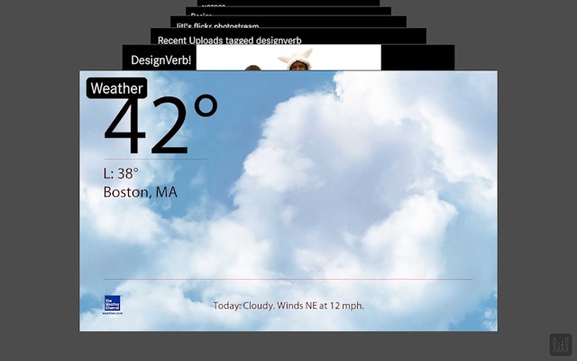
In the laptop configuration, these cards can appear arranged on the screen like thumbnails, or opened up one at a time in full screen; in the easel/broadcast configuration, the cards appear as a stack and can be selected or “tuned in” like a channel.
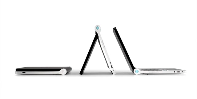


Litl is an innovative web computer, or webbook, that marries the communication functions of a laptop and TV. Small, portable, and equally at home on a kitchen countertop or a living-room coffee table, the webbook is designed for families with multiple users who like to keep in touch and socialize. Litl is always connected to the web (with access to Wi-Fi) and flips upright like an easel for TV-like viewing of photos and video. It has no hard drive, files or applications of its own, but instead runs on the “cloud,” using web-based applications like webmail, Google, Flickr and Facebook.
Pentagram worked closely with Litl founder John Chuang and the Litl design team on the development of the Litl experience. The designers created an accessible, friendly identity for the brand as well as a unique graphical user interface (GUI) based on Litl's brilliant OS that makes the webbook fun, convenient and easy to use. All help to make Litl the next big thing in home computing.
The Litl webbook can be used in two configurations: like a traditional laptop, with full keyboard, used to surf the Web; or flipped upright, like an easel or picture frame, for broadcast of photo and video. The laptop configuration has been conceived as a “lean forward” mode, for active participation; the easel configuration conceived as “lean back,” for watching. (The laptop was designed by Yves Behar at Fuseproject.)
The interface creates a continuous experience between different user modes. The GUI is based on a series of “cards,” each card functioning like a tab in an open browser window. In the laptop configuration, these cards can appear arranged on the screen like thumbnails, or opened up one at a time in full screen; in the easel/broadcast configuration, the cards appear as a stack and can be selected or “tuned in” like a channel.
The cards function like different applications or widgets. Each card is devoted to a different use: one tuned to Facebook, one to Flickr, one to the Weather Channel, one to the time, etc. We worked on the customized visualization of data for several of these cards, including the weather and alarm clock. The cards are color-coded: black for the widgets, or "channels"; white for web browsers; and blue for “permanent” cards for the Litl’s users, photos of family and friends or personal settings. In the Web navigation mode, the screen accommodates 12 of the cards at a time, set up like thumbnails. (More can be opened and scrolled through, using the blue ring on the laptop’s hinge.)
In broadcast mode, with Litl functioning like a TV or viewing screen, the cards become a stack of larger windows that can be flipped through and selected to fill the whole screen. Litl features an unusual, TV-like 178-degree viewing “cone” that allows a group of users to see the screen at once, and the webbook can be hooked up to a hi-def televisions to view images or video.
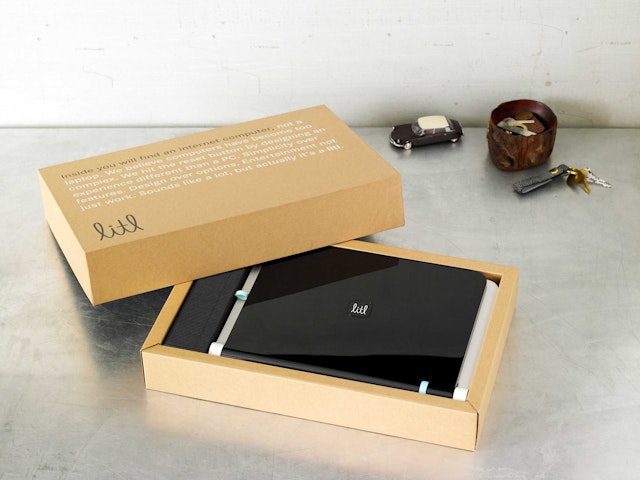
The brand identity for Litl is accessible and designed to appear friendly, familial and domestic. In the logotype (custom-drawn, but reminiscent of the font Schulschrift) two cursive lowercase Ls cradle the letters IT. The logotype’s curves are inspired by the forms of the laptop and suggest the flexibility of the webbook in its different configurations. The graphics are designed to blend in with the iconography of home appliances and to appear genderless—unlike the masculine technology identities usually found on electronics—and to appeal to a wide range of ages, from kids to seniors, embodying Litl’s mission as technology for everyone. In some applications the logotype is placed in a square with rounded corners, the shape of the keys on Litl’s keyboard. The designers also chose a friendly, modern color palette of a distinctive blue and black and created standards for the logo’s application to the computer and its accessories.
Office
- New York
