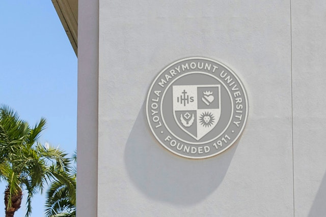
The identity system is composed of three graphic components, including a refined academic seal, an institutional logo based on a shield, and a new spirit mark.
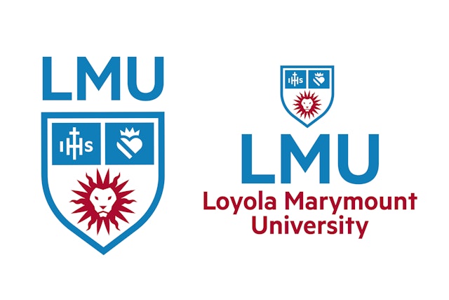



The identity simplifies and refines the elaborate, ‘old-school’ seal, updating the shield and the symbols for the two original founding institutions, Loyola and Marymount.


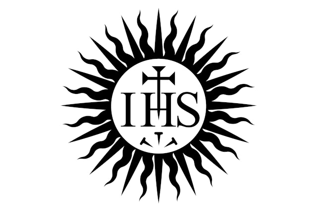
A new icon features the simplified head of a lion, LMU’s mascot, rendered with a distinctive, ‘sunburst’ mane based on the ancient Jesuit symbol for Jesus.


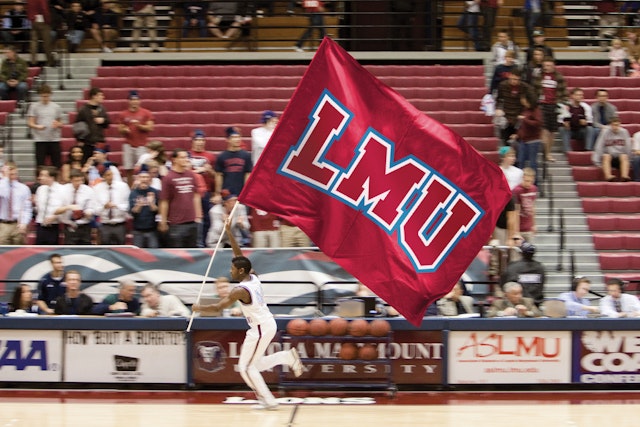
A refreshed color palette updates the original colors of the two founding institutions, making the maroon and blue brighter, sportier and more compatible when used together.




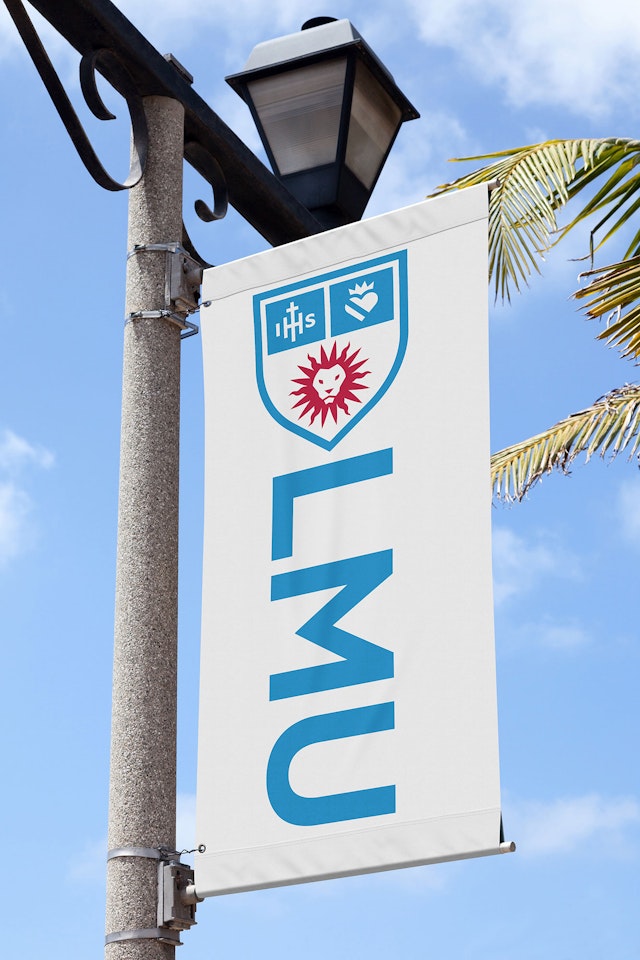
In 2010 Pentagram redesigned the alumni magazine of Loyola Marymount University (LMU), changing the name of the publication from the generic Vistas to the more ownable LMU Magazine, and since then the Austin office has worked with the Los Angeles-based institution on a wide variety of projects including advertising, poster campaigns, street banners, logos, print collateral, online fund raisers, bus wraps, animations and even branding for the university’s annual beer festival. Now Pentagram Austin has completed its most ambitious initiative to date for the top-ranked Jesuit university–the complete redesign of LMU’s academic and athletic identity system launching this month.
LMU’s previous identity was designed by Pentagram’s San Francisco office in 2003 but that type-based system became dated and less useful as time marched on. Bodoni, the delicate Roman typeface the identity was composed of, couldn’t hold up to the small use applications demanded by today’s digital platforms–websites and mobile phones. This time around, in addition to an updated, more utilitarian typographic system, LMU wanted a logo to build their new identity around.
The Pentagram Austin team, who has developed identities for other prominent higher education institutions like the University of Southern California (USC), Drexel University, Oregon State University, Amherst College and the University of Kentucky, created an identity system composed of three main graphic components including a refined academic seal, an institutional logo based on a shield, and a new spirit mark.
LMU's seal, a coat-of-arms grounded in the long tradition of using heraldry for academic identity, has evolved many times since the college’s founding in 1911. The design team’s first order of business was to simplify and refine the fussy, “old-school” seal keeping the shield component and the symbols for the two original founding institutions, Loyola and Marymount, but dropping the less critical representations of the Archdiocese of Los Angeles and the State of California.
A new icon, the simplified head of a lion (LMU’s mascot) rendered with a distinctive, “sunburst” lion’s mane based on the ancient Jesuit symbol for Jesus (often seen as a halo in Catholic art) takes the place of the two California specific representations in the original seal. The contemporary spirit mark will replace the dated, “cartoony” lion logo athletics was using and it also hints at the idea of a fiery sun, as in "Sunny Southern California" where LMU warmly resides. The lion spirit mark gives LMU a new graphic element in its identity toolbox and a single image for the entire university to rally around.
The new academic seal, modern and streamlined but still symbolic of the university’s roots, retains the representations of LMU’s heritage while functioning better in today’s demanding digital environments. The seal is reserved for use by the President’s office and other formal administration applications like on diplomas, acceptance letters and other official university correspondence.
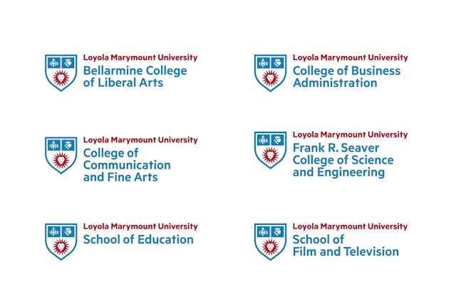
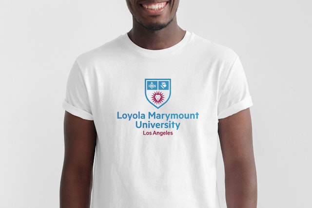
The shield is pulled out of the new academic seal to become the main logo for the rest of the institution–the colleges, schools, foundations and other academic units. Both the shield and the seal are paired up with a new primary wordmark set in Metric, a confident, sans-serif typeface designed by the Klim Type Foundry of New Zealand, which gives the identity system a contemporary attitude and holds up nicely in small, digital applications. It’s a workhorse of a typeface but handsome and refined too. A Roman typeface called Lyon (that happens to have a similar name to the university’s “Lion” mascot), developed by German designer Kai Bernau for Commercial Type in 2009, is a beautiful, very readable typeface that plays a supporting role in the new identity system. It is intended for use with headlines, text and lengthier blocks of copy.
A logical typographic system and hierarchy was developed by the Pentagram team in order to encourage and maintain the consistent application of the new identity system across the university. Different lockups and explanations for their proper usage are provided in a set of comprehensive, easy-to-use style guidelines.
When Loyola officially merged with Marymount in 1973 to become Loyola Marymount University, Loyola’s adopted school color was a dark maroon and Marymount’s was a pale blue. Both colors have their roots in the heritage of their particular religious institutions but when the two colors were thrown together they were uneasy bedfellows. Loyola’s maroon looked too dark in contrast with Marymount’s light blue shade. Probably as a reaction to this innate color problem, particularly when it comes to athletic uniforms, LMU’s colors evolved over time to the point where there were two color palettes–one for athletics and one for the academic institution. Neither palette, both composed of a dark maroon and a dark blue, functioned very well because the two dark shades caused contrast problems in real world applications.
To remedy this the Pentagram team looked back at the original colors of the two founding institutions but tweaked the maroon towards a brighter, sportier color and the blue found a happy spot halfway between Marymount’s original light blue and the dark blue it had evolved into overtime. The resulting color scheme, more compatible when used together, tips a hat to LMU's founding roots and gives the university a more distinctive and functional color signature for its academic branding and athletic uniforms. A secondary color palette was created from looking at the colors of the ocean, sky, tropical plants and sunsets of Southern California. This palette of alternate colors, all based on LMU’s unique setting, enhances the identity systems color offerings and gives the user of the new identity system more options and flexibility.
Unveiling a brand new, comprehensive identity system can be a tricky proposition, particularly in the higher education realm. Most people are uncomfortable with change to begin with but when you start messing with a school’s mascot and team colors (branding a community has developed a loyalty to over time–whether it’s good or not) it can get dicey. There are a lot of armchair quarterbacks critiquing new identities and logos on the Internet these days.
To its credit LMU went to extraordinary lengths to explain the new identity system to its constituency. The university’s marketing and communications group headed by John Kiralla and Maureen Pacino organized a series of nearly forty different meetings and town hall forums in order to present LMU’s new identity to a diverse group of students, faculty, alumni and the general public. At these gatherings Pacino and Kiralla thoughtfully explained the rationale behind the new identity system and then they listened. The feedback they received during the open forums was seriously evaluated and much of it was relayed to the Pentagram team who revised the designs accordingly. In the end the process led to a stronger, more refined identity system and an enlightened university community.
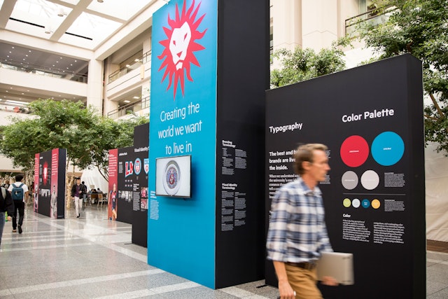
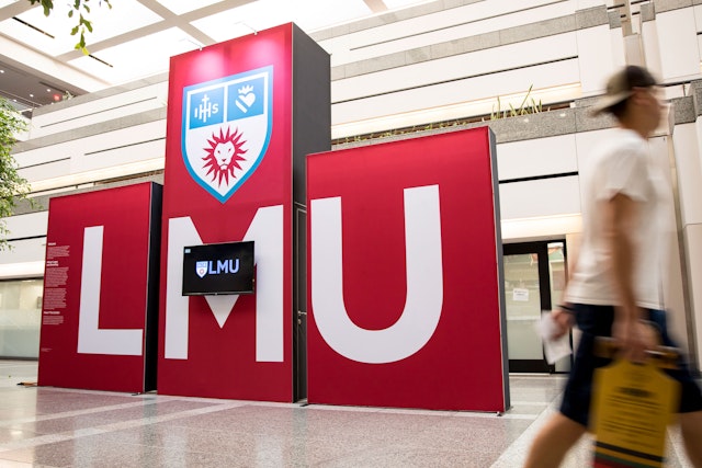
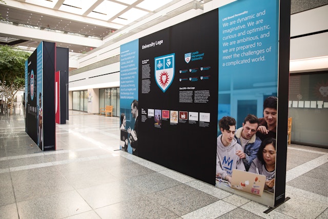
In addition to the open forums, LMU commissioned Pentagram to develop and design a three dimensional display to graphically explain the thinking behind the new identity system to the campus community. The display, consisting of eight 8-foot high panels and a double-sided 16-foot high centerpiece tower with two 50-inch monitors, was erected in the atrium of the heavily trafficked University Hall. A short video/animation presentation of the new identity, also created by Pentagram, played on a continuous loop for the entire two months the display stayed up in the building.
The video and display highlight the evolution of LMU’s past identities and shows how Pentagram derived the new direction from the university’s deep roots and Catholic/Jesuit heritage. The story of the new identity is presented in a fun, engaging and lively way. After all, the college years are often the best of times. Now LMU’s new identity will become a part of those fond memories for generations to come.
Office
- Austin
Partner
Project team
- Haley Taylor Nitsch
- Roxy Torres
- Jeffrey Wolverton
- Anna Donlan
