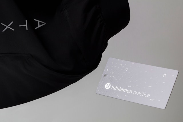
The custom practice typography appears in orbital patterns that evoke the movement, flow and repetition of one’s yoga or fitness practice.
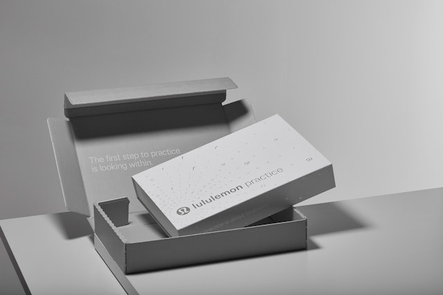
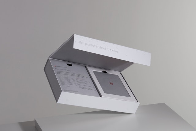
The welcome kit’s unique design reflects the premium nature of the brand, with custom structural packaging, high-quality materials, and details that make it feel special.


One of the world’s leading activewear brands, lululemon athletica goes beyond retail to function as a holistic lifestyle brand for a devoted following of consumers who apply its vision of wellness to their everyday practice of yoga, running, working out, self-care and mindfulness. To engage these followers, the retailer launched lululemon practice, its first loyalty membership program. Pentagram developed the brand identity framework for the program, including a custom variation on the lululemon brand typeface and the design of welcome kits for new members.
Pentagram worked closely with the lululemon creative team led by Rémi Paringaux on the project, the second in a series of collaborations after the design of the lululemon manifesto. As lululemon has grown as a lifestyle brand, it has started looking for new ways to connect with its customers through new products and experiences. The community-based practice offers members special dedicated yoga classes, a gift of limited edition gear customized for their city, and other special retail benefits. The pilot program debuted in Denver, Austin and Edmonton, Canada, with other cities to follow, and has been greeted with an overwhelming response.
In keeping with lululemon’s branding, the goal of the practice framework was to create a user experience that is universal, warm and engaging, but also premium, to help members feel like part of a special community. In their work for lululemon, the Pentagram designers have looked for ways to introduce custom typographic expressions outside of the wordmark, to expand the brand’s visual language and make it more flexible and experimental. This can be seen in the manifesto, a graphic representation of the core values of the brand that appears in store graphics and on apparel, and in the sub-brands for new extensions like practice and lululemon selfcare, a line of personal-care products also designed by Pentagram.
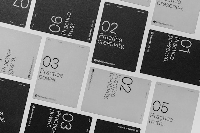
The identity features a new custom version of the lululemon brand typeface Calibre Light (designed by Klim Type Foundry) called Calibre Practice Light. The custom font, developed by Pentagram in collaboration with the type designer Chester Jenkins, has applied dynamic cuts to the letters that convey strength, utility and evolution. Both practice and selfcare use the custom stencil typeface for their principal expressions of brand voice as well as graphic indicators like numbers, to link the sub-brands to lululemon but give them their own distinctive visual character.
The practice typography appears in orbital patterns that evoke movement, energy, flow and repetition, all core elements of one’s yoga or fitness practice. The type-driven approach reflects the active, social and mindful nature of the lululemon community, also seen in the graphics for the manifesto and lululemon selfcare.
Members who join practice receive a welcome box that provides a “tool kit” for their personal practice. The Pentagram team developed a unique design and unboxing experience for the kit that reflects the premium nature of the brand, with custom structural packaging, high-quality materials and printing, and other details that help it feel special. The kit comes packaged in an outer shipping box that opens with a tearable seal to reveal the membership box inside, accompanied by the message: “The first step to practice is looking within.”
The practice typographic patterns cover the exterior of the kit, blind debossed in a silver foil, and “Your practice is about to evolve” runs along the spine. The box itself is constructed of a tactile, uncoated heavy-weight card stock and easily opens and reseals with a magnetic closure. Inside, members find the gift of a piece of apparel customized for their city and a set of personal development cards with daily exercises that help them on their path to self-development and mindfulness. The team also designed a set of custom icons for the cards with cuts that echo the typography.
Office
- New York
Partner
Project team
- Ken Deegan
- Jack Collins
- Paul Yoon
- Dana Reginiano
Collaborators
- Chester Jenkins, type designer
- Pierce Cunnane, animator
- Lauren Coleman, photographer
