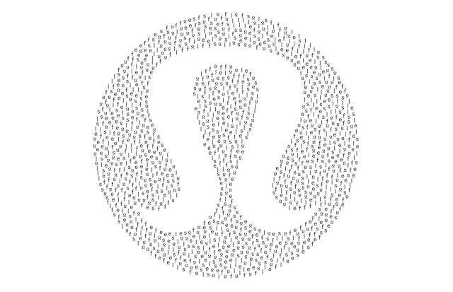

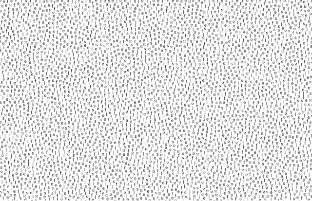

The visual language and packaging convey selfcare’s focus on function and utility, but with a premium look and feel.


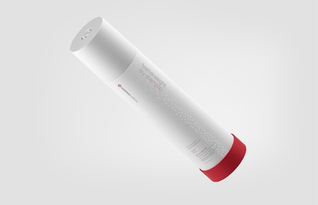
The selfcare typography appears as a fluid graphic pattern that covers the packaging, hinting at the product’s function.

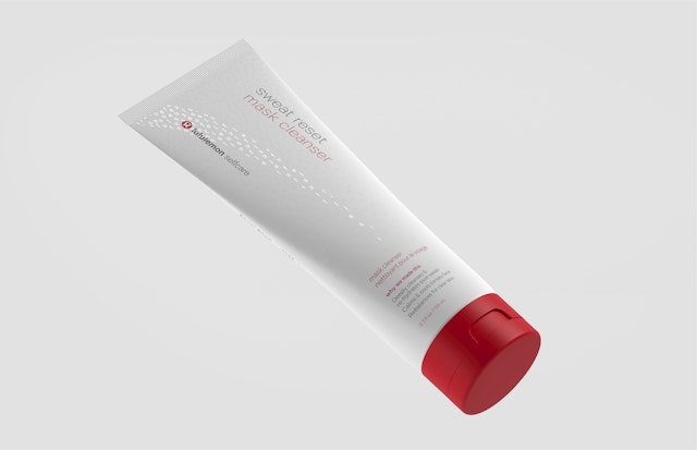

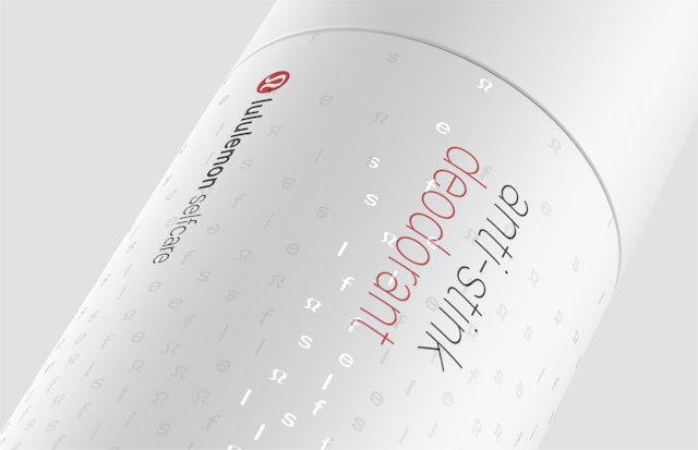
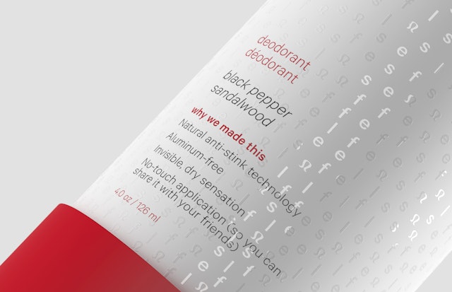

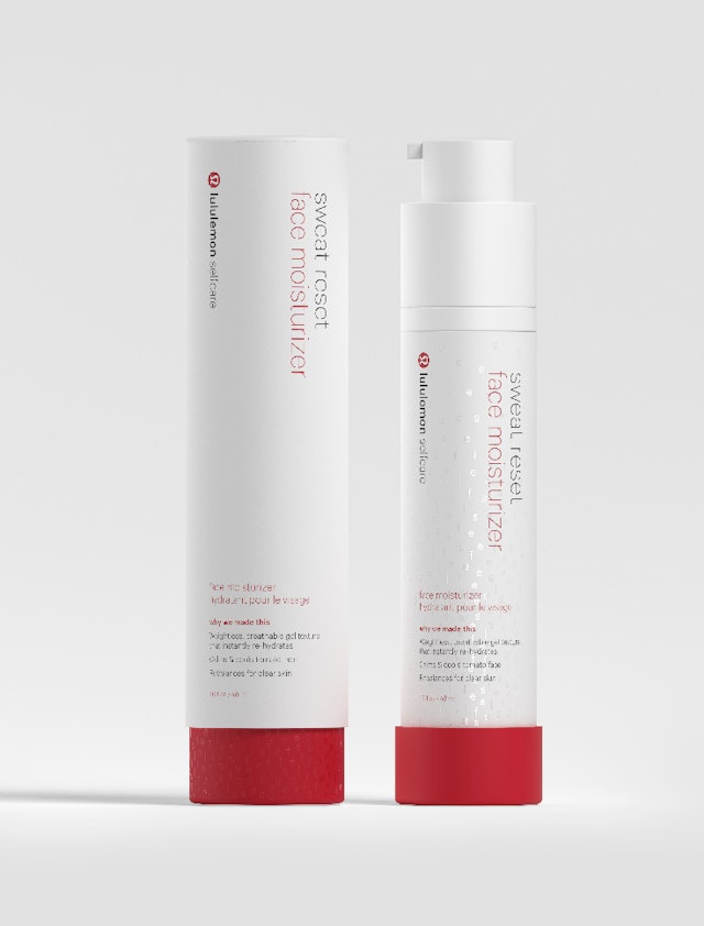
The typographic pattern shimmers in the light and almost looks like moisture on the surface.

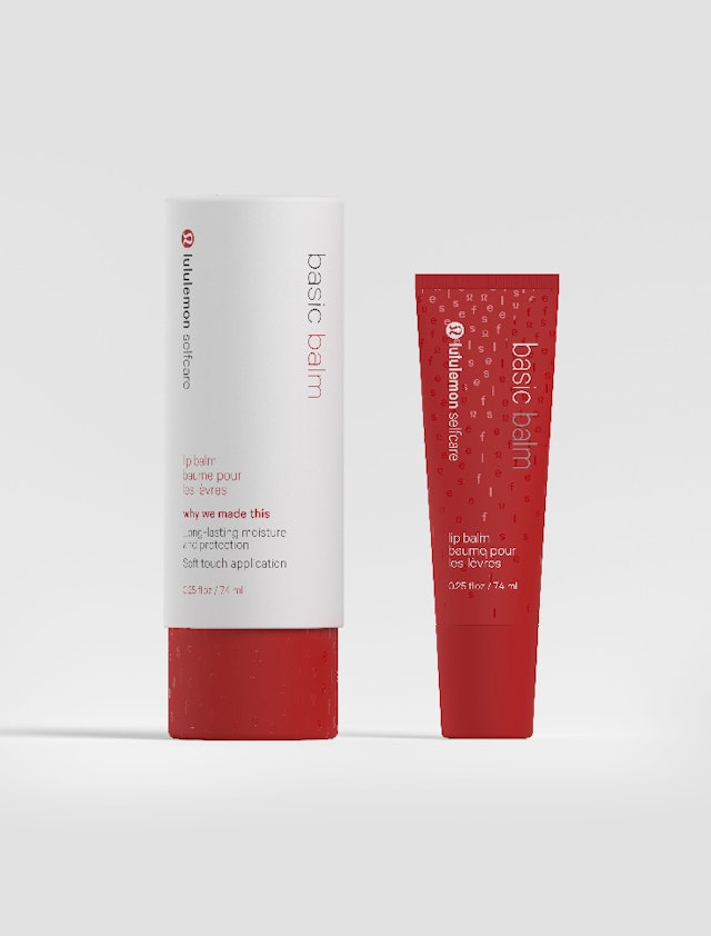
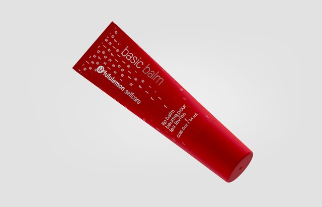
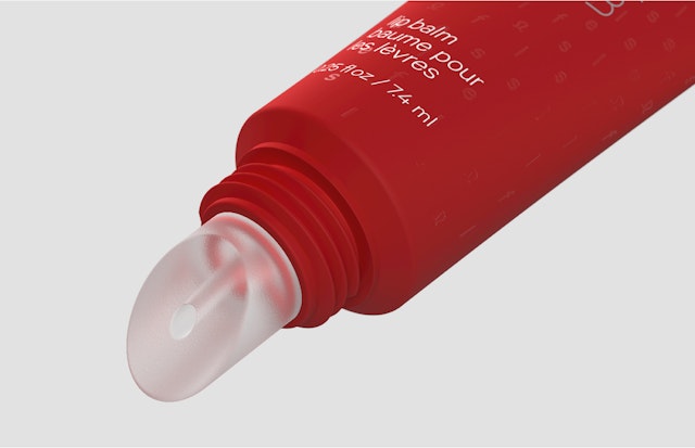
Activewear brand lululemon athletica launched its first-ever beauty line with lululemon selfcare, a collection of personal care products that are designed to be used as part of one’s yoga and fitness practice. The gender-neutral, five-product range includes lip balm, dry shampoo, facial moisturizer, deodorant and body lotion, specifically formulated for pre-, mid- and post-workout. Pentagram developed the brand identity framework for the line, including brand positioning, naming, messaging and packaging design. The sleek red-and-white packaging nods to the iconic lululemon identity and conveys the line’s focus on function and utility, but with a premium look and feel.
Pentagram worked closely with the lululemon creative team led by Rémi Paringaux on the project, the third in a series of collaborations after the lululemon manifesto and lululemon practice. As lululemon has grown as a holistic lifestyle brand, it has started looking for new ways to connect with the devoted following of consumers who apply its vision of wellness to their everyday practice of yoga, running, working out and mindfulness. The company developed the selfcare line to address a different aspect of well-being––active personal care––answering the need for a beauty product to use in the transitions between working out and everyday life (and back again), which are usually quick and on the run. The selfcare solutions were developed and tested with input from a community of over 100 lululemon ambassadors and are made of natural, cruelty-free ingredients and safe synthetics (which don’t deplete natural resources).
The Pentagram team first worked on the brand strategy and positioning. In keeping with the lululemon brand personality, the designers wanted selfcare to feel authentic, accessible and engaging in a way that makes its users feel special. The naming and messaging is honest and straightforward, with a quirky, playful sense of humor that makes it human. The team developed the name “selfcare” as a direct definition of what the line is for. Names for individual products are similarly on point, describing exactly what they do––Basic Balm, Anti-Stink Deodorant, No-Show Dry Shampoo, Sweat Reset Face Moisturizer and Speed Up Cool Down Body Lotion. Each item features a simple statement of “Why we made this,” and packaging copy appears in both English and French, in line with lululemon’s Canadian origins.
Selfcare’s visual language and packaging connect with the master brand with a minimal look that communicates serenity and utility. The designers wanted selfcare to feel like part of the larger lululemon brand but have the ability to stand on its own. (The line is sold on lululemon’s website and in lululemon stores, as well as on Sephora.com and in select studios.)
The containers have a streamlined structure that is compact and portable, so users can just throw them in their gym bags, and feature thoughtful touches that make them feel special. A distinctive red-band rubber “boot” sits around the bottom of the containers (or tube cap on the mask cleanser) for stability and makes the products instantly recognizable as lululemon. Leak-proof seals prevent spills, and a tactile, soft-touch coating that, along with the rubber bottoms, minimizes any clinking that might disturb the hush of the yoga studio.
Along with the signature lululemon red, the packaging graphics incorporate distinctive typography. In their work for lululemon, the Pentagram designers have looked for ways to introduce custom typographic expressions outside of the wordmark, to expand the brand’s visual language and make it more flexible and experimental.
The selfcare typography appears as a fluid graphic pattern that covers the surface of the packaging, hinting at the product’s function. The letters form the word “self” in a generative pattern that also subtly integrates the lululemon mark. “Self” is not immediately legible, but as the user’s eye travels around the graphics, the name comes into focus. The designers got the idea from yoga itself, which builds simple elements of movement into larger structures. The typographic patterns are also used in selfcare brand graphics where the letters dynamically group themselves to form the lululemon symbol.
On packaging the pattern is subdued, applied as a gloss laminate that slightly shimmers in the light when the product is handled and almost looks like moisture on the surface. The selfcare logotype and type patterns are set in Calibre Practice Light, a custom version of the lululemon brand typeface Calibre Light (designed by Klim Type Foundry). The custom font was originally developed by Pentagram in collaboration with the type designer Chester Jenkins for the lululemon practice loyalty program and is used again here to differentiate selfcare from the master brand and signal an evolution in new directions.
Office
- New York
Partner
Project team
- Brankica Harvey
- Pedro Mendes
- Ken Deegan
Collaborators
- lululemon, product images and animations
- Pierce Cunnane, animator
