

Strong, elegant and dynamic, the identity answers the creative brief of presenting Luminato as a connector and an enabler.


Luminato is Toronto’s international multi-arts, multi-platform festival dedicated to performance, visual art, music, theatre, dance, and other programming that cuts across traditional boundaries.
Over the course of its first decade, Luminato has featured three different identities. In 2013 Pentagram replaced their sponsor-heavy wordmark with a colourful rectangular logotype and gridded system for the brand collateral. This was updated in 2016 with an anniversary logo to mark its 10th year.
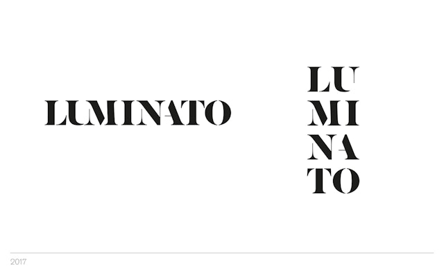
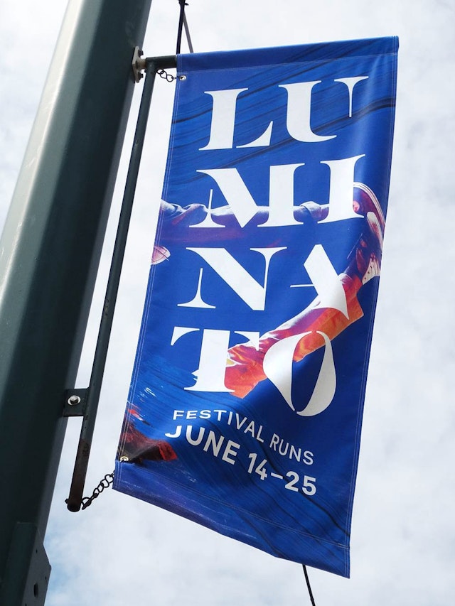
Pentagram debuted a new logotype for the festival’s 2017 season. Strong, elegant and dynamic, it answers the creative brief of presenting Luminato as a connector (across art forms and borders—between artists, industries and institutions); and as an enabler (stitching together pathways and partnerships, turning artist opportunities in to realities). The horizontal and vertical versions allow for flexible application, with ‘TO’ city code of Toronto, emphasised in the vertical lock-up.
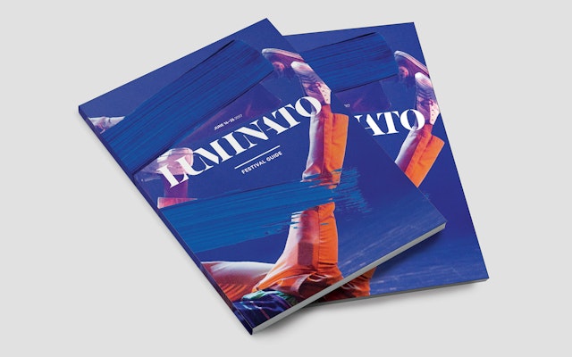
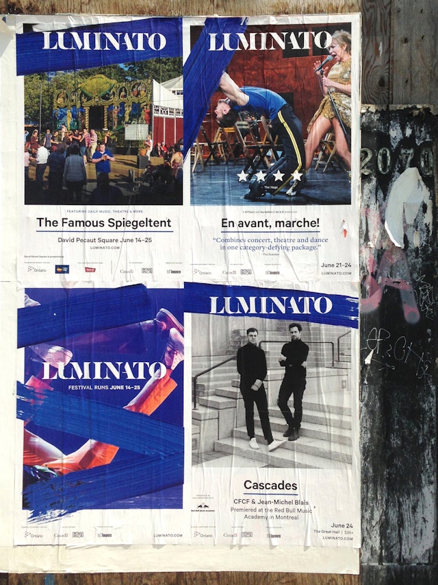
The brand roll-out was carried out by Luminato's lead designer Liz MacInnis (print) and interactive manager Seowon Bang (web), and features expressive brush strokes in Yves Klein Blue.
Office
- London
