

Color was essential to Matisse’s art, and the design utilizes a brilliant palette inspired by the artist to create a lively and engaging framework for a work of serious scholarship.


Among its extraordinary masterworks of Post-Impressionist and early Modernist art, the Barnes Foundation contains one of the most significant holdings of Matisse in the world. The museum played a pivotal role in the artist's career: Dr. Albert C. Barnes, the founder of the Barnes, was Matisse's most serious American collector and in 1932 commissioned the painter to create the mural The Dance for the Foundation’s main gallery, leading to an important new phase of work. Pentagram has designed Matisse in the Barnes Foundation, a landmark three-volume set that is the first authoritative publication to document this remarkable collection in full. The beautifully produced book builds on the identity, environmental graphics, website and publications that Miller has developed for the museum since it relocated to its new home in downtown Philadelphia.
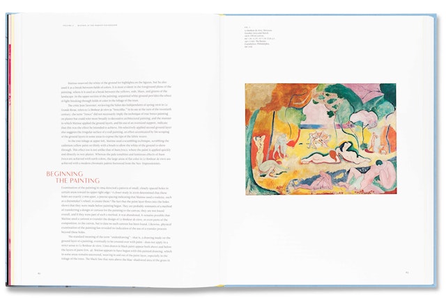
The massive, 894-page book was a major undertaking by the Foundation. Edited by the art historian Yve-Alain Bois, a noted Matisse expert, it encompasses every piece by the artist in the museum’s collection—59 works from every stage of his career—each represented with a full-color image of the work, a photograph of the piece installed in the museum, and detailed interpretive analysis that tell the story of its acquisition and critical reception. The evolution of The Dance is covered in depth, with the full exchange of correspondence between Barnes and Matisse about the commission and documentary photographs showing the different states of the mural published together for the first time. The book also features essays on what Barnes thought of Matisse, how and why he collected his work, and the latest findings on Matisse’s techniques.
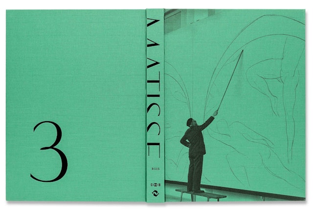
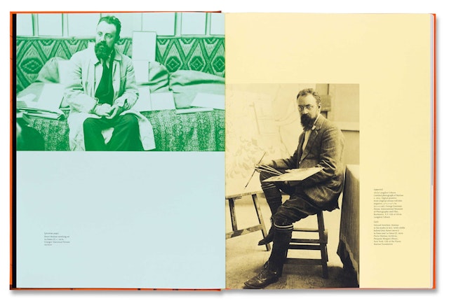
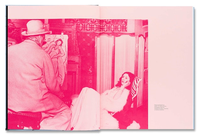
Color was essential to Matisse’s art, and the design utilizes a brilliant palette inspired by the artist to create a lively and engaging framework for a work of serious scholarship. To accommodate the size of the collection, the book has been divided into three volumes housed together in a slipcase. The hardcovers and the slipcase are each a different color (lemon, tangerine, mint, and robin’s egg blue) taken from Matisse’s Le Bonheur de vivre, an important Fauve painting at the Barnes. Each cover features an image of Matisse drawing The Dance with a pole and charcoal, printed directly on the cloth. The fore-edges of the books are also printed with color, and inside, select pages are printed on the full spectrum of Favini Italian papers. Display typography has been set in the elegant contemporary sans serif font Vanitas, designed by Michael Jarboe; text is set in Leitura, designed by Dino dos Santos.
Matisse in the Barnes Foundation is finding a wide audience: The book has been highlighted by Interview and Oprah, and Publishers Weekly has called it a “feast for the eyes.” Art News says it “may be one of the most gorgeous coffee-table books you will ever own.”
The book is the fifth Miller has designed for the institution, following The Barnes Foundation: Masterworks, a definitive guide to the museum's collection; The Architecture of the Barnes Foundation, about the design of the new building by Tod Williams Billie Tsien Architects; Renoir in the Barnes Foundation, a comprehensive survey of the Foundation's holdings in Renoir; and Strength and Splendor: Wrought Iron from the Musée Le Secq des Tournelles, Rouen, a catalogue for the recent exhibition about the Foundation's collection of wrought iron objects.
Matisse in the Barnes Foundation is published by Thames & Hudson. Order the book in the US / Europe.
