
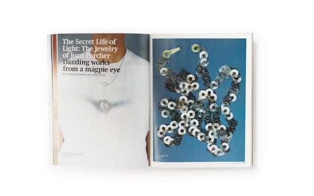

The new look and feel are designed to bring readers closer to the objects featured in the magazine and create a more sophisticated reading experience, more akin to an art catalogue than a trade publication.




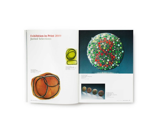
Metalsmith, the publication of the Society of North American Goldsmiths (SNAG), has in recent years expanded its focus beyond art jewelry to become a showcase for art and craft design. Published five times a year, the magazine presents profiles and portfolios of artists and designers, news and articles about materials and processes, and reviews of exhibitions and books. To accommodate its growing vision, editor Suzanne Ramljak commissioned Pentagram to redesign the publication. The new design for Metalsmith emphasizes the art's creative impulse and reshapes the magazine into an object as crafted as its subject.
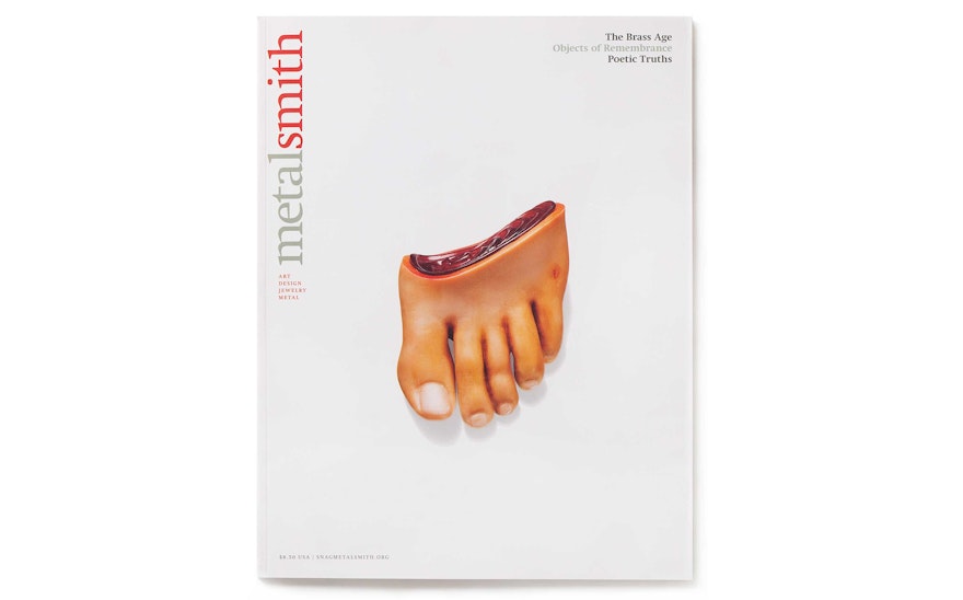
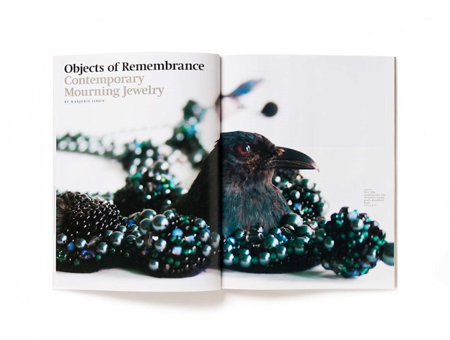
The new Metalsmith has been retooled for a slightly different feel than its predecessor, most immediately apparent in its size. The magazine's previous dimensions were close to the traditional 8 1/2" by 11"; the new design trims the journal down to a more intimate, customized scale of 7 3/4" x 10". This smaller format, coupled with a shift from glossy paper to an uncoated stock, helps make the magazine more tactile and appealing. The new look and feel are designed to bring readers closer to the objects featured in the magazine and create a more sophisticated reading experience, more akin to an art catalogue than a trade publication.
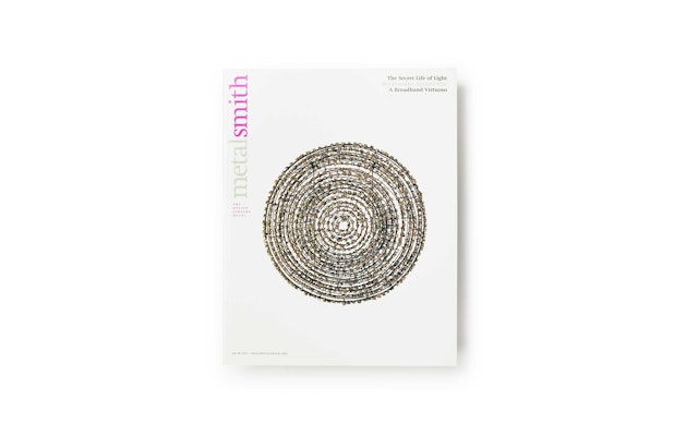
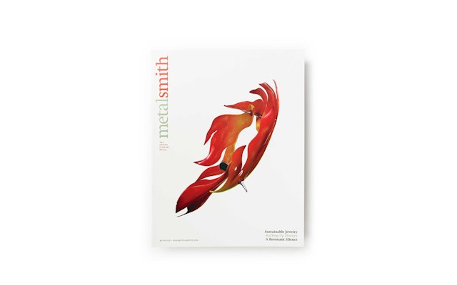
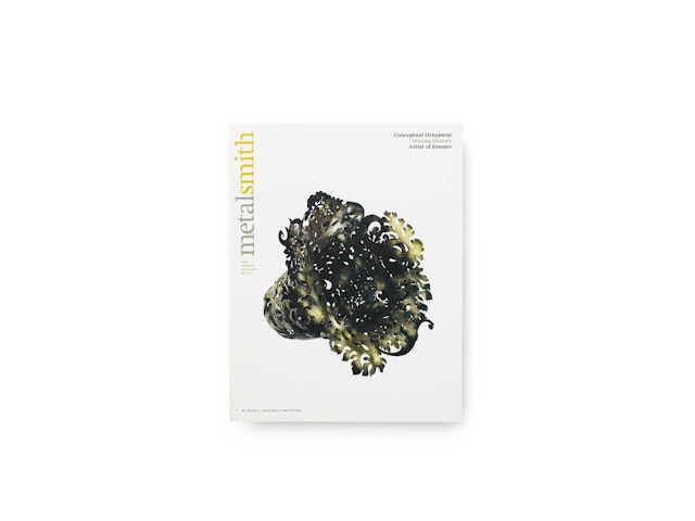
Pentagram and designer Rami Moghadam created many graphic alterations to go along with the physical ones. On the cover, the nameplate has been turned vertically on its side and changed from upper- to lowercase for a more intricate and delicate look. A two-tone color scheme has been applied to the logotype, dividing it so that "metal" is always a gunmetal gray while "smith" appears in a bright color that serves as a changing accent hue for each new issue. This emphasis on "smith" reinforces the notion of skill and craft.
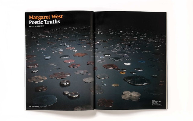
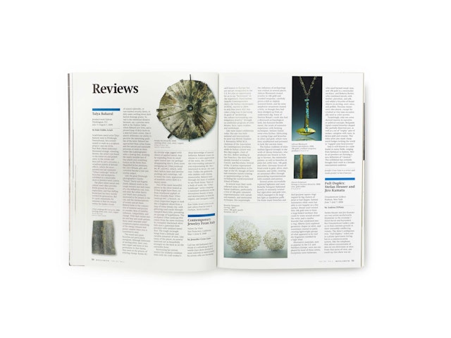
As a journal, Metalsmith is usually found in libraries and educational institutions. The content of the magazine is at a postgraduate level, conceptual and academic. With this in mind, a great emphasis was placed on legibility. Swift, a serif font with a cut and angular feel, was chosen for its readability.
The goal of the redesign was to take Metalsmith in the direction of a serious academic journal, while creating a dramatic look that is at once seductive, provocative and intellectual. Still creative, but less institutional, the new design is even more responsive to the art inside and embraces its subject matter with a connoisseur's eye.
Sector
- Publishing
- Arts & Culture
Discipline
- Publications
Office
- New York
