Pentagram has developed a name and brand identity framework for MIND that uses continuous dynamic motion to highlight the platform’s approach to vigilant threat detection.

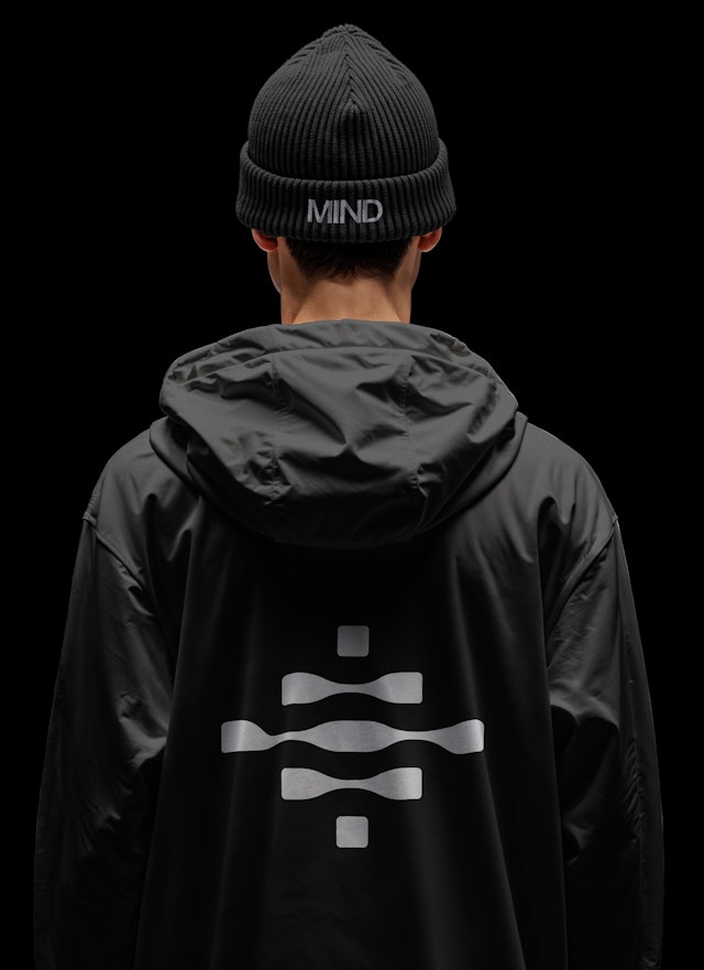
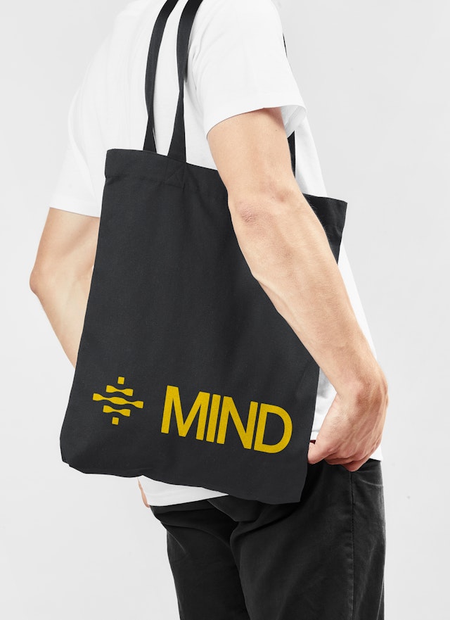
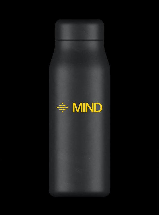
The MIND logo expresses the idea of fluid intelligence in an abstract symbol built of swelling lines with twist-like oscillations inspired by parametric brainwaves.
The new branding was conceived to set the right tone visually and verbally, with messaging that cuts through the dense, overly technical terminology typical of cybersecurity for something more straightforward, creative and engaging.
On the website and other applications, clarity of MIND comes through in a bold, simple interface with a high visual impact that reflects the effectiveness of the platform.


Mind over matter
Eighty-five percent of organizations have suffered at least one data loss event in the past year, with the average cost of a data breach amounting to $4.88 million. MIND is the first-ever data security platform that puts data loss prevention (DLP) and insider risk management (IRM) programs on autopilot, so users can identify, detect and prevent data leaks at machine speed.
Pentagram has developed a name and brand identity framework for MIND that uses continuous dynamic motion to highlight the platform’s approach to vigilant threat detection. Working closely with leadership at MIND, the designers revitalized the entire brand identity, evolving everything from the company’s name, positioning and tone of voice, to the visual identity and distinct motion style.
Heads above
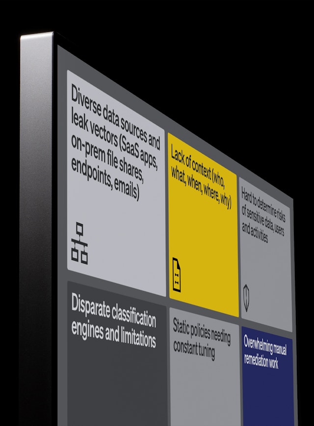
The challenge was helping MIND to set itself apart in a crowded category: There are a surfeit of data security products on the B2B market and it can be difficult to distinguish among them, even for those that offer superior performance. MIND wanted to highlight its mission-critical mentality and how it is unlike any other DLP solution in the industry.
"There were several goals for our new brand identity — MIND, however, the ultimate one was to help our startup stand out in an ever-increasingly noisy cybersecurity market,” says Eran Barak, Co-Founder and CEO at MIND. “We didn’t want to be just like every other B2B enterprise security company — we had to stand out to thrive.”
“Since MIND is my second startup, I knew the importance of a strong go-to-market foundation from the get-go, and our brand identity is key to our strategy," says Barak.
All knowing
MIND melds data security products in one omniscient, all-knowing solution that highlights data risks proactively and in real-time. Blindspots are everywhere, and the visibility of unstructured sensitive data is often obscured, missed by conventional data security point products. MIND sees the big picture, melding with systems to discover and classify information––helping users understand exactly what they have in their resources and unique organizational context.
The new branding was conceived to set the right tone visually and verbally, with messaging that cuts through the dense, overly technical terminology typical of cybersecurity for something more straightforward, creative and engaging. This started with the name, which is memorable and reinforces the idea that MIND is always thinking, always aware, always on. The name also lends itself to smart, clever messaging: The new tagline is “Mind What Matters”; the company overview is “State of MIND” and the blog “Top of MIND”; visitors to the site are invited to “Tell us what’s on your mind.”
Riding the wave
The strength of MIND is in stopping data leaks automatically and autonomously. While the platform is powerful and hyperalert, the branding conveys a sense of enlightened, informed calm; MIND is wise and secure in knowing what it can do.
The MIND logo expresses this idea of fluid intelligence in an abstract symbol built of swelling lines with twist-like oscillations that reference parametric brainwaves. This distinctive detail carries through to a series of custom icons, tying the identity together throughout the visual language. The wordmark and other brand typography are set in the straightforward Grotesk Söhne (by Klim Type Foundry).
MIND in motion
MIND specializes in advanced threat detection and response solutions, aimed at protecting organizations from sophisticated cyber threats. Key to the identity is motion design that suggests the narrative of MIND attacking and holding down a breach. Like an immune system taking on an intruder––or a brain surging with activity––the swirling motion pours into the mark and various icons, taking their shape and making them part of MIND. Swarms of letters surround, absorb and subsume the forms, in three-dimensional renderings animated in vibrant kaleidoscopic color that represents and indicates data prevention and risk detection.
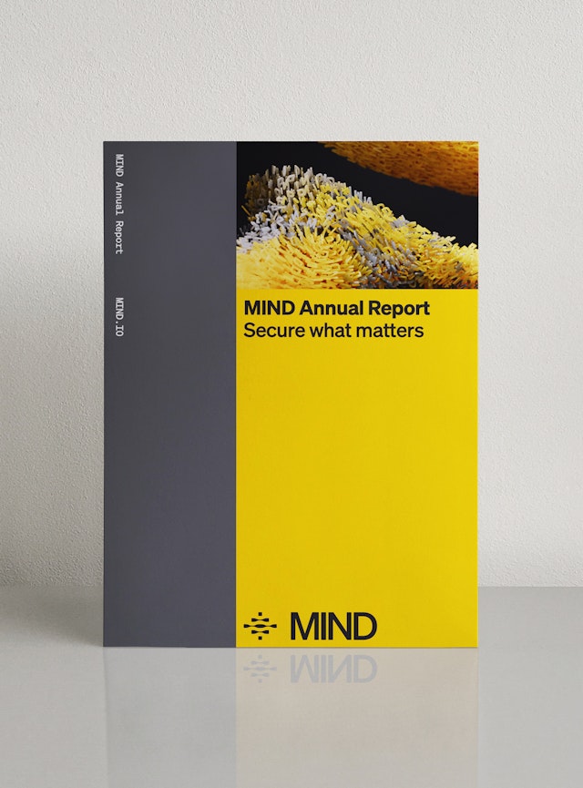
On the website and other applications, clarity of MIND comes through in a bold, simple interface with a high visual impact that reflects the effectiveness of the platform. This is reinforced by a neutral palette of black, white and gray, with bright yellow as a secondary brand color that suggests alertness and stands out from the blue prevalent in the tech security category. (Navy is a tertiary color in the MIND palette.)
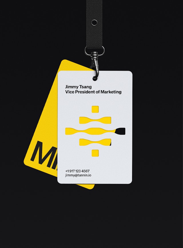
"We’re proud of the MIND brand identity we forged early in our startup journey — brought to life alongside the brilliant team at Pentagram," says Jimmy Tsang, VP of Marketing at MIND. “The brand truly shines across every touchpoint — from the mind.io web experience to our engaging videos, event materials, swag, collateral and even within the MIND data security platform itself. We’re looking forward to taking our brand experience even further in the coming months and years, limited only by our creativity and minds."
Office
- New York
Partner
Project team
- Jun Park
- Ruairi Walsh
- Cristina Giménez
- Dana Reginiano
Collaborators
- Hannes Weikert, animator
- Decimal Studios, web development
