

The redesign builds on the simplicity and clarity of MIT’s design heritage and transforms it.


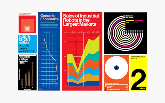
A new approach to photography, illustration and data visualizations is more vivid, varied and striking.
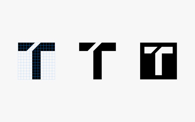
The rebrand introduces a new symbol, a monogram with a 45-degree cut through the letter ‘T’ to form a lowercase ‘r.’
MIT Technology Review is a world-renowned, independent media company whose insight, analysis, reviews, interviews and live events explain the commercial, social and political impact of new technologies. Pentagram has developed a new brand identity and editorial design for MIT Technology Review that builds on the publication’s commitment to responsible journalism while reasserting its innovative approach.
The new redesign is introduced at a moment when technology and culture have almost fully converged, and coincides with the publication’s updated mission statement to bring about better-informed and more conscious decisions about technology through authoritative, influential and trustworthy journalism. In print, each issue will examine a single technology or theme from a wide range of angles, exploring deep questions about how technology affects our world. CEO and Publisher Elizabeth Bramson-Boudreau and Editor-in-Chief Gideon Lichfield led the editorial transformation.
Working closely with the magazine’s in-house team led by Chief Creative Officer Eric Mongeon, Pentagram began by considering the graphic history of MIT and MIT Technology Review. In the sixties and seventies, the magazine found a foundational visual expression through the work of MIT’s Office of Design Services, led by the legendary Muriel Cooper with Jacqueline Casey, Ralph Coburn and Dietmar Winkler. Since then, successive design teams at MIT Technology Review have explored their own interpretations of that original group’s combination of modernist rigor and experimental expressiveness.
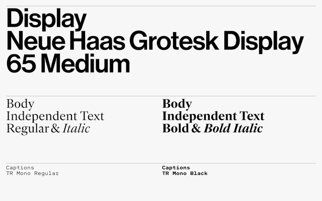
The redesign, which launches with the July/August issue on newsstands July 3, both extends this heritage and transforms it. MIT’s emblematic use of Helvetica––now reborn as Monotype’s Neue Haas Grotesk––is carried through to the nameplate and the rest of the cover. The redrawn wordmark has been customized and refined by Christian Schwartz at Commercial Type.
Inside, the new text face is Independent, designed by Henrik Kubel at A2-TYPE. It is supplemented by a custom monospaced typeface, TR Mono, used for captions and sidebars and created especially for MIT Technology Review by Hubert & Fischer. Neue Haas Grotesk is used for headlines and display. All the typeface choices have been chosen not just for legibility and ease of use, but for consistency across print and digital platforms.
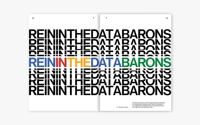
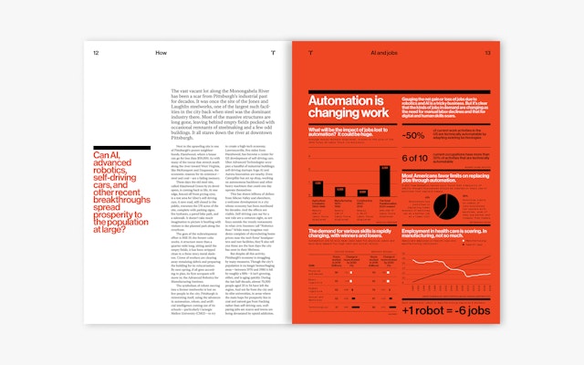
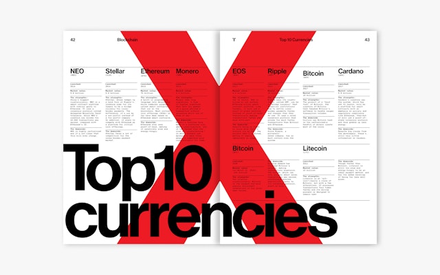
The redesign employs a flexible 12-column grid that allows for more diverse layouts and a greater mix of elements like sidebars, infographics and pull quotes. MIT Technology Review’s new approach to photography, illustration, infographics and data visualizations is more vivid, varied and striking. A bright, modern color palette brings data and other information to life.
The redesign also introduces a new symbol, a monogram with a 45-degree cut through the letter “T” to form a lowercase “r.” (The configuration updates a longstanding “TR” logo.) The distinctive angle is integrated into layouts in the magazine, where it crops the corners of images, organizes typography, and helps to call out information.
The new look will be extended to MIT Technology Review’s digital presence, including the website designed by Upstatement, email newsletters and social media, as well as live events. Subscribe to MIT Technology Review here.
Pentagram previously designed the identity for the MIT Media Lab and MIT Libraries.
Sector
- Technology
Discipline
- Brand Identity
- Publications


